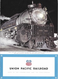
Union Pacific issued more dining car menus than any other railroad. It had plenty before World War II, but really cranked them out after the war. My count shows more than 50 menus in various series before the war and more than 160 after — an average of more than six new menus a year between 1946 and 1971. This doesn’t count menus used in hotels and lodges or special menus (such as for Christmas) that aren’t part of a series.
If you know of any menus or entire menu series that aren’t included below, please let me know. If you have such a menu or menus and a scanner, please send me scans. Thanks.
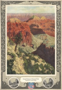
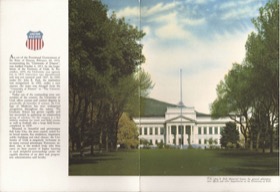
Art Nouveau
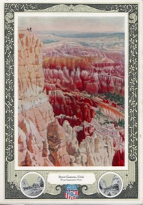
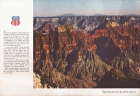
The busy decorative borders around the photographs are in the Art Nouveau style. The first menus in this series use black-and-white photos that have been hand colored and then printed using lithographic plates. The results were darker than reality, probably because the colorists had never been to these locations. Later menus use “natural color photographs.”
Curiously, there are three nearly identical menus showing Bryce and three showing Zion’s Great White Throne. It isn’t clear why UP wasn’t satisfied with the first menus, but the last in each triplet are color photos rather than lithographs. I’ve positioned each of these triplets together for comparison purposes.
I am pretty sure I have all seventeen of this series. I haven’t seen any dated before 1927, but it is possible some were issued before then as not all of them are dated. These menus were last used in 1935.
 1927 Menu |  1928 Menu |  1929 Menu |
 1929 Menu | 1929 Menu | 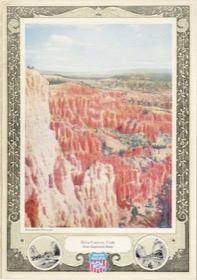 1935 Menu |
1929 Menu | 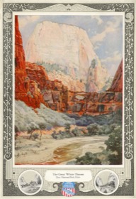 1930 Menu | 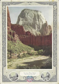 1934 Menu |
 1930 Menu | 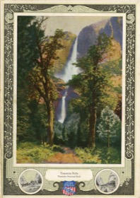 1930 Menu | 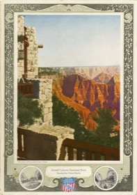 1931 Menu |
 1934 Menu | 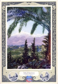 1934 Menu | 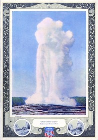 1934 Menu |
 1929 Menu | 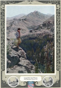 1929 Menu |
Moderne
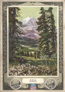
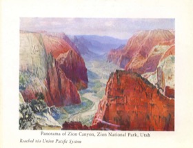
In 1935, UP replaced the Art Nouveau series with a series I call Moderne, but could just as easily be called Art Deco. These menus used the same photos and text as were on the Art Nouveau menus but all of the busy borders were replaced with white space and a few blue lines. The results are much more appealing to the modern eye.
There would have been fewer in this series than the Art Nouveau series because some in the Nouveau series were reshoots of similar scenes and the earlier versions wouldn’t be repeated in the Moderne series. I believe the images below show all of the menus in this series including Mount Rainier, which is missing from my collection.
 1935 Menu | 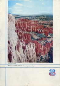 1935 Menu | 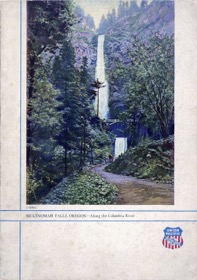 1935 Menu |
 1935 Menu | 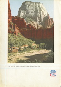 1935 Menu | 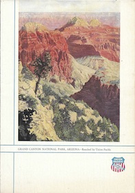 1935 Menu |
 1935 Menu | 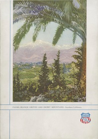 1936 Menu | 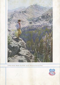 1936 Menu |
 1936 Menu | 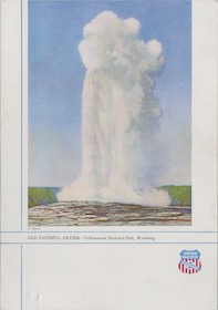 1936 Menu | 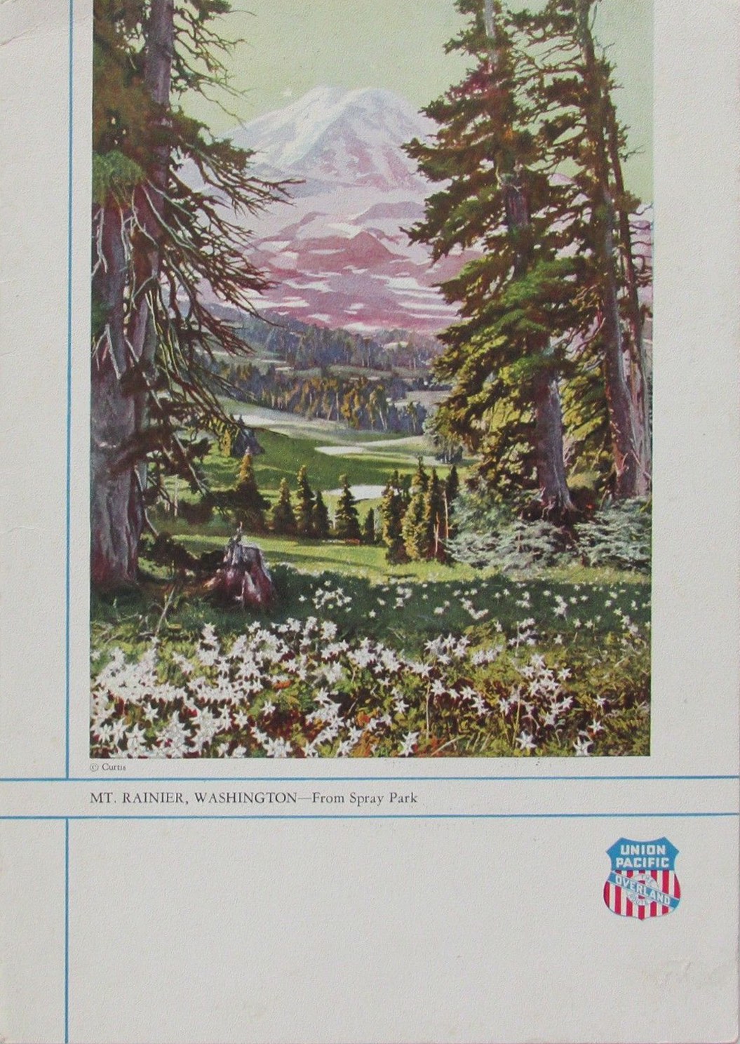 Missing |
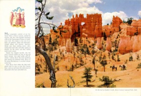
Lodge Cards
In the late 1920s and early 1930s, Union Pacific used these little (4-1/3″x5-2/3″) menu cards in the Bryce, Grand Canyon, and Zion lodge restaurants. The lithographs are not only colorful, the colors are fairly accurate. In addition to the nine shown here, I’ve identified three more that I’ll try to post soon. For some reason, starting around 1935, UP used menus that were the same size but without the photos; they were simply blank on the back.
 1929 Menu | 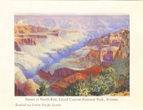 1929 Menu | 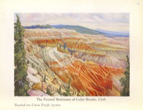 1929 Menu |
 1929 Menu | 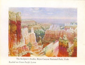 1929 Menu | 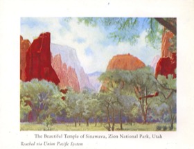 1929 Menu |
 1929 Menu | 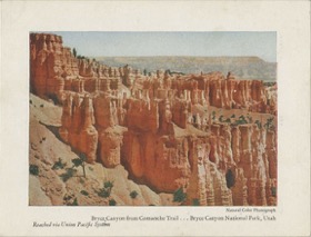 1931 Menu | 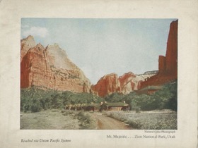 1931 Menu |
Black & White
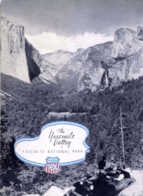
These menus have two different black-and-white photos on the front and back covers. Usually they are related, but sometimes only distantly: Yosemite on the front cover is paired with San Francisco on the back cover. The back covers sometimes also changed: one Yosemite shows downtown San Francisco on the back and another shows the Golden Gate Exposition.
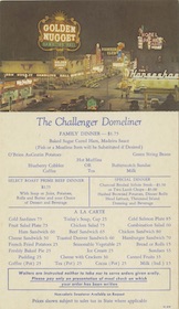
These menus were used for secondary trains such as the Challenger. As far as I know, the ten menu covers shown here are the complete series, but others may turn up.
 1938 Menu | 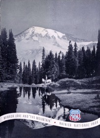 1938 Menu | 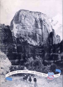 1938 Menu |
 1938 Menu | 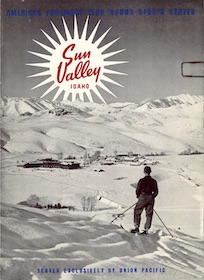 1938 Menu | 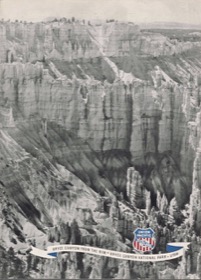 1939 Menu |
 1940 Menu | 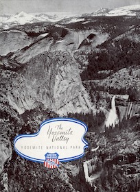 1941 Menu | 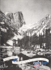 1941 Menu |
 1943 Menu |
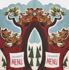
Children’s Menus
Union Pacific issued two very different styles of children’s menus. The first three were used before the war and the second three after the war.
 1930 Menu | 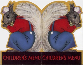 1930 Menu | 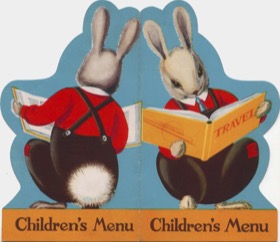 1930 Menu |
 1964 Menu | 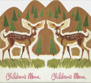 1965 Menu | 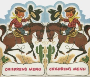 1969 Menu |
Premiere
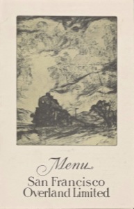
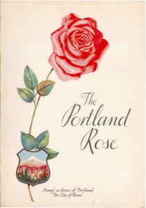
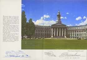
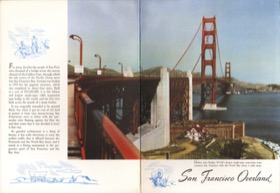
These menus were used for Union Pacific’s premiere daily trains. From the dates, it appears that most were first issued about the time UP began introducing the streamliners. Except for the City of Denver, the overnight streamliners operated only a few times a month, so trains like the Los Angeles Limited, Portland Rose, and San Francisco Overland still carried some cachet. A train called the Colorado Flyer also had its own colorful menu cover.
Union Pacific apparently allowed partner Southern Pacific to design the San Francisco Overland menu. The fact that the locomotive on the cover is clearly a Southern Pacific steam engine rather than a Union Pacific loco pretty much gives it away.
Some of these menus stayed in use for a few years after World War II, but were soon replaced by the color photo menus.
 1939 Menu |  1939 Menu |  1942 Menu |
 1943 Menu | 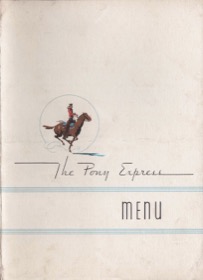 1948 Menu | 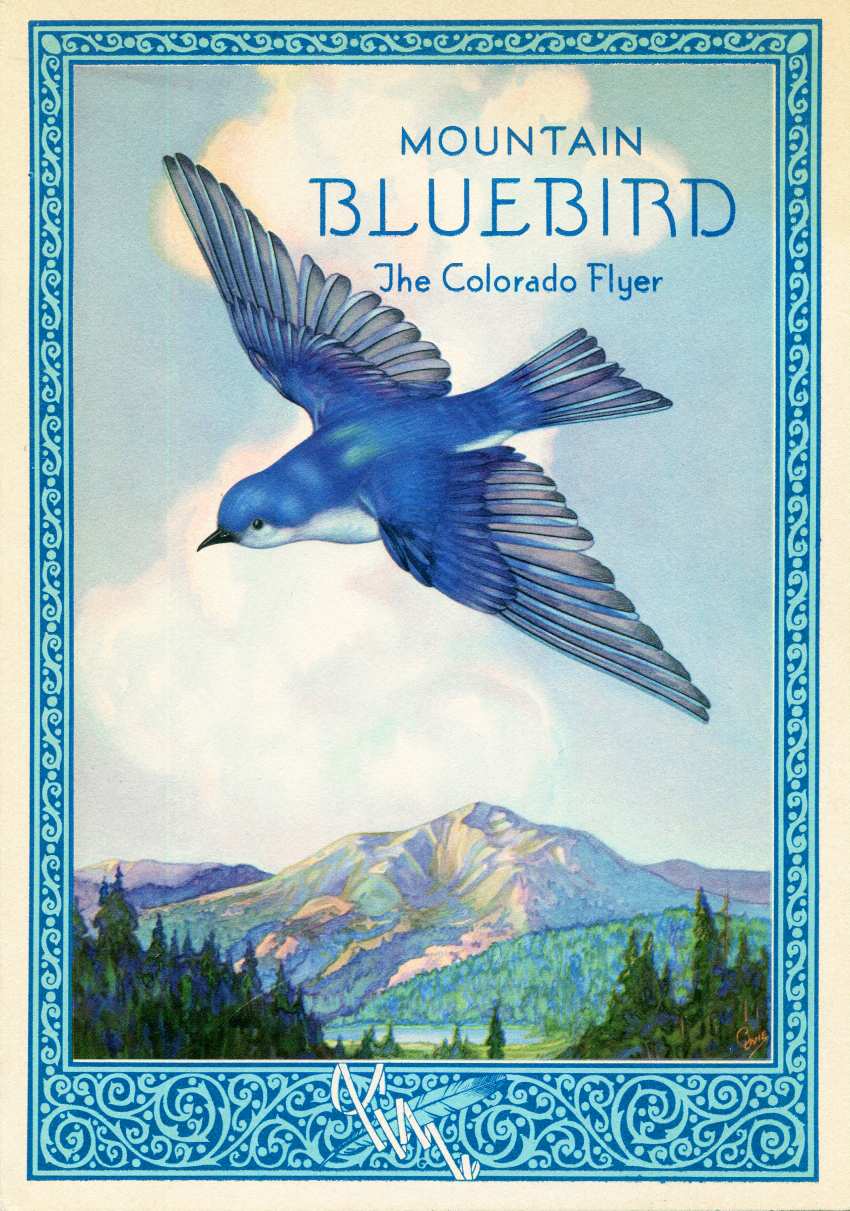 Missing |
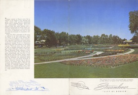
Winged Streamliner
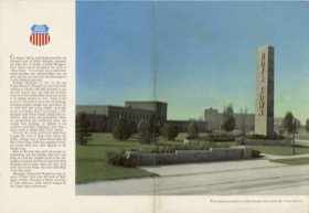
These menus were used on the full-sized streamliners — in other words, not the early M-10000 series trains but the ones that came after. Although I only have the City of Denver, City of San Francisco, and City of St. Louis, no doubt similar menus were made for the City of Los Angeles and City of Portland. All of my menus in this series date from 1946, but I suspect they were first used before the war.
 1946 Menu | 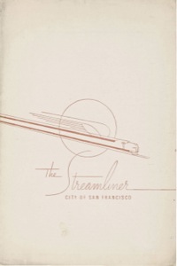 1946 Menu | 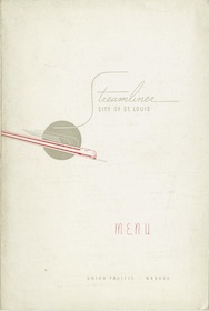 1950 Menu |
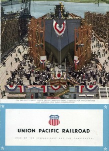
Patriotic
Union Pacific’s 1943 calendar was filled with photos showing people making their patriotic contributions to the war effort. At least four photos from the calendar were made into menus. These menus are pretty rare, so I wouldn’t be surprised if others were also made into menus. The menus have printer codes that seem to indicate they were used in 1946, but at least one comes with an insert dated 1943 despite the 46 printer code, so I’m pretty sure they were all used before 1946, when they would have been obsolete.
 1943 Menu | 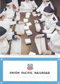 1943 Menu | 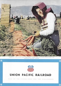 1943 Menu |
 1943 Menu |
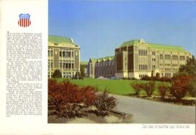
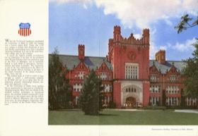
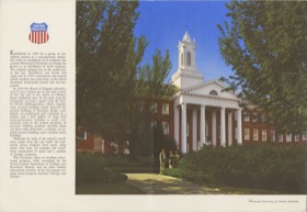
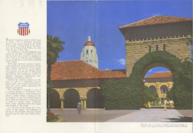
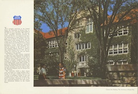
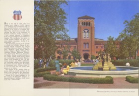
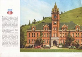
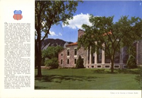
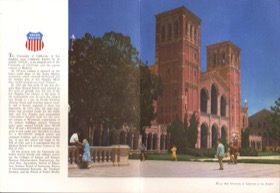
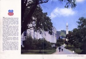
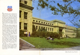
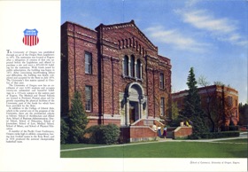
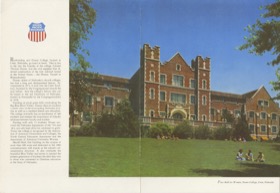
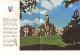
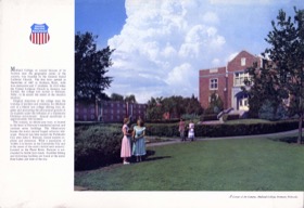
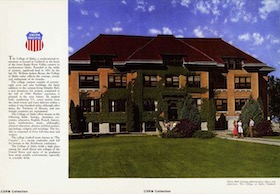
Colleges
In 1946, Union Pacific began its famous series of color-photo menus. Most of them used photos that wrapped around to the back cover. For my own convenience, I’ve divided most of them by geography, but in 1949 UP issued a series of menus featuring colleges and universities on the covers.
Someone at UP must have been pretty serious about this series as at least two dozen were issued. Someone else must have decided they didn’t resonate with the public, however, as the series was used for only about four years.
There were two menus each for Colorado, Idaho, Kansas, Oregon, and Washington, four for California, and five for Nebraska — Union Pacific’s home state but not a state graced with outstanding enough scenery to be featured on many other menus. However, there is only one for Missouri, Montana, Nevada, Utah, and Wyoming. Montana, Nevada, and Wyoming only had one major university in those years, but I’ve speculated that a second menu should have featured another Utah college. However, I haven’t found it. There is also one for Missouri even though Union Pacific didn’t really go into Missouri.
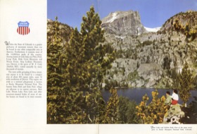
Colorado
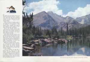
Colorado menus fall into two groups: Denver scenes, which were used almost exclusively on the City of Denver (or City of St. Louis when it was routed through Denver), and Rocky Mountain National Park scenes, which might be used on any streamliner.
 1953 Menu | 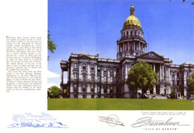 1954 Menu | 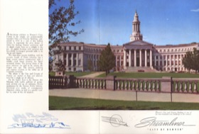 1955 Menu |
 1955 Menu | 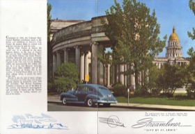 1957 Menu | 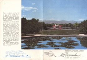 1957 Menu |
 1957 Menu | 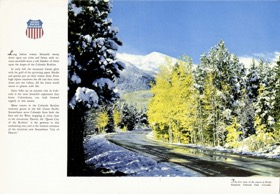 1958 Menu | 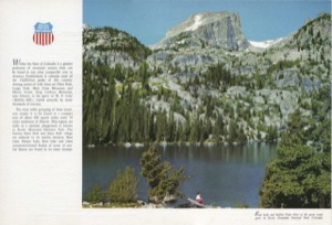 1958 Menu |
 1971 Menu |
Missouri-Nebraska
I group these two states together only because there are so few from each. The two Missouri menus were used exclusively on the City of St. Louis. Some people have listed the Boys Town menu as a part of the college series on the theory that it is a school. Since it’s not a college, I don’t, but there really isn’t any other series to list it under: except for Nebraska colleges, it is the only menu showing a Nebraska scene.
 1951 Menu | 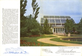 1952 Menu | 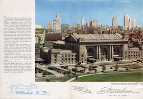 1952 Menu |
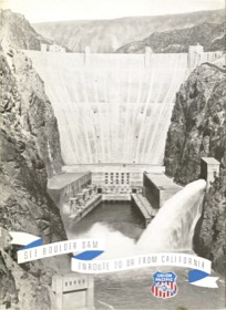
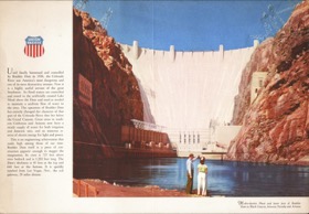
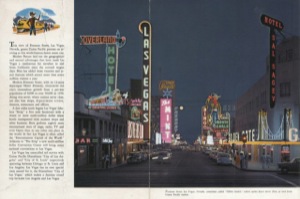
Nevada
Nevada menus fall into two groups: Hoover Dam and Las Vegas. Both were used on the route of the City of Los Angeles, but these menus might occasionally be found on the City of Portland.
 1947 Menu | 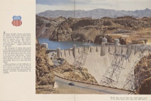 1948 Menu | 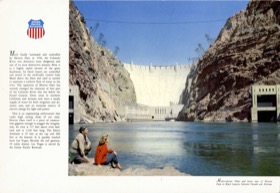 1958 Menu |
 1959 Menu | 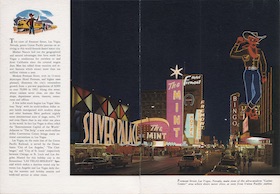 1964 Menu | 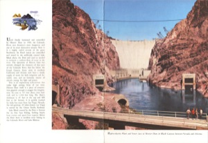 1968 Menu |
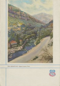
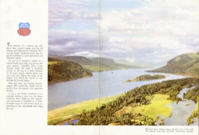
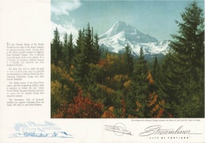
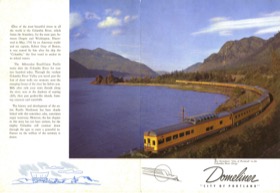
Pacific Northwest
The only Union Pacific menu featuring a photo of a streamlined passenger train was the domeliner City of Portland. It seems like the City of Los Angeles should also have been featured on a menu, but I haven’t found any. (Of course, there’s a Howard Fogg painting of that train on the centennial menus.) Although it would seem natural to find these menus on the City of Portland, they could also be found on the City of Los Angeles.
 1950 Menu | 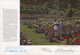 1953 Menu | 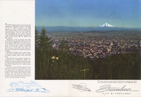 1953 Menu |
 1954 Menu | 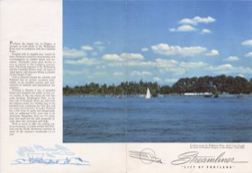 1953 Menu | 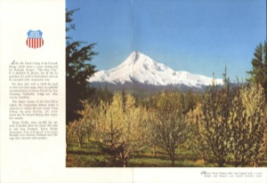 1954 Menu |
 1957 Menu | 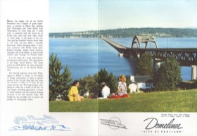 1959 Menu | 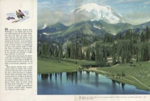 1959 Menu |
 1966 Menu | 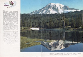 1966 Menu |
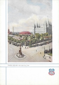
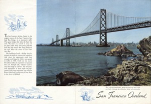
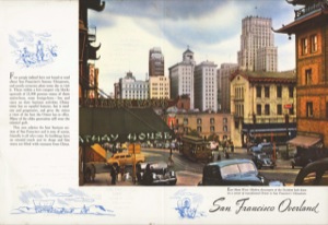
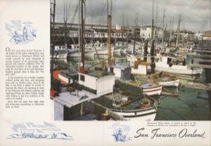
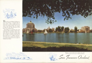
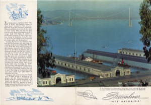
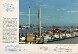
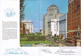
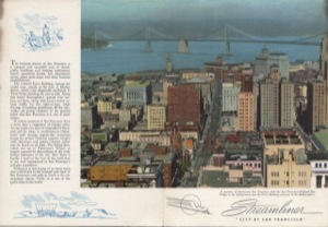
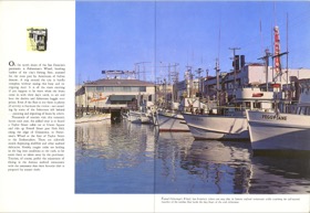
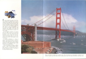
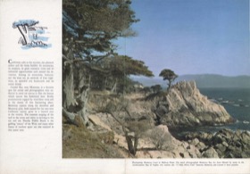
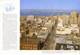
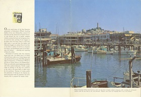
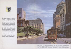
San Francisco Bay Area
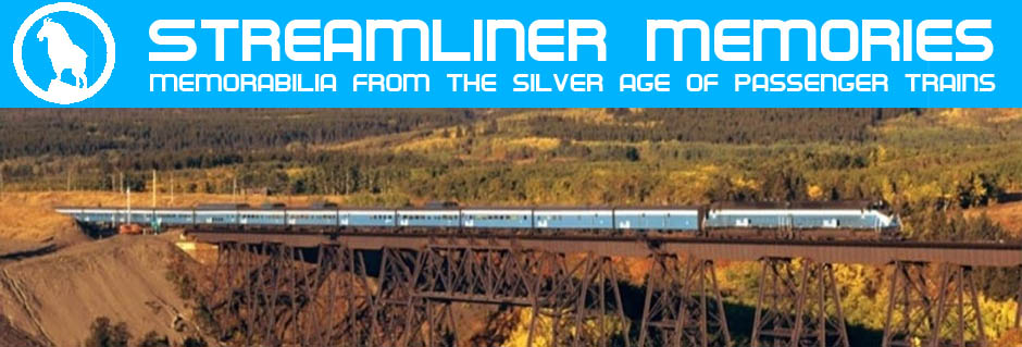
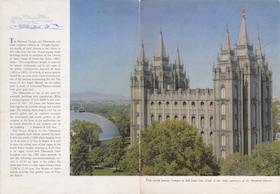
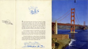
Union Pacific seemed to allow Southern Pacific to pick the subjects of menus for the City of San Francisco and the last years of the San Francisco Overland. Though at least some of the photos were taken by Union Pacific photographers, menus on San Francisco-bound trains almost exclusively used photos of the Bay Area and Bay Area photos were almost exclusively used on San Francisco trains. Other than a photo of the Mormon Temple in Salt Lake City, the few exceptions were probably accidents.
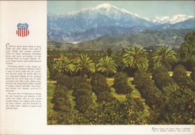
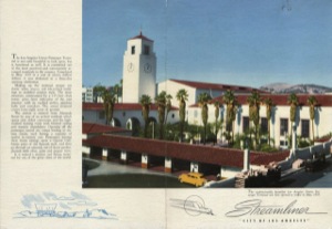
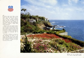
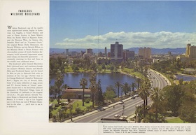
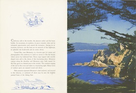
Southern California
Like Pacific Northwest photos, southern California photos were used on both the City of Los Angeles and City of Portland.
 1947 Menu | 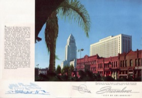 1950 Menu | 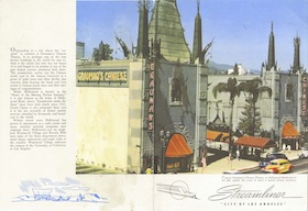 1953 Menu |
 1954 Menu | 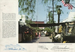 1955 Menu | 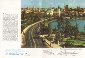 1955 Menu |
 1958 Menu | 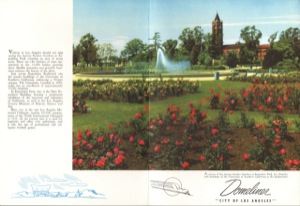 1961 Menu | 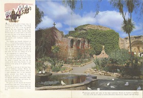 1962 Menu |
 1962 Menu |  1964 Menu |  1964 Menu |
 1971 Menu |  1971 Menu |
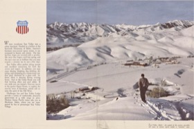
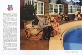
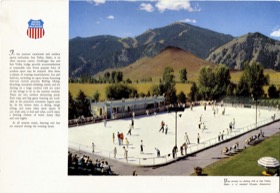
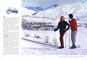
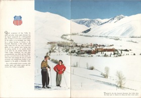
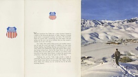
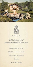
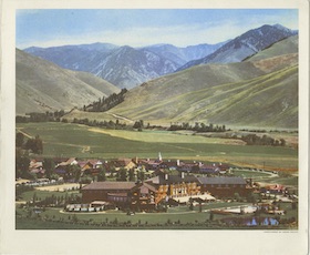
Sun Valley
Union Pacific was happy to advertise its Sun Valley resort on the City of Los Angeles and City of Portland. After UP sold the resort at the end if 1964, however, it apparently lost interest in promoting it.
 1948 Menu | 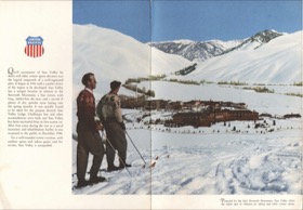 1948 Menu | 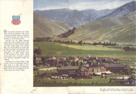 1948 Menu |
 1950 Menu | 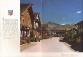 1952 Menu | 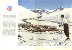 1953 Menu |
 1958 Menu | 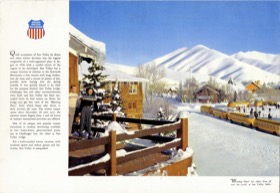 1958 Menu | 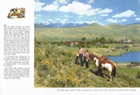 1961 Menu |
 1963 Menu | 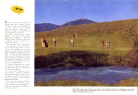 1963 Menu | 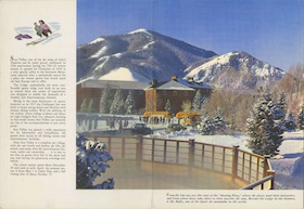 1964 Menu |
 1965 Menu |  1965 Menu |
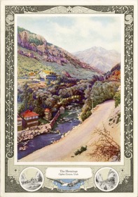
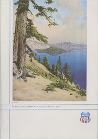
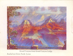
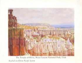
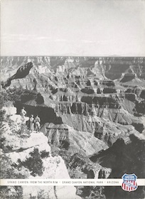
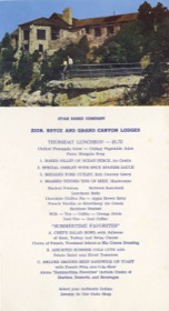
Utah/Grand Canyon
I include here menus showing the Mormon Temple as well as the southern Utah Parks (which include the Grand Canyon). As noted above, menus with the Mormon Temple were sometimes used on San Francisco trains; Southern Pacific apparently considered it to be a part of its domain. The others were mainly used on the City of Los Angeles and City of Portland.
The first two menus show that UP sometimes issued menus showing nearly identical scenes at around the same time. There are many examples of UP photographers rephotographing scenes several years apart to update hair styles, automobile models, and so forth, but the two photos here look like they may have been taken minutes apart, one with a model and one without.
What you can’t see in the one with the model is that a young man is standing behind the young woman in the photo. Though he was cropped out of the menu photo, he can be found in other UP advertising.
1946 Menu | 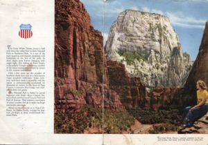 1950 Menu | 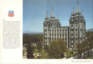 1949 Menu |
 1950 Menu | 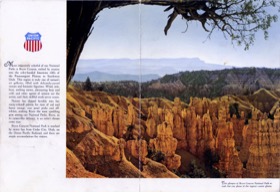 1950 Menu | 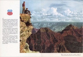 1952 Menu |
 1954 Menu | 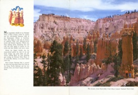 1960 Menu | 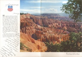 1960 Menu |
 1966 Menu | 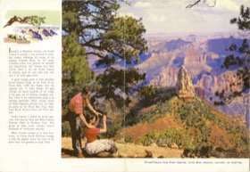 1966 Menu | 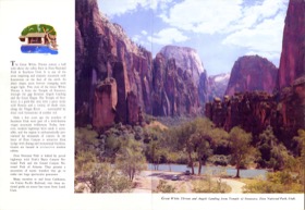 1967 Menu |
 1970 Menu | 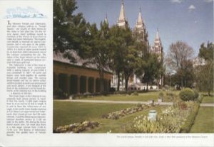 1971 Menu | 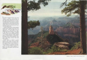 1971 Menu |
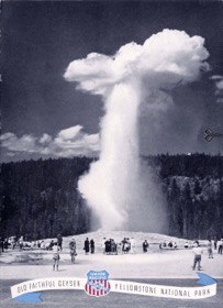
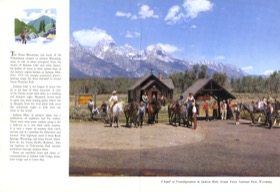
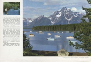
Wyoming
Predictably, Yellowstone and Grand Teton national parks are featured in most of the Wyoming menus. But there are also two different menus showing Lake Marie in southern Wyoming.
 1947 Menu |  1947 Menu |  1947 Menu |
 1949 Menu | 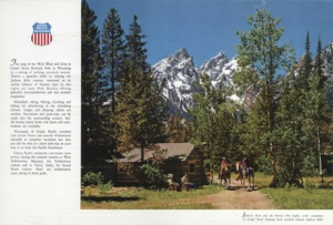 1958 Menu | 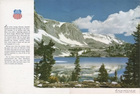 1958 Menu |
 1958 Menu | 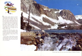 1964 Menu | 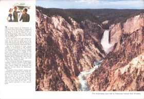 1967 Menu |
 1970 Menu | 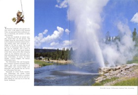 1970 Menu |
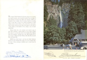
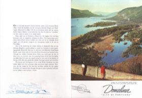
Non-Wraparound
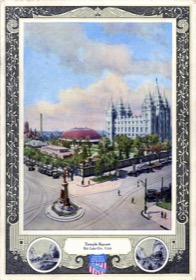
Union Pacific issued a few menus with photos that didn’t wrap around to the back. The first two were probably designed that way because the photos had a vertical orientation. That would certainly be true of the Multnomah Falls photo. It and the Columbia Gorge photo were first issued as early as 1949.
Several years later, about the time the dome dining cars were introduced, UP made more menu with non-wraparound photos, sometimes simply cropping a photo that had previously been used in a wraparound menu.
 1954 Menu | 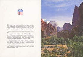 1957 Menu | 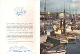 1960 Menu |
 1960 Menu | 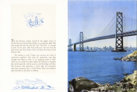 1961 Menu | 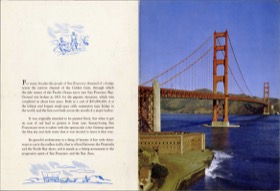 1961 Menu |
 1961 Menu |
Extra Flap
The dome diners seemed to demand something special, so Union Pacific designed some menus with an extra flap that had just a UP logo on one side and the name of the train on the other side. These menus also used photos that didn’t wrap around to the back, sometimes the very same photos used in the non-wraparound menus without the extra flap.
I would think that UP first tried the extra-flap menus and then decided the extra flap wasn’t worth it and replaced them with non-wraparound menus. The problem with that theory is that the earliest non-wraparound menus I’ve found (not counting the Multnomah Falls and Columbia Gorge menus) are dated before the earliest extra-flap menus.
Although the extra-flap menus were mainly used on the City of Los Angeles and City of Portland, the last two shown below were used on the City of San Francisco; note they have a Winged Streamliner logo in place of the UP logo in deference to SP’s role in the train. Calendar photos of the dome-diners show the menus inserted into menu holders with the extra flap folded so that the name of the train was visible, as if passengers might not know what train they were on.
 1957 Menu | 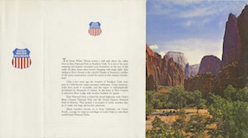 1957 Menu |  1958 Menu |
 1958 Menu |  1958 Menu | 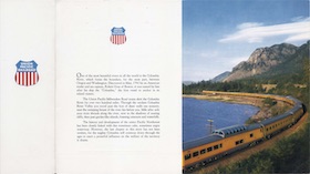 1959 Menu |
 1960 Menu | 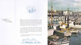 1960 Menu |
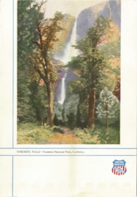
Postcard Menus
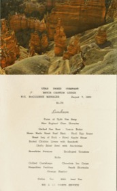
Some of these menus were used on the Challenger but most were used at the Sun Valley, Bryce, Grand Canyon, or Zion lodges. The photo at the top could be torn off and used as a postcard, which no doubt was supposed to make up for the indignity of being given only a menu card instead of a menu folder.
 1953 Menu | 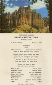 1953 Menu | 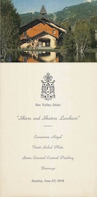 1954 Menu |
 1954 Menu | 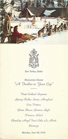 1954 Menu | 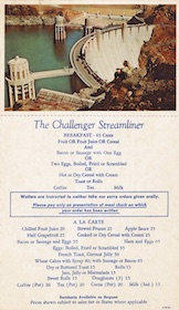 1954 Menu |
 1955 Menu | 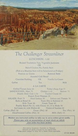 1956 Menu | 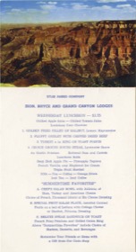 1961 Menu |
 1961 Menu | 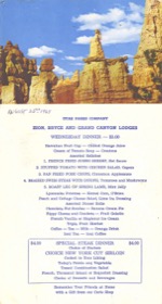 1965 Menu | 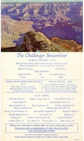 Missing |
 Missing | 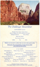 Missing |
Sun Valley Lodge
These two menus were used exclusively at Sun Valley Lodge.
 1953 Menu | 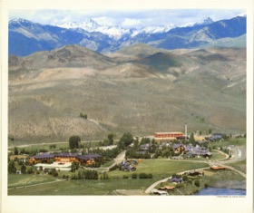 1955 Menu |
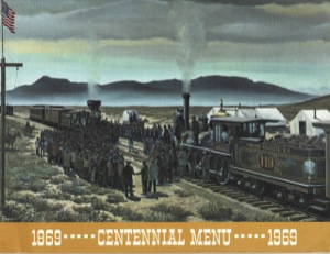
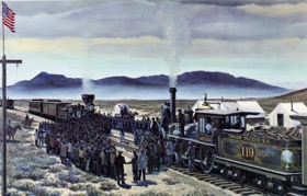
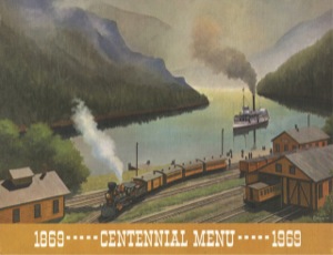
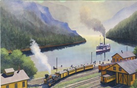
Howard Fogg
For the centennial of the Last Spike ceremony, Union Pacific commissioned sixteen paintings by noted railroad artist Howard Fogg. All were used on UP’s 1969 calendar, but UP used only six of them on menus. Dinner menus were folders (identifiable in the thumbnails below by the “1869 – Centennial Menu – 1969” strip), but breakfast and lunch menus were only cards. UP could have used six paintings on the menu cards that were different from the six used on the folders, but instead, as shown below, it used the same six on each.
 1969 Menu | 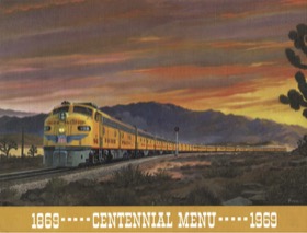 1969 Menu | 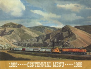 1969 Menu |
 1970 Menu | 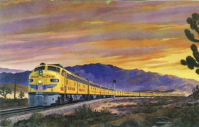 1970 Menu |  1970 Menu |
 1971 Menu | 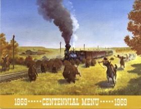 1971 Menu | 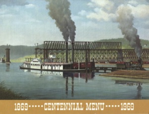 1971 Menu |
 1970 Menu | 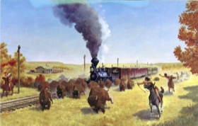 1970 Menu |  1970 Menu |