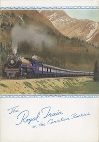
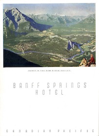
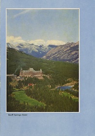
Although Union Pacific had more dining car menus than any other railroad, Canadian Pacific had far more total menus because it also served meals in hotels, steamships, station restaurants, and airplanes. Many of the menu designs used in these venues were also used on dining cars.
I’ve focused on menus that would be used in dining cars, though I’ve made some exceptions. Some hotel and steamship menus are included here because their covers look similar to dining car menus and may have been used in dining cars. Some series are not included here because they were used only in hotels or on steamships.
Elsewhere, I defined a series as “a group of menus that follow a similar template defining where text, photos, and other illustrations are located.” For Canadian Pacific, however, I am forced to bend that definition. On one hand, CP issued many menus that were clearly in a series yet didn’t follow a strict template. On the other hand, CP made a bewildering number of variations in templates that make it hard to classify them into separate series.
Are two menus in the same series if they are similar but one has a landscape-style picture and the other a portrait-style picture? What if they have the same picture and decorations but use a different typeface? Does changing the shape of lines bordering the image make a new series? Does adding a flag or a CP logo make a new series?
These kinds of questions particularly apply to menus issued between about 1935 and 1970. These menus are all similar in that they have a color image filling only part of the menu cover, with space for a few words and some other decorations.
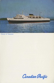
I could lump these altogether and call them one series. Groups issued within the same few years can look very similar, but the 1970 Princess of Vancouver menu looks so different from menus from mid-1930s menus that no one could seriously call them part of the same series. I could split up every change in font, decoration, and width of borders around the images, but I’d end up with dozens of series, many of which are nearly identical to one another. I tried to take a middle ground but you might classify them differently.
The result is more than 230 unique menu covers. About 70 are from the Chung collection, eight are menu covers I’ve identified but don’t have anything but an image, and the rest are my own. See the Canadian Pacific menu page for a complete set of more than 340 CP menus that have previously been shown here on Streamliner Memories, including duplicate covers, menus that aren’t part of a series, and menus in a style that was only used in hotels or on steamships.
As usual, click on the image to download a PDF of that menu; click on the date below the image to go to the post describing that menu in detail. “Missing” menus have no links. Dates ending in 0 or 5 may be approximate.
If you know of any menus or entire menu series that aren’t included below, please let me know. If you have such a menu or menus and a scanner, please send me scans. Thanks.
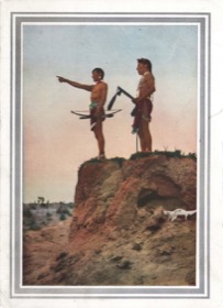
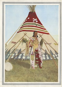
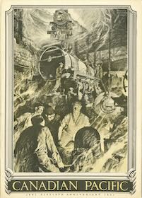
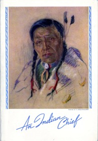
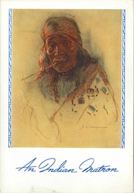
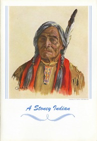
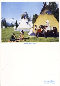
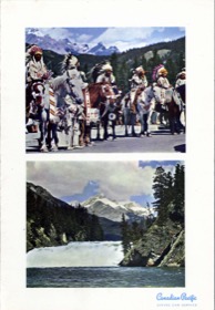
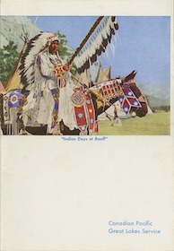
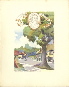
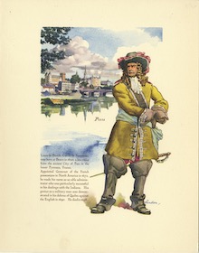
The Buffalo Child Series
The four Buffalo Child menus feature colorized versions of photos of Blackfeet Indians taken in about 1910 by photographers Herbert Lawrence and Harry Pollard. The opposite sides of the menus contain text written by a man who called himself Buffalo Child Long Lance but whose real name was Sylvester Long. Though he claimed to be a full-blooded Blackfeet Indian from Alberta, in fact he was part Cherokee, part Croatan, part white, and possibly, but probably not, part black from North Carolina.
Long left North Carolina to get away from racism and had an apparently distinguished career in the military, as a reporter, and as a movie star. He was talented, charismatic, and an effective spokesman for the plight of Native Americans. But he was also a compulsive liar about his own background, and after being exposed he committed suicide at the age of 41.
Before then, Long’s had been employed for a time by Canadian Pacific in Banff, where he presented lantern slide presentations that included hand-colored versions of these photos. In 1925 CP issued these menus with his mostly accurate descriptions of what they portray. The menus themselves don’t necessarily follow a single template; three are standard folding menus but the menu with the teepee has only half a page on the front, while the image shown here is actually the back cover.
 1925 Menu | 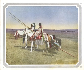 1925 Menu | 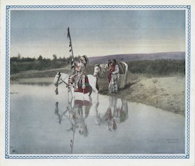 1926 Menu |
 1927 Menu |
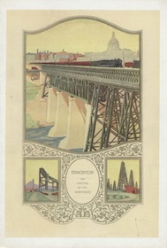
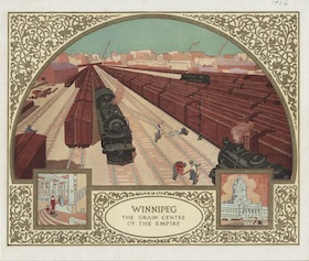
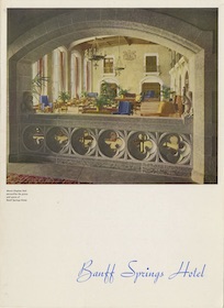
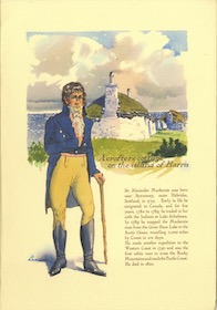
The City Series
In 1926, CP began issuing a series of menus commemorating cities and other important locations alongs its route. While they didn’t all follow the same template, with the black ones being especially different from the yellow ones, most were designed to appear as if the viewer is looking through a window or archway, sometimes with extra little windows providing alternate views.
 1926 Menu |  1926 Menu |  1926 Menu |
 1926 Menu | 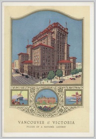 1926 Menu |  1926 Menu |
 1926 Menu | 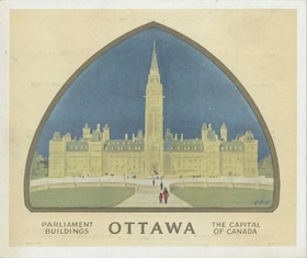 1926 Menu | 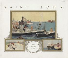 1926 Menu |
 1926 Menu |  1928 Menu | 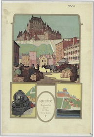 1928 Menu |
 1928 Menu |
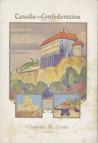
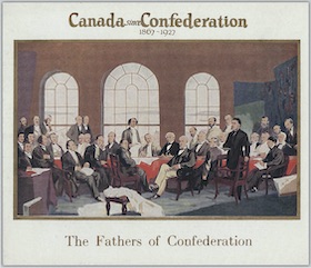
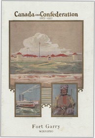
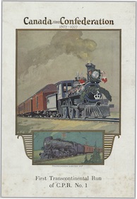
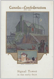
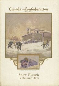
The Confederation Series
In celebration of the sixtieth anniversary of Canadian nationhood in 1927, CP issued this series of commemorative menus. Most of them focus either on how primitive transportation was before the railroad or on how much better it was after the Canadian Pacific was built.
 1927 Menu | 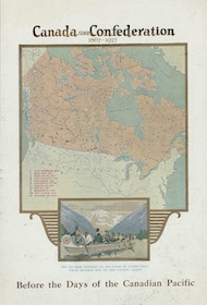 1927 Menu | 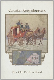 1927 Menu |
 1927 Menu | 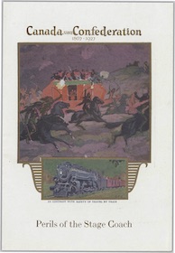 1927 Menu | 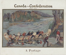 1927 Menu |
 1927 Menu | 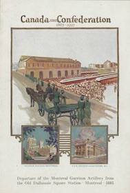 1927 Menu | 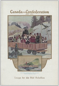 1927 Menu |
 1927 Menu | 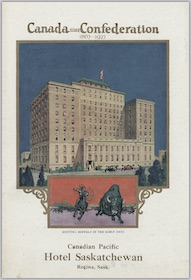 1927 Menu | 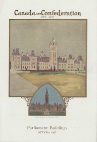 1927 Menu |
 1927 Menu | 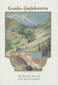 1927 Menu | 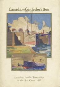 1927 Menu |
 1927 Menu | 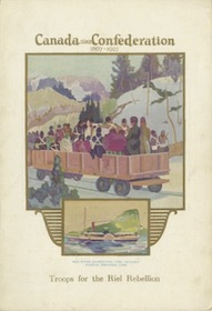 1927 Menu |  Missing |
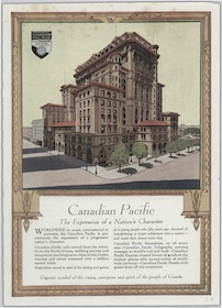
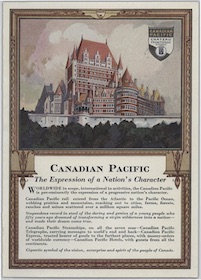
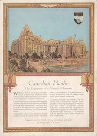
The Expression Series
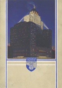
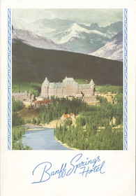
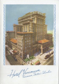
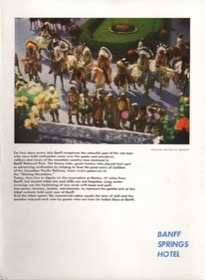
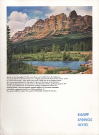
Perhaps because it had to compete with government-owned Canadian National, CP issued this menu series claiming that Canadian Pacific was the true heart of the nation. The front covers were also used on a series of booklets about Canadian Pacific hotels.
Except for the picture, the covers say nothing about either the hotels or the contents within the folder (such as whether it is a menu or a hotel booklet), which to me is a poor sort of advertising. The backs of the menus picture 12 different hotels. Presumably, menus were issued with all of them on the front cover, but I’ve only seen the seven shown here.
 1928 Menu | 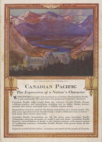 1929 Menu | 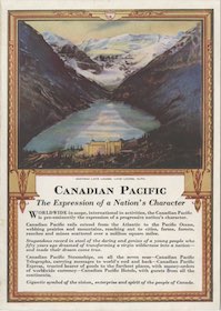 1929 Menu |
 1930 Menu | 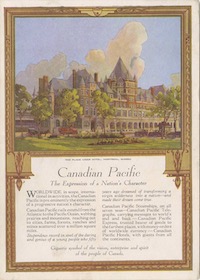 1930 Menu | 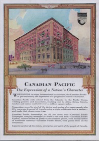 1930 Menu |
 1930 Menu |
The Fresco Series
Many of the paintings on these menus, which look like they were painted on plaster (an effect I suspect was added during the printing process) are signed either Greenwood or Gillespie (GFG), referring to Charles James Greenwood and Gordon Fraser Gillespie. Both worked on commission for Canadian Pacific when these menus were issued and both were later hired full time as the railroad’s artists. The menus in this series focus on the delightful destinations that could be reached by Canadian Pacific trains or steamships.
 1928 Menu |  1928 Menu |  1928 Menu |
 1930 Menu |  1928 Menu | 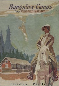 1930 Menu |
 1931 Menu |
The Canadian Industry Series
This series uses the same artistic style and apparently the same artists as the Fresco series but the focus is on industry rather than recreation. The cover illustrations on both wrap around to the backs of the menus, but the wraparound is more prominent in the Industry series so I’ve included both fronts and backs in the thumbnails shown here.
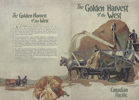 1930 Menu | 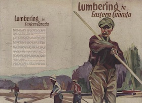 1930 Menu | 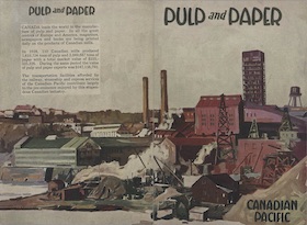 1930 Menu |
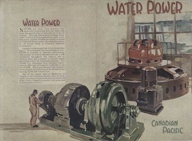 1930 Menu | 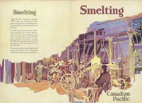 1930 Menu | 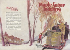 1930 Menu |
The Anniversary Series
In 1931 Canadian Pacific celebrated the 50th anniversary of its incorporation with this series featuring charcoal or pencil drawings by a U.S. artist named Michael Leone Bracker. Each drawing represents a different aspect of the CP empire: the railroad, hotels, steamships, and the settlement of western Canada that was enabled by the railway. The use of black-and-white art instead of color paintings probably reflects the Depression economy.
 1931 Booklet | 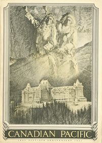 1931 Booklet | 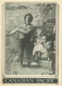 1931 Booklet |
 1931 Menu |
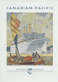
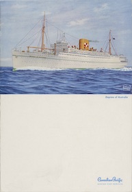
The Cruise Series
This is less of a series and more of a theme: dining car menus advertising Canadian Pacific cruises to the Far East, West Indies, and elsewhere. Some are color images representing destinations; some are black-and-white photos; others show art deco illustrations of the ships themselves.
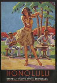 1930 Menu | 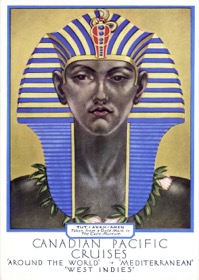 1931 Menu | 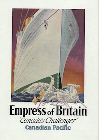 1932 Menu |
 1932 Menu | 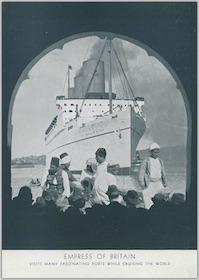 1936 Menu | 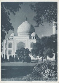 1936 Menu |
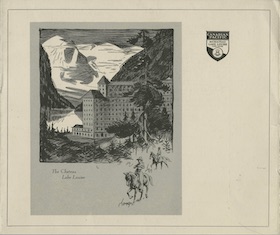
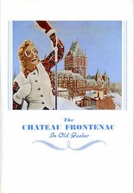
The Charcoal Series
Possibly due to the Depression, in the early 1930s CP issued a number of menus that were printed just in black, rather than the multiple colors found on many of its 1920s menus. Most of these menus featured an illustration done in charcoal or pencil.
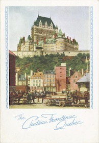
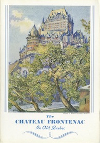
Over the decade, the exact design of the menu covers varied from time to time. For example, a square drawing of the Empress of Britain appeared on a menu with a horizontal fold and another menu with a vertical fold. A drawing of the Chateau Frontenac appears on menus with three different additional decorations.
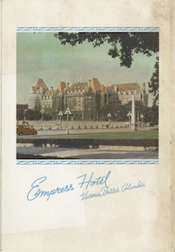
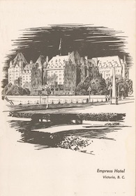
I am missing a menu showing the Empress Hotel. The last menu shown here is an engraving by W.J. Phillips rather than a drawing and probably doesn’t really belong in this series.
 1930 Menu | 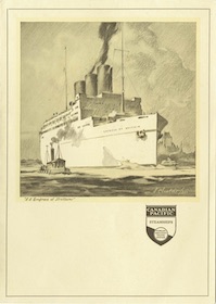 1930 Menu | 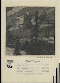 1930 Menu |
 1930 Menu | 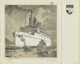 1930 Menu | 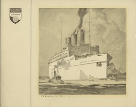 1931 Menu |
 1935 Menu |  1935 Menu |  1935 Menu |
 1936 Menu | 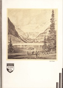 1936 Menu | 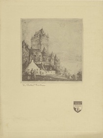 1937 Menu |
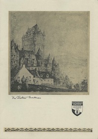 1937 Menu | 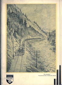 1940 Menu | 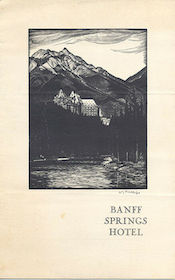 Missing |
 Missing |
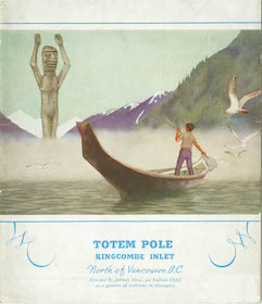
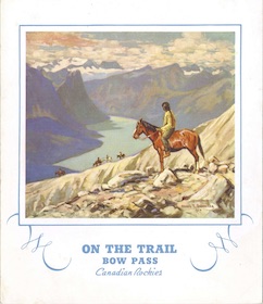
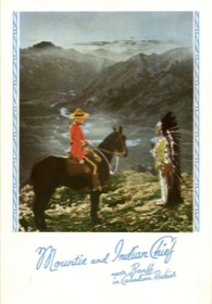
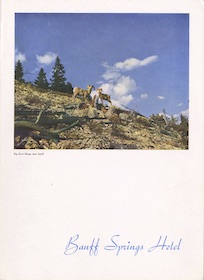
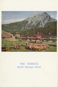
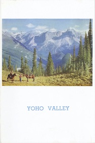
The Full Page Series
This is a catch-all category of menus with full-color covers, most issued in the 1930s and 1940s. Some of these cover illustrations bled to the edges of the paper instead of being bound inside a white border. Others had unusual designs that didn’t fit into another series. There may be several distinct series here. For example, the bottom three menus that each have a photo caption in a little banner clearly belong together. Some of the others such as the Trail Riders menu may be just one-offs.
 1925 Menu | 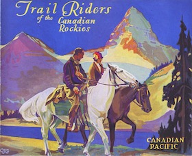 1929 Menu | 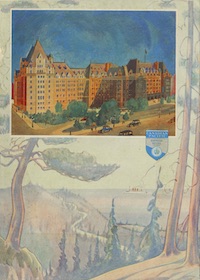 1930 Menu |
 1931 Menu | 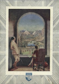 1934 Menu |  1935 Menu |
 1935 Menu | 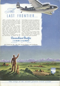 1944 Menu | 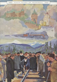 1945 Menu |
 1950 Menu | 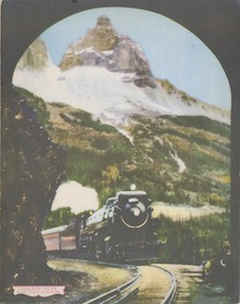 1952 Menu | 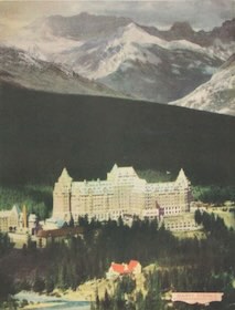 Missing |
The Black and White Series
Again, perhaps because of the Depression, CP issued a number of menus in the 1930s with black-and-white photographs on their covers, thus reducing printing costs from full-color paintings.
 1934 Menu |  1934 Menu | 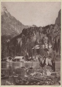 1934 Menu |
 1934 Menu | 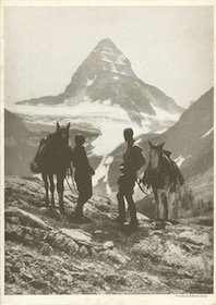 1935 Menu |  1935 Menu |
 1935 Menu |  1936 Menu |  1936 Menu |
 1936 Menu | 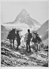 Missing | 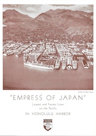 Missing |
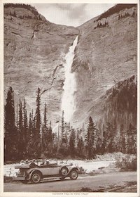 Missing |
The Embossed Series
These two menus are printed on very fine paper that is folded twice, instead of just once, making them seem even higher in quality. This quality is underscored by having the cover images embossed into the paper. As far as I know, these are the only two menus in this series.
 1937 Menu | 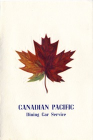 1940 Menu |
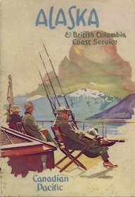
The Script Box Series
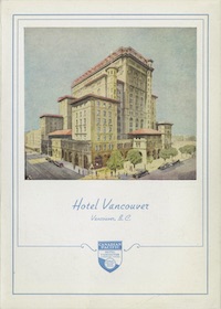
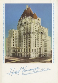
These menus, which were used on Alaska steamships, are distinguished by text in a script typeface and by a cyan-colored box around the image. The menus aren’t dated, but they would have be from before 1939, when the Hotel Vancouver shown on one of the covers was replaced by a newer hotel. I suspect they are from before 1938, when CP replaced the box around the image with either vertical or horizontal lines.
 1935 Menu | 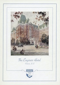 1935 Menu |  Missing |
The Bodoni Box Series
Like the previous series, these menus have a box around the image but the text is in a Bodoni typeface rather than script. Other design variations include the filagree at the lower corners instead of the Canadian Pacific logo at the bottom of some of the previous menus. These menus were apparently first issued in 1936.
 1937 Menu |  1937 Menu | 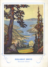 1937 Menu |
 1937 Menu | 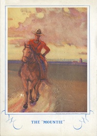 1940 Menu | 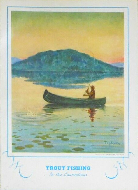 1936 missing menu |
The Trifold Series
These menus have the same cover treatment as the previous series but the menu pages are square and the menu is a trifold instead of a bifold. Note that all the ones I have are dated 1937. They were all also used in dining car service.
 1937 Menu | 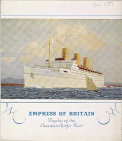 1937 Menu | 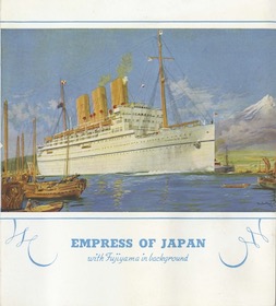 1937 Menu |
 1937 Menu |
The Script Series
This is like the Script Box series but the cyan-colored box is replaced by some vertical lines on either side of the image if it is portrait-style, and usually horizontal lines above and below the image if it is landscape-style. The lines usually have some little circles in them that appear Art Nouveau-inspired, but sometimes are just plain lines.
The Bodoni Series
This is like the Script series but replaces the script typeface with a serifed typeface, usually in the Bodoni font. The lines are usually just plain lines but occasionally are in the Art Nouveau style. CP’s Atlantic steamships continued to use Bodoni long after the dining cars had progressed to a more modern typeface.
 1940 Menu |  1940 Menu |  1941 Menu |
 1941 Menu | 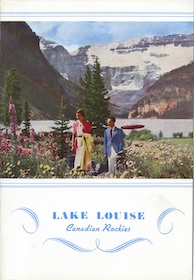 1942 Menu | 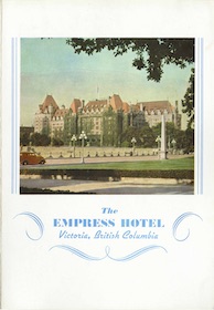 1942 Menu |
 1944 Menu |  1944 Menu | 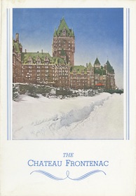 1946 Menu |
 1947 Menu |  1947 Menu |  1946 Menu |
 1951 Menu | 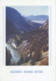 1954 Menu | 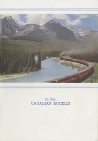 1955 Menu |
 1957 Menu | 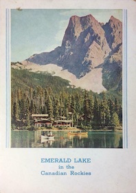 Missing |
Some menus use both serifed and script fonts, and I tried to assign them to whichever was dominant. CP often used the same images on menus with different font and line styles, making them difficult to classify.
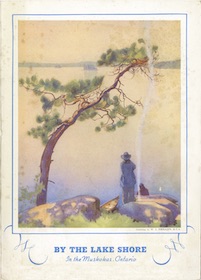
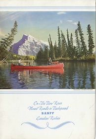
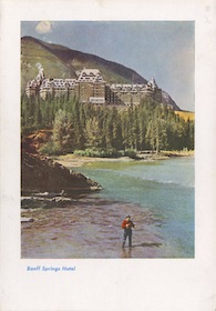
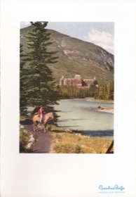
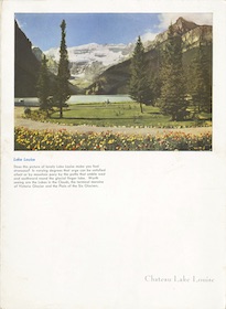
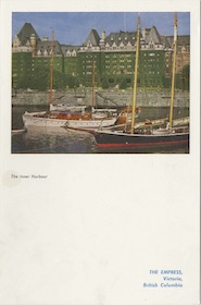
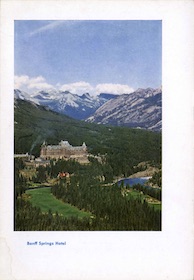
The Center Portrait Series
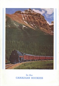
After World War II, Canadian Pacific mostly dropped the fancy fonts and decorative boxes and lines and just put photos on the menu covers, usually with a brief label or logo. Although I didn’t distinguish between portrait and landscape images in the pre-war menus, this distinction is more apparent in the post-war menus because of how the photos are placed on the page.
The portrait menus shown here have images placed horizontally in the center of the menu, while others shown below have images placed in the upper left corner of the menu and two are in the upper right corner. The landscape images, however, are nearly all placed in the horizontal centers, but are given several different vertical placements.
 1947 Menu | 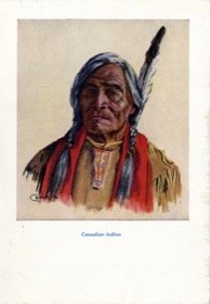 1947 Menu |  1947 Menu |
 1952 Menu | 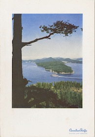 1952 Menu | 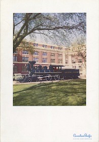 1952 Menu |
 1952 Menu | 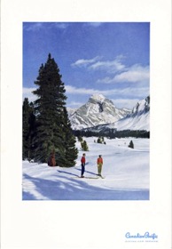 1954 Menu | 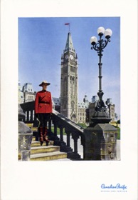 1954 Menu |
 1957 Menu | 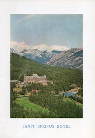 1957 Menu | 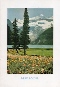 1957 Menu |
 1957 Menu | 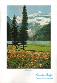 1963 Menu |
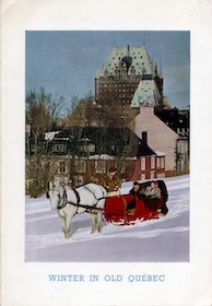
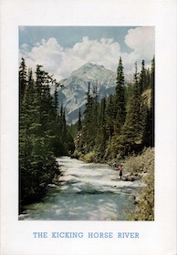
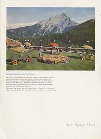
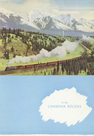
The Top Border Series
This group of postwar menus with landscape images on the top half of the front cover could be split into more than one series as some of them have broad borders above and to either side of the images while others have narrow borders. Unlike the Portrait series, some of these use the white space for lengthy photo captions.
One menu has two strangely unrelated photos on the cover, but I included it because it otherwise fits the definition of having a photo on the top half surrounded by a border. Some in this series are also slightly larger than dining car menus and were used in hotels.
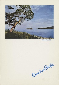
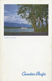
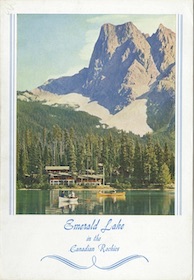
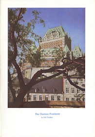
The Top White Series
The landscape images on the top half of these menu covers have no borders above or on either side of the images. Some of them use photographs that are also in the Top Border series.
 1948 Menu |  1951 Menu | 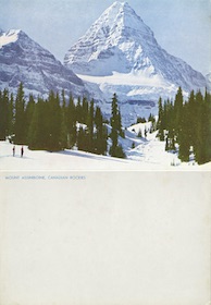 1951 Menu |
 1954 Menu | 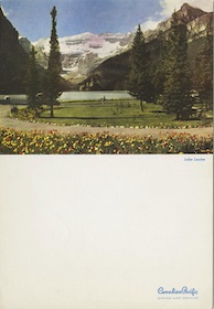 1954 Menu | 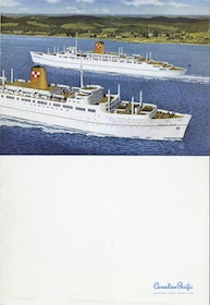 1958 Menu |
 1970 Menu |  Missing |
The Upper-Left Border Series
The portrait images on these menus are placed in the upper left of the menu cover, usually with a border, though the thickness of the border varies.
 1949 Menu |  1949 Menu | 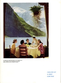 1949 Menu |
 1949 Menu | 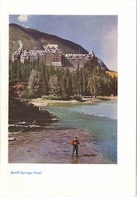 1951 Menu |  1953 Menu |
 1953 Menu |  1954 Menu |  1955 Menu |
 1957 Menu |  1963 Menu |
The Top Color Series
In about 1948, Canadian Pacific began printing some menus with a colored background instead of plain white. The colors were usually blue, yellow, red, or pink, but a few are grey. The colored area was sometimes decorated with a flag (which seemed to denote a steamship menu) or a white splotch containing some text.
 1948 Menu |  1948 Menu |  1948 Menu |
 1948 Menu | 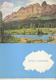 1948 Menu | 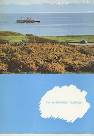 1948 Menu |
 1948 Menu |  1948 Menu | 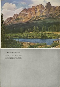 1948 Menu |
 1949 Menu | 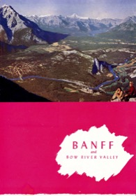 1950 Menu | 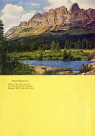 1950 Menu |
 1951 Menu |
The Upper Left Color Series
The portrait-style editions of the color menus included at least one green one. Although the colored backgrounds add flair to the menus, for some reason CP appears to have stopped using color backgrounds on its dining car menus in about 1951. It continued to use them for some of its steamship menus at least as late as 1954.
 1949 Menu |  1949 Menu | 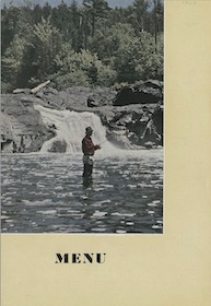 1949 Menu |
 1949 Menu | 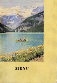 1949 Menu | 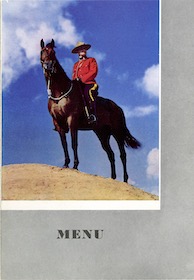 1949 Menu |
 1950 Menu |  1950 Menu |  1950 Menu |
 1951 Menu | 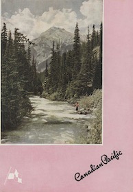 1952 Menu |  Missing |
The Upper Right Series
As near as I can tell, CP only issued two menus with portrait images in the upper-right hand corner of the cover. One had a white background and one was colored.
 1950 Menu |  1955 Menu |
The Top Band Series
Instead of printing the image with a full bleed to the top and sides, or a similarly sized border on top and side, CP issued some menus that included a broad white band on top and either no or very narrow borders on the sides. It’s not easy to place a landscape-sized image on a portrait-sized page, but of Canadian Pacific’s various efforts this is probably the least-aesthetically pleasing way to do it.
 1954 Menu | 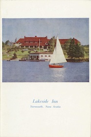 1954 Menu |  1954 Menu |
 1954 Menu | 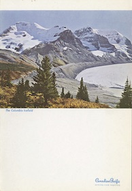 1955 Menu | 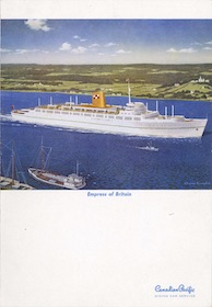 1956 Menu |
 1954 Menu | 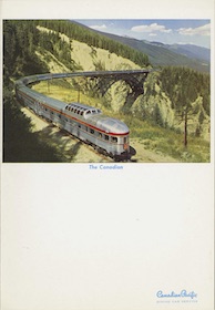 1956 Menu | 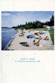 1956 Menu |
 1956 Menu | 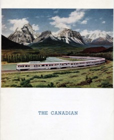 1957 Menu | 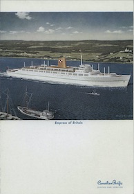 1957 Menu |
 1959 Menu |
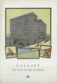
The Woodcut Series
In the early 1950s, CP issued a few menus reminiscent of the Charcoal Series, with a monotone image on the cover that is probably a woodcut rather than a drawing. The first two shown here are by the same unidentified artist; I suspect there are more by the same artist but haven’t seen any.
The third one really isn’t in the same series. While I’ve seen the other two marked for both dining cars and steamships, the third one is for Calgary’s Palliser Hotel.
 1950 Menu |  1950 Menu |  1950 Menu |
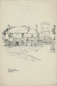
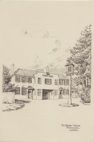
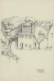
The English Inn & Pub Series
These menus used on Canadian Pacific steamships to Great Britain feature unsigned sketches of an English inns and pubs. All are from the Chung collection and are dated 1953.
 1953 Menu | 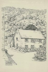 1953 Menu |  1953 Menu |
 1953 Menu | 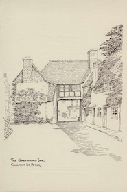 1953 Menu | 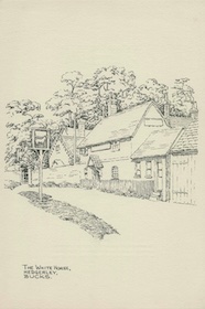 1953 Menu |
 1953 Menu |
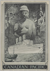
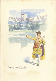
The Palace Series
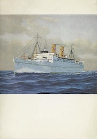
Most of the steamship menus shown above were also used, or at least were similar to ones used, on Canadian Pacific dining cars. But CP issued several series of Empress menus that were only used on trans-Atlantic steamships. Most of them were printed in England and showed scenes from Britain or Europe.
In 1953, or possibly before, CP issued several menus showing palaces, mostly ones that were still actively used by the royal family. This was probably due to the glamour of the recent coronation of Queen Elizabeth II. Other Empress series menus, some of which are presented below, show British artists, historical figures with various imposing structures, and nautical items.
 1953 Menu | 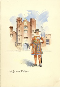 1953 Menu | 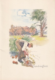 1953 Menu |
 1954 Menu | 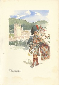 1954 Menu | 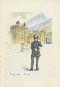 1954 Menu |
The Artists Series
These Empress menus featured famous writers or artists of Great Britain. The ones I have are dated 1957 or 1961, but they could have been issued a few years before and/or after that.
 1957 Menu |  1957 Menu |  1957 Menu |
 1961 Menu |
The Historical Series
Each of these menus feature a historic personage standing in front of a historic building that is somehow related to them, although the relationship is often remote. All the ones I have are from 1961, but as with the previous series they may have been issued in earlier and/or later years.
 1961 Menu | 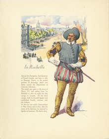 1961 Menu | 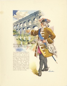 1961 Menu |
 1961 Menu | 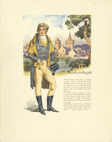 1961 Menu |
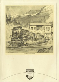
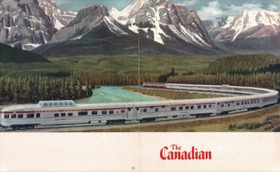
The Canadian Series
Canadian Pacific issued these menus to support its new stainless steel domeliner, the Canadian, as well as the Dominion. The first one, by an unidentified illustrator, was issued in 1954 before the train began operating. The later ones, with the painting by Chesley Bonestell, differ in how the painting is cropped on the pages. The nicest one is the first 1956 menu, but even that menu crops the tops out of the mountains; other images show the mountain tops were in Bonestell’s original painting.
 1954 Menu |  1956 Menu |  1956 Menu |
 1958 Menu | 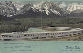 1959 Menu | 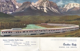 1961 Menu |
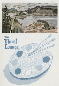
The Mural Lounge Series
Canadian Pacific’s order for stainless steel cars from Budd included eighteen observation cars named after national or provincial parks, each of which was decorated on the interior with unique murals by famous Canadian artists depicting those parks. Although there were eighteen different cars with murals, as far as I can tell Canadian Pacific put only two of the murals on the covers of the beverage menus used in these lounge cars. The two covers show murals of Quebec’s Laurentide Provincial Park, by Albert Edward Cloutier, and Kootenay National Park, by George Douglas Pepper.
 1959 Menu | 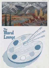 1962 Menu |
The Skyline Car Series
Coach passengers could go to the Skyline car, which had a dome above and café below. As far as I know, these are the only two covers used for menus for the Skyline café.
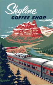 1964 Menu | 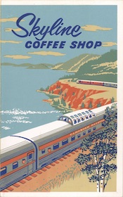 1970 Menu |