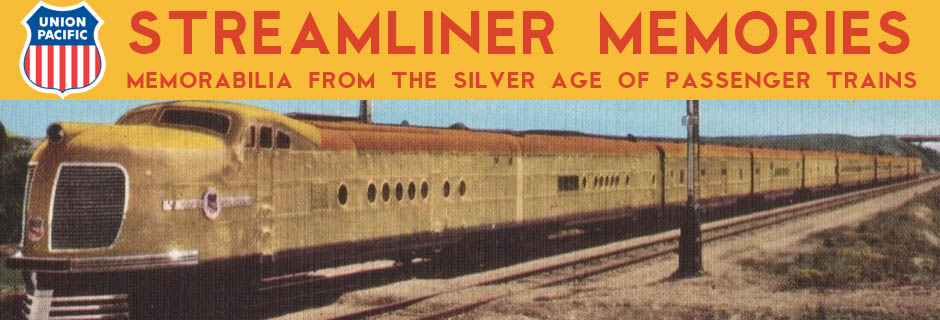
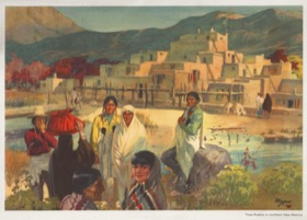
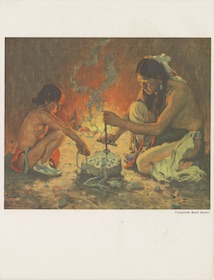
Before World War II, Santa Fe menus were pretty plain, often displaying nothing on the cover but the railroad or train logo and name of the train. After the war, the railroad drew upon its huge collection of artworks, mostly painted by artists in the Taos colony, for its menu covers.
If you know of any menus or entire menu series that aren’t included below, please let me know. If you have such a menu or menus and a scanner, please send me scans. Thanks.
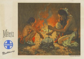
Horizontal Fold Series
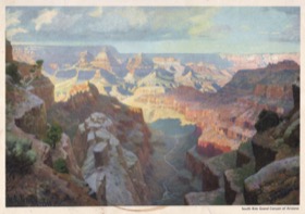
Most Santa Fe artworks had a landscape orientation that could fit or could be cropped to fit into approximately 5-3/4″x8-1/4″ space. These paintings were printed on menus that had a horizontal fold. The interiors were printed so that, when the menus opened up, they didn’t have to be rotated to read. The front cover was slightly smaller than the back cover, allowing the name of the train on the bottom of page 3 to be visible when it was folded.
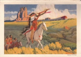
Many of the paintings used in this series, such as one of Navaho Indians looking at a distant steam train, were decades old. Others, such as the streamliner passing in front of Red Cliffs in New Mexico, appear to have been recently commissioned. As near as I can tell, I have all of the menus in this series, but two are blank below until I post the menus in November.
Santa Fe used strange date codes on these menus that read something like “X-Y-Z.” I’ve assumed “X” is the month and “Y” the day, which would make “Z” the year, but is it in the 1950s or 1960s? Meals priced around $2 probably would mean early 1950s while meals priced around $3 to $4 probably would mean early 1960s. Or maybe it isn’t a date code at all. In any case, some or all of my dates may be in error.
 1950 Menu | 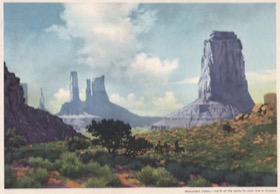 1950 Menu |  1950 Menu |
 1950 Menu | 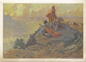 1951 Menu | 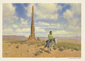 1952 Menu |
 1953 Menu | 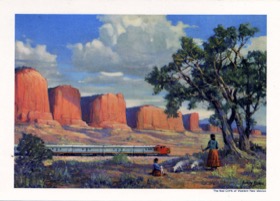 1956 Menu |  1961 Menu |
 1961 Menu |  1963 Menu |
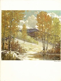
Vertical Fold Series
At some point, probably around 1960, Santa Fe decided to fold most menus vertically. This allowed taller artworks to fill the width of the page but still left a lot of white space. As far as I know, I have all of the menus in this series.
1962 Menu | 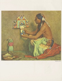 1962 Menu | 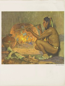 1962 Menu |
 1962 Menu | 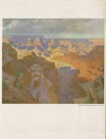 1962 Menu | 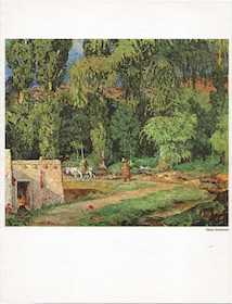 1965 Menu |
 1970 Menu | 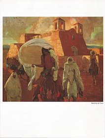 1970 Menu |
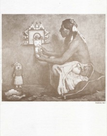
Vertical Fold Sepia-Tone Series
These menus were formatted the same as the Vertical Fold series but the paintings were reproduced in sepia tone rather than in full color. These menus were apparently used only on the Texas Chief. As far as I can tell, only the four Indian craftsmen paintings by E.I. Crouse were used in this series; there were four such paintings so I may be missing one.
 1961 Menu | 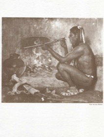 1961 Menu | 1961 Menu |
Horizontal Fold with Logo Series
Based on the dates on these menus, after Santa Fe switched to a vertical fold for most of its menus, it went back to a horizontal fold for a few, but used the same images that were on vertical fold menus. This left some room on the menu that Santa Fe filled with its logo. I only have two of these but all four of Crouse’s Indian craftsman paintings were used in this format, and there may be others as well.
 1965 Menu | 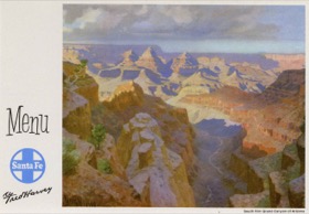 1966 Menu | 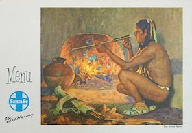 Missing |
 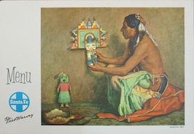 Missing |