This menu has exactly the same cover, front and back, as was used on a 16-page booklet from the Chung collection about the hotel. Strangely, there’s nothing on the front or back of either cover to indicate whether they are hiding a menu, an advertisement for the hotel, or simply promotional literature for the entire railway.
 Click image to download a 1.3-MB PDF of this menu.
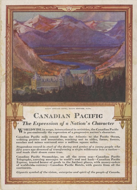
Issued only six years after government-owned Canadian National had absorbed the Grand Trunk Railway, the condescending tone of the cover text has to be viewed as a way of getting customers to think that Canadian Pacific, not Canadian National, was the true “people’s railway.” Never mind the tiny handful of people behind the curtain who got superrich from the railway; Canadian Pacific should be thought of as a “gigantic symbol of the vision, enterprise and spirit of the people of Canada.”
The painting on the cover doesn’t have a signature, but another brochure in the Chung collection indicates it was by “L. Richmond.” This refers to Leonard Richmond (1889-1965), a British artist who was commissioned by Canadian Pacific in 1925 to make posters advertising its trains and hotels.