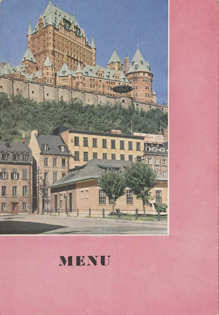
As this one illustrates, Canadian Pacific’s postwar menus differed in several way from the prewar versions. While the subject matter was often the same, the postwar menus used real color photographs printed using the four-color process. The photos were positioned in a variety of ways, and not always centered as they were in the prewar era.
 Click image to download a 1.1-MB PDF of this menu.
In this case, the photo is in the upper left corner with no borders around the top or left side. Other than a small white border on the bottom and right side of the photo, the rest of the cover is printed with a pinkish color that I suspect is magenta. Other menus in this series are printed in yellow or cyan — in other words, each uses one of the primary colors of the CYMK (cyan-yellow-magenta-black) printing process.
I’ve wondered before why early Canadian Pacific color printing often used cyan, magenta, or yellow as highlight colors. I suspect it is because Canadian Pacific’s marketing department failed to understand that, with the CYMK process, they could use almost any color they wanted. Instead, being used to “process colors” in the black-and-white era, they probably thought they could only use CYM or they would have to pay extra for another process color.
Although this is a dinner menu, the table d’hôte entrées are limited to baked ham, stuffed tomatoes with bacon, a mushroom omelet, or assorted cold cuts, each of which are $2.00 (about US$16.60 today). But, like a menu shown here a couple of weeks ago, this one has an insert for a $1.75 “Pacific Sea Food Dinner” glued over the a la carte page. Since the a la carte pages on these menus are pretty similar, I didn’t try to detach it to scan the items underneath.
