
We’ve seen this photograph before in the upper left of the cover on a 1949 menu for the Chateau Lake Louise. Here the photograph is in the center of the cover, and the caption is in the Bodoni type face. As I noted yesterday, Bodoni was used for captions on Canadian Pacific menus in the 1940s, but by the 1950s its use on dining car and hotel menus had given way to a more modern, sans serif type face.
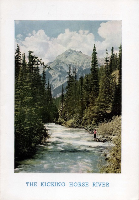 Click image to download a 1.6-MB PDF of this menu.
The steamship menus continued to use Bodoni for a few more years. This menu, like yesterday’s, was used aboard a trans-Atlantic steamship, this time the Empress of Britain. The menu is dated June 8. According to CP’s April, 1957 timetables (available from the Chung collection), the Empress left Liverpool on June 7 with an arrival in Montreal scheduled for June 14, so this would have been the second day out.
I’ve never been on a cruise ship, much less a trans-Atlantic ocean liner, and I always find these menus to be hard to interpret. This one is easier than most as the left side has two suggested meals and the right side is broken down into 15 different categories of food, from juices to cheeses. There are nine hors d’oeuvres, three soups, two fish, seven salads, and six desserts plus three flavors of ice cream. Entrées are listed in three categories: entrees (lamb, tripe, and frankfurters), joint (a boiled New England dinner), and grill (steak, frog legs, and sausage). How did people manage not to gain 20 pounds on these trips?
Unlike our distinguished author, I have experienced some crossings and cruises. This menu today would probably start a revolt by passengers. Let me explain why? In the era of this menu, most ate a full breakfast, followed by bullion on deck at 11, lunch at one and dinner at 7 or 8. Most of the food was incredibly heavy, full of butter, cream etc. Not saying it was not good, but life expectancy was quite a bit shorter then. This “foraging” may have contributed to that earlier demise.
I’m a bit late to reply, but the typeface on the cover and the last page appears to be Rockwell: https://en.wikipedia.org/wiki/Rockwell_(typeface)
…Rather than Bodoni. Rockwell is distinctive, in that all lines are of equal thickness. It was released in 1934 but enjoyed a renaissance many years later in the 80s, being used (for example) for Expo ’86 in Vancouver, as well as on the Docklands Light Railway in London (opened in 1987).