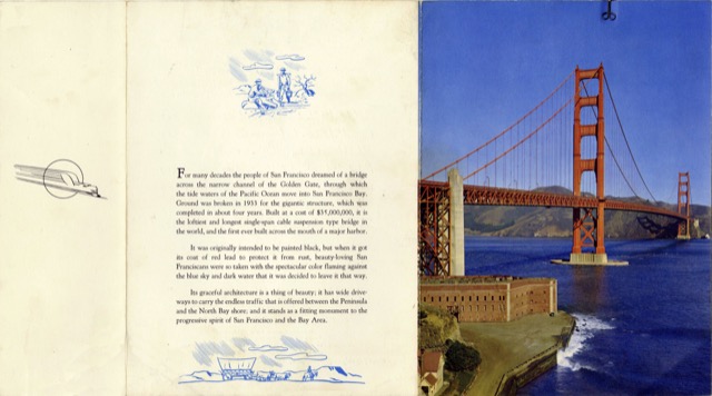
In keeping with a design change that was instituted in 1958 or earlier for Union Pacific’s dome-diners, this menu has a photo that fills the front cover but doesn’t wrap around to the back, there is an extra flap that tells the name of the train on one side and has a logo on the other, and the menu itself is table d’hôte only, with no a la carte section. The City of San Francisco didn’t have a dome-diner, but it apparently sometimes used this format anyway.
Click image to download a 1.8-MB PDF of this menu.
On City of Portland and City of Los Angeles menus, the logo on the flap is the Union Pacific shield. But in this case, as a concession to the Southern Pacific, the winged streamliner logo was substituted, even though that was also strongly identified with Union Pacific. Nothing else on the menu mentions any of the three railroads that operated the train.
The nicely saturated photo is one we haven’t seen before on a menu cover. Notice it was taken from an angle that emphasizes the verticality of the bridge towers, rather than the horizontality of the bridge deck. This aptly fits with the portrait mode of the photo.