Union Pacific April 1950 Timetable

We’ve previously seen a January 1950 timetable, so I wouldn’t expect too many changes in this one. There were some changes in times.

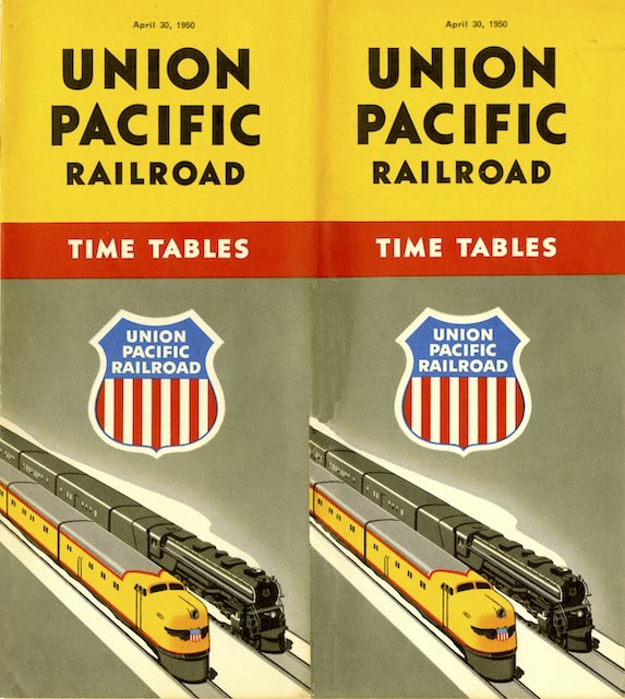
Click image to download a 29.1-MB PDF of this 44-page timetable.

The City of San Francisco left Chicago 30 minutes earlier at 7:00 pm instead of 7:30. The City of Portland left Chicago at 6:15 pm instead of 6:30. The Gold Coast left Chicago at 10:00 pm instead of 8:10 pm. The City of Denver and City of Los Angeles times didn’t change nor did any of the eastbound trains change. There may have been some other minor changes but I didn’t find any.

The Copper King in 1938

I once downloaded scans of this booklet from the Smithsonian‘s web site, but the scans were missing two pages. I posted a PDF of those scans here anyway, but I’ve now acquired a copy of my own. Of course, the two missing pages were blank, but it is nice to have a complete copy.


Click image to download a 3.2-MB PDF of this 28-page booklet.

As I noted before, the Copper King was originally a baggage car built for the first City of San Francisco. As Union Pacific expanded its streamliner fleet, it converted the baggage car into an observation car for the City of Los Angeles, and it first entered service in July of 1938. Later it saw use on the City of Portland and City of Denver before being scrapped in 1958. Continue reading

1937 Summer Tours Flip Book

We’ve previously seen a booklet like this one dated 1940. Both booklets are summaries of the complete tour booklets, in this case the 1937 summer tours guide. Each page in these little booklets flips up to describe one or two of the tours.

Click image to download a 19.3-MB PDF of this 52-page booklet.

For some reason, the 1940 flip book used the same image on its cover as the previous year’s tour guide book but this one uses the same cover as the 1937 guide. Both booklets invite readers to write the “Department of Tours” for the full tour booklets. Continue reading

The Portland Limited

Unlike the Overland Limited, the Portland Limited wasn’t an all-Pullman train, but this booklet is just as elaborate as yesterday’s. It uses the same typefaces, many of the same drawings, and the floor plans on page 15 show that the two trains shared nearly identical observation cars. However, the Overland Limited had a club car at the front of the train that wasn’t found on the Portland Limited.

Click image to download a 1.4-MB PDF of this 20-page booklet.

The front cover of this booklet has less filagree than yesterday’s, but it does have a logo that hints at the grandeur of the Columbia River Gorge. Both the logo and the color are identical to a blotter we’ve seen advertising this train. Continue reading

The Overland Limited in 1930

From the mid-1920s through the mid-1950s, Union Pacific published little booklets like this one advertising many of its named trains. This is the first one I’ve obtained for the Overland Limited, one of its two most exclusive (meaning all-Pullman) trains. The elaborate cover is similar to the booklet published for the Los Angeles Limited, the other exclusive train.

Click image to download a 1.7-MB PDF of this 20-page booklet.

The booklet is filled with simple drawings of people enjoying the interiors of the lounge, dining, and other cars aboard the train. While even-numbered pages are headed “Overland Limited,” odd-numbered pages are headed “Finest & Fastest,” which is the sort of repetition I criticized yesterday. Floor plans of the club car, observation car, and a Pullman car are on page 15. Continue reading

Over the Overland Route to California

Although it appears to have been issued a couple of years later, this is a companion booklet to the 1914 Columbia River Route booklet shown here two days ago. Like the Columbia booklet, this one is 36 pages long and has half a front cover that, when closed, leaves half the title page exposed. Also like the Columbia booklet, the booklet’s name is on the back cover (the left and center panels shown below) while the front cover just has an image and UP logo and motto but no booklet name.

Click image to download an 13.0-MB PDF of this 36-page booklet. Click here to download a PDF of the full cover of this booklet.

Unlike the Columba River Route booklet, this one has no color photographs. The images on the cover are paintings, not photos, and the inside has numerous photos but they are all black-and-white. The centerfold map is also black and white (with red highlights) rather than the colors used in the Columbia booklet. My guess is that the UP decided that the process of hand coloring black-and-white photos, making four-color separations of those photos, and carefully printing them so that the colors all aligned correctly was too time consuming or too expensive to use in booklets after the one from 1914. Continue reading

The Pacific Northwest and Alaska

Through 40 photographs and a dozen pages of about 400 words of text each, this 52-page booklet introduces eastern readers to the Pacific Northwest. For Union Pacific, “Pacific Northwest” meant the Columbia River Gorge, Portland, Mount Hood, the Puget Sound, Mount Rainier, and Spokane. Seven of the photos and three of the text pages are on Alaska, which was not enough to do justice to the nation’s largest territory but was probably thought to be enough to entice people to read the booklet.


Click image to download a 19.3-MB PDF of this 52-page booklet.

Nearly half the photographs are of the Columbia River and the then-new Columbia River Highway. Many of these photos are marked “© Weister Co. Portland, Ore.” Weister was George Weister (1862-1922), who began his photography career in 1888 and started the company that bore his name in 1895. But these photos were taken by Arthur Prentiss (1865-1941), who worked for Weister from 1913 to 1917, then started his own studio and bought Weister’s collection of photos (including ones Prentiss had taken) after the latter’s death. Continue reading

The Scenic Columbia River Route

This gorgeous booklet has an unusual but not unique design. Though it is the standard 8″x9″ format used for many railroad booklets and timetables, the front cover is only about 4 inches wide, leaving half of the title page exposed. When I saw this on a 1923 Union Pacific booklet, I thought at first someone had cut off half the cover.

Click image to download an 21.6-MB PDF of this 36-page booklet. Click here to download a 2.7-MB PDF of the full cover of this booklet.

I’ve since seen the same design on Canadian National booklets from 1922, 1924, and 1925. I’m not sure what the point of it is but maybe marketers thought exposing part of title page would make it more inviting. Continue reading

A Los Angeles Limited Romance

Today, we have a real treat: a romantic novel (or, really, short story) written to promote Union Pacific’s Los Angeles Limited. We’ve previously seen an 1889 brochure that told a fictional story of a romance in wonderland to advertise Northern Pacific trains. Today’s item is a hardbound book that tells a story of a romance on board the Los Angeles Limited.

Click image to download a 4.9-MB PDF of this 38-page booklet.

In the story, a 23-year-old “Boy” (the capitals are in the story) falls for a 22-year-old “Girl” on a trip from Chicago to Los Angeles. Sadly for him, he discovers near the end of the trip that she is married and has a baby daughter. The story concludes with him asking her to raise the baby to be “as nearly like you as possible” because “I’m going to wait for her.” This may have sounded romantic when this was published but today would be considered creepy. Continue reading

California Sights and Scenes

Today is the twelfth anniversary of Streamliner Memories, and I’ve often used this date to show Union Pacific menus that I’ve collected in the past year. As it happens, I haven’t found a previously unseen UP color photo menu in more than two years, which suggests I have them almost all of them except the Moderne version of a Mount Rainier menu. Instead, I will begin presenting some Union Pacific booklets and timetables.

Click image to download a 15.1-MB PDF of this 36-page booklet plus fold-out map from the David Rumsey collection.

Despite the name, this booklet is mostly text. The “sights and scenes” it contains consist of ten engravings, mostly of San Francisco and Yosemite Valley. One of the engravings is credited to Rand McNally; another one to the Photo Electric Engraving Co., New York. The rest are uncredited. Continue reading