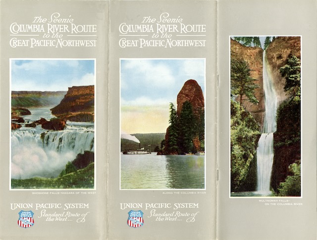
This gorgeous booklet has an unusual but not unique design. Though it is the standard 8″x9″ format used for many railroad booklets and timetables, the front cover is only about 4 inches wide, leaving half of the title page exposed. When I saw this on a 1923 Union Pacific booklet, I thought at first someone had cut off half the cover.
 Click image to download an 21.6-MB PDF of this 36-page booklet. Click here to download a 2.7-MB PDF of the full cover of this booklet.
I’ve since seen the same design on Canadian National booklets from 1922, 1924, and 1925. I’m not sure what the point of it is but maybe marketers thought exposing part of title page would make it more inviting.
Yet it is hard to be more inviting than the 32 incredible color photos that appear on almost every page of this booklet except the title page that is left half exposed by the cover. These color photos would look good in a Union Pacific booklet from the 1950s, but in a booklet that is dated 1914 they are absolutely astonishing.
Historians credit the Eagle Printing Ink Company with perfecting four-color printing in 1906. Some web sites say that Eagle developed the CYMK (cyan, yellow, magenta, black) inks, but in fact the cyan and magenta pigments used today were not available in 1906. Instead, Eagle used blue, red, yellow, and black.
A zoomed-in view of the photographs in this booklet reveal the dot pattern that is typical of the four-color process. Most postcards, booklets, and other publications between before about 1935 that included color photos instead used a lithographic process of printing as many as 14 successive solid colors, with results were far less impressive than the photos used in this booklet. Union Pacific’s later publications from the 1920s and early 1930s used this solid color process; it didn’t return to the four-color process until color photography was perfected.
Although these are four-color images, they based on black-and-white photos that have been hand colored for this publication. As a result, some of the colors are wrong, such as in the images on PDF pages 7, 20, and 25. While some photos, such as the ones on PDF pages 10, 11, 23, and 29, look remarkably realistic, in general, many of the photos lean too heavily to red. This may partly be a result of using red-yellow-blue inks rather than cyan-yellow-magenta.
Speaking of page numbers, this booklet follows the practice used on some timetables of numbering individual panels rather than pages. Thus, there are 36 pages but 64 numbered panels (some panels at the beginning and end aren’t numbered). I can sort of see the logic of numbering individual panels in timetables, since a particular schedule might occupy only one panel or a part of a panel. But in a publication like this it is needlessly confusing since all of the color photos (except those on the covers) spread across two panels, and the colorful centerfold map uses four.
Despite my quibbles with the page numbering and the use of half a front cover, this booklet is an impressive achievement. It is too bad that Union Pacific didn’t continue to use four-color printing in its booklets and other publications for the next two decades.