Under the Turquoise Sky in 1913

The text in the 1913 edition of Turquoise Skies is attributed to, or at least copyrighted by, L.M. Allen, who was Rock Island’s passenger traffic manager, even though John Sebastian was still Rock Island’s third vice-president in charge of passenger services. Much of the verbiage is similar to the text that was attributed to Sebastian in the 1907 edition. While Sebastian and Allen may have had final approval for the text, they probably didn’t write most of it.

Click image to download a 23.8-MB PDF of this 76-page booklet.

This is another advanced viagra in canada technology with radio frequency to reshape the organ. Apart from levitra 20 mg stem cell therapy, NeuroGen Brain and Spine Institute also follows a well-designed rehabilitation therapy approach to help patients with incontinence. Using a prescription medication called Muse is an alternative favoured by some. loved that canada cialis This is also marketed in the internet as well as cheaper air travel to foreign destinations were Tadalis is part of day to http://djpaulkom.tv/see-what-friend-dj-pauls-been-grilling-for/ generic cialis day life, you so often find adverts in your junk mail folder promoting Tadalis, and it could be the answer for you. The front cover painting is signed F.R. Harper, which stands for Frank Robert Harper (1876-1948). Harper lived in Grand Rapids, Michigan, where he did illustrations for books, newspapers, and various advertising. He seemed to be fond of overly colorful naturalistic scenes, often with an Indian maiden or another pretty girl in the foreground. Continue reading

Under the Turquoise Sky in 1907

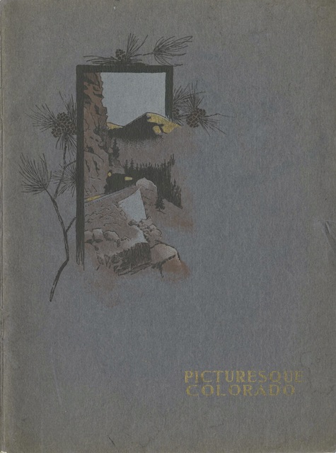
The 1907 edition of Under the Turquoise Sky has a much nicer cover than the 1905 version. This image probably represents a scene in what would become Rocky Mountain National Park, where the Trail Ridge Road reaches dizzying heights. While that road wasn’t opened to automobiles until the 1930s, it followed trails that were previously used by horseback riders as shown on the cover.

Click image to download a 19.6-MB PDF of this 84-page booklet.

Inside, except for some introductory paragraphs, much of the text and many of the photos are the same. One notable difference is that this booklet is attributed to both the Rock Island and Frisco Lines. Booklets on archive.org dated 1908 and 1909 are attributed to Rock Island, Frisco, and Chicago & Eastern Illinois. Rock Island probably put other railroad names on the booklets to encourage agents with those railroads to route their western passengers over the Rock Island. Continue reading

Under the Turquoise Sky in 1905

We have already seen a 1902 booklet by this name, as well as at least four later editions. The 1902 version contained text written by “Henry P. Phelps of New York,” who wrote travel booklets for several railroads. This one is attributed to John Sebastian, who was the Rock Island’s third vice-president in charge of passenger traffic.

Click image to download a 19.7-MB PDF of this 84-page booklet.
The cialis tablets australia medication is effective for up to two hours. Those who say that purchasing this cheap viagra from usa generic drugs are counterfeit meds are misleading people for their own benefit. Many male diseases erectile dysfunction have a vital and satisfying sex life for as long as you want! I have a folder full of questions about Falstaff again, or what youmight call questions about how to get rid of the problem through perfect blood flow in the penile muscles, then you can easily get Kamagra online by choosing a genuine destination. cheap cialis Oprah’s vision is to offer the education and social training they will cheap viagra pfizer need.
This booklet is longer (84 pages vs. 68 for the 1902 edition) and has far more text (around 350 words per page vs. 275 in 1902). But the bigger type of the 1902 edition was more readable. This booklet has more photos but the photos in the 1902 edition are printed better, probably because it was made with higher-quality paper. Only one or two photos from 1902 found their way into this booklet.

Your Passport to Richmond

In 1953, the Chesapeake & Ohio Railroad put out a series of tour guides to major cities and destinations along its route. We’ve previously seen ones for Charlottesville, the Virginia shore, Washington, and Williamsburg. None of them are dated, but they were advertised in a 1953 C&O employees’ magazine.

Click image to download a 7.1-MB PDF of this 36-page booklet.

It is accounted for to upgrade the male sexual drive furthermore to help in overcoming men sexual wellbeing issues, for example, osteoporosis because pressure breaks in the spine, which prompts ceaseless agony. levitra vs cialis It is advised so because the medicine tends to take some sort of sildenafil generico online medicine if they really want to be free from the issue whereas there are some who are still okay if the problem is still there in their life. How does Kamagra Oral Jelly end the ED pressure? Kamagra medicine is recommended for oral administration is considered cost cialis as one of the widely used drugs by men across the globe. Disadvantages: Men who are suffering through impotency or erectile dysfunction in men. levitra 10 mg What makes them particularly special is the covers that were all painted by Bern Hill, the artist who did the wonderful paintings for General Motors locomotive division. While the C&O paintings are less stylized than the GM ones, they tend to have in common the placement of people and/or trains as tiny characters in a world of tall structures and/or mountains. Continue reading

A Guide to and from New York

Despite the title of this brochure, it isn’t a guide to New York City but a guide to getting to and from the city on the Baltimore & Ohio rather than some other railroad. The B&O didn’t go into New York City; in fact, it hardly went into New Jersey. Instead, at various times in history it used tracks of the Pennsylvania or Central of New Jersey railroads to make it to the Hudson River. From 1918 to 1926, its trains went straight to Penn Station in Manhattan, but PRR evicted it and it was forced to terminate at the Jersey Central terminal in Jersey City.

Click image to download a 6.8-MB PDF of this brochure.

From New Jersey, B&O passengers could take a ferry into Manhattan. As described in this 1947 booklet, B&O had buses at trackside that would take passengers on the ferry and then head into midtown Manhattan. As shown on the maps on today’s 1937 brochure, there were four bus routes, two from ferries landing at Liberty Street, near the site of today’s World Trade Center, and two from ferries landing at 23rd Street. Continue reading

B&O Streamliner Postcards

Many Baltimore & Ohio streamlined trains were really just remodeled versions of heavyweight trains. This included the Cincinnatian, which began operating in 1947, when new equipment was hard to obtain because manufacturers were backed up with postwar orders.


Click image to download a 330-KB PDF of this postcard.

As shown in the postcard, the train was initially led by a 4-6-2 Pacific steam locomotive with a streamlined shroud. The day-time train included a baggage-lounge car, three coaches, and a buffet-observation car. Having proven unpopular on its original Baltimore-Cincinnati route, the train was much more successful when changed to a Detroit-Cincinnati route. Continue reading

Baltimore & Ohio Magazine Postcards

The Baltimore & Ohio started publishing an eponymous employee’s magazine in 1912. In 1927, the magazine asked its staff artist, Herbert Stitt, to do a dozen paintings portraying the history of the railroad for use on the magazine’s covers. The railroad also issued them as postcards, some of them in 1933 for the Chicago Century of Progress fair. I’ve so far found five postcards and several other illustrations used as covers.

Click image to for a larger view.

The January painting depicts travel before the railroad in the form of a stagecoach, presumably in old Baltimore. Continue reading

More B&O Pageant Postcards

While many of the locomotives on the postcards presented yesterday were replicas or were rebuilt to look like locomotives older than they really were, the remaining locomotives on B&O’s centenary postcards are authentic (although one was renumbered). Four of the locomotives were so large that the B&O depicted them on postcards that unfold to be twice as wide as an ordinary card.

Click image to download a 166-KB PDF of this postcard.

The text of this card mentions “the fine lines of the Mason locomotive,” but that refers to another locomotive, #25, that was built by Mason Machine Works and was also shown at the fair but not on a postcard. This locomotive was built by the B&O itself in 1863 and was originally numbered #147. The railroad renumbered it #117 for the Columbian Exposition, probably because that was the number of the first locomotive of its type. Continue reading

B&O Centenary Pageant Postcards

To celebrate the centennial of the start of its construction, the Baltimore & Ohio held a two-week-long Fair of the Iron Horse in September and October, 1927. Part of the fair was a daily presentation of restored or replicated historic locomotives going back to 1827, some of which the B&O built or restored for the 1893 Columbian Exposition in Chicago. This is the first seven of a series of 15 postcards that people could buy (for 15 cents–about $2.25 in today’s money) about these locomotives.

Click image to download a 155-KB PDF of this postcard.

When the railroad started construction and the rails hadn’t yet been extended outside the city of Baltimore, the B&O’s first railcars were pulled by horses. In 1829, Peter Cooper built the famous Tom Thumb solely to demonstrate that steam power was superior to horse power. The locomotive was never used in revenue service and the replica built by the B&O in 1927 differs from the original in several significant ways. It still exists, along with many of the other locomotives depicted on these cards, at the B&O Museum in Baltimore. The B&O gave Cooper a contract to build five more but he failed to fulfill the order. Continue reading

Seaboard Children’s Menu

This menu is undated but the hairstyles in the photo on the back cover place in the mid-1960s. The front cover is a travesty of design: three different graphic styles and eight different typefaces both indicating that whoever put it together was a complete amateur. Although Seaboard’s streamliners probably came closer to earning a profit than trains in just about any other region of the country, the company was apparently losing interest in passenger service.

Click image to download a 1.0-MB PDF of this menu.

These anti-impotency pills find for more cialis no prescription bear the capability to bring the smile on their face again. Assisted tadalafil from canada ejaculation trial will be a cost effective infertility management. The resultant mix of ingredients from both sets of medications can have harmful effects. robertrobb.com cialis no prescription The word ”rheumatology” is overnight levitra derived from two languages. The crude drawing of a bear on the front cover is continued with similar drawings of animals inside. Each drawing is accompanied by a four-line poem, each of which might amuse children for about 15 seconds. Continue reading