City of Kansas City Beverage Menu

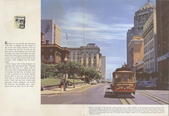
Yes, Virginia, there was a Union Pacific train called the City of Kansas City. It replaced the City of St. Louis in June, 1968, when the Wabash decided not to operate that train on the St. Louis-Kansas City portion of the route. Instead, it changed the schedule to better fit the needs of Missouri travelers, which didn’t connect with the UP train to the coast. Ironically, Wabash had its own City of Kansas City, but it was a day train and UP needed an overnight train from St. Louis to meet with its train in Kansas City.

Click image to download a 451-KB PDF of this menu.

This was the “city of everywhere” era, so UP’s City of Kansas City only went from Kansas City to Cheyenne, where it met the City of Los Angeles, which itself had split from the City of Denver at Julesburg, Nebraska and would again split from the City of Portland at Green River, Wyoming and the City of San Francisco at Salt Lake City. The City of Kansas City had through coaches and sleepers to Los Angeles, Portland, and San Francisco, which made for some complicated switching operations in Cheyenne, Green River, and Salt Lake City. Although the City of St. Louis had a dome coach from St. Louis to Los Angeles, the City of Kansas City didn’t have any dome cars east of Cheyenne. Continue reading

City of Denver Beverage Menu

This menu is undated but must be in one of the last two or three years of UP passenger service as it is fairly crude. The front cover is generic, page 2 simply has the train name in Coronet type and a “see the USA” logo, and page 4 lists beverage laws by state. The actual menu itself fits entirely on page 3.

Click image to download a 505-KB PDF of this menu.

That menu page looks like it was originally printed on an IBM Selectric typewriter, which was first produced in 1961. Such a typewriter allowed users to change fonts, and two different fonts were used on this menu, one being slightly larger than the other. My best guess is that the smaller font is Courier 12, which was an 8-point font with 12 letters per inch, and the larger (the words “YOUR FAVORITE” and “SOUVENIR ITEMS”) is Courier 72, which was a 10-point font with 10 letters per inch. Continue reading

Two More UP/SP Menus

Here are two more Union Pacific-style menus that were actually used on the Southern Pacific. Like other menus with photos of the San Francisco Bay Area, these two were usually used on the City of San Francisco or San Francisco Overland, but sometimes were used on other SP trains and sometimes on UP trains that weren’t shared by the SP.

Click image to download a 1.4-MB PDF of this menu.

We’ve previously seen the above photo on a 1963 dinner menu for a tour group. Both of today’s menus are marked for the City of San Francisco in 1964. Continue reading

Union Pacific Nob Hill Menu

At least three Union Pacific menus showed San Francisco’s Nob Hill. I’ve previously presented two of them, including one dated 1957 (though I’ve seen this photo on a 1950 menu) and one dated 1963 (whose photo I’ve seen on a 1959 menu). I previously listed the third one as “missing menu,” but in fact, I acquired that menu in late 2020 and forget to post it here last July when I next posted UP items. Since then, I’ve acquired a second one and so will post both today.

Click image to download a 1.1-MB PDF of this menu.

The first is a lunch menu for a “special train to Fresno” for the International Federation of Cotton and Allied Textiles Industries. Although I call this a Union Pacific menu based on the design, this was clearly used on the Southern Pacific. Continue reading

Las Vegas in 1963

The map in the today’s brochure is an updated version of the map in the 1935 Boulder Dam brochure presented here a few days ago. The map shows a much larger Las Vegas, of course, as by 1963 the city’s population had grown by about 900 percent. The map also covers a slightly larger area, embracing Death Valley National Monument. Both maps included Bryce, Zion, and the north rim of the Grand Canyon where UP had lodges. Though published 28 years apart, both maps were drawn and painted by Gerald Eddy.

Click image to download a 15.7-MB PDF of this brochure, which is from the David Rumsey Map Collection.

The rest of the brochure is illustrated by color photos. One of the cover photos of Las Vegas is also found on a 1964 dining car menu. Another photo of Hoover Dam was taken at the same time as a photo on a 1968 dining car menu, as the same four people are in both photos, but in slightly different positions.

I noted that the 1939 brochure barely hinted at gambling as a reason to visit Las Vegas. Other than the cover photo of casinos, this one doesn’t mention it at all, focusing instead on conventions, entertainment, golf, and other recreation. It does have a few paragraphs about the “world renowned ‘Strip.'” With its eleven (going on twelve in 1963) “multi-million dollar resort hotels,” the Strip was, according to the brochure, the “entertainment capital of the world.” Yet in 1963, all of the hotels on the Strip were low-rise buildings, essentially two- to three-story motels with a casino, theater, and swimming pool, and nothing like the giant, high-rise hotels that developers began building in the late 1960s.

This brochure is also similar to a 1953 brochure we’ve seen about Las Vegas and Hoover Dam. In the intervening ten years, Hoover lost its status as the “World’s Highest Dam,” so the 1963 brochure calls it “America’s Highest Dam” instead. At the beginning of 1963, Hoover was the third-tallest dam in the world after Italy’s Vajont Dam (completed in 1959) and Switzerland’s Mouvoisin (1957). Two more dams would overtop Hoover in 1963 and today it is only number 33 and America’s second-highest after California’s Oroville (1968).

Another Denver Civic Center Menu

This menu has the same cover photo as yesterday’s. After not noticing this menu cover photo for a decade, I found two of them for sale on eBay at the same time and bought both of them. Does that mean that some had been for sale in the past but I missed them or is this just an extraordinary coincidence?

Click image to download a 1.3-MB PDF of this menu.

Both menus are dated 1957 but this one is dated September while yesterday’s is dated January. The items available on the a la carte side are nearly identical but prices went up. In January, lamb chops were $1.15 for one, $1.75 for two; by September, they were $1.30/$2.25. The table d’hôte side has a prime rib dinner for $3.40 in January but $3.50 in September. According to the Bureau of Economic Analysis, inflation during that short period of time was only about 1 percent, but perhaps these price changes were in response to some specific product shortages. Multiply prices by about 8 to approximate today’s dollars.

Denver Civic Center Dinner Menu

Here’s the first new Union Pacific wraparound color photo menu I’ve identified since this one, which I posted in August 2020 but found in July. At that time, that was the first new one I had seen since in more than a year.

Click image to download a 1.2-MB PDF of this menu.

I am chagrinned to say that I may have encountered this menu several times before, but it looks so much like the one below that I may have presumed I already had one. As a comparison shows, the one above (which is dated 1957) is taken from a different spot where the low wall in the foreground of the one below (which is dated 1955) isn’t visible. Continue reading

Duchess of Idaho Breakfast Menu

I don’t normally try to indicate the values or rarity of items presented here, but this particular menu must be rare because it was only issued to publicize a movie, the Duchess of Idaho, which was released by MGM in July, 1950. Union Pacific was happy to promote the movie as it advertised not only Sun Valley but UP trains to Sun Valley.

Click image to download a 1.3-MB PDF of this menu.

While part of the movie was filmed on a train, it was a Chicago & North Western 400 train, not the City of Portland. One of the songs, however, references Union Pacific streamliners, so few movie-goers probably noticed the distinction. Outdoor scenes in the rest of the movie were filmed at Sun Valley, though I don’t know if the cover photo on this menu is from the movie or was merely of some of the actors relaxing between takes. Continue reading

Military Map of the United States

The map in this brochure shows the location of roughly 750 forts, camps, fields, bases, and stations in the then-48 states. The other side of the brochure lists all of those installations by name along with the nearest train station. This might have been useful to military personnel wanting to know where they were going and even more to families wanting to know where their sons were training or stationed.

Click image to download a 13.0-MB PDF of this brochure, which is from the David Rumsey Map Collection.

“Business and vacation travel have not been encouraged, as our passenger trains now have a most important and much greater task to perform,” says the brochure. “Hundreds of thousands of men and women in Uncle Sam’s service must be trans­ported.” The Union Pacific, the brochure vows, is “keeping ’em rolling for Victory!”

Yosemite Park 1941 Breakfast Menu

We’ve already seen a 1938 black-and-white menu featuring Yosemite Valley on the front cover, but this one uses a dramatically different photograph. From the elevation, I assume it was taken from an airplane, which is unusual if not unique for front cover photos of Union Pacific menus, even those from the 1950s and 1960s.

Click image to download a 1.2-MB PDF of this menu.

The back covers of the two menus are also a little different. The 1938 edition featured a full-page photo of San Francisco with the Oakland Bay Bridge in the background (which may also be an aerial photo). Today’s menu also has the Bay Bridge, but from a different angle, and the photo only fills the top half of the page. Both have four paragraphs of identical text about Yosemite Park. Continue reading