Canadian Pacific’s 1938 world cruise was also its last true round-the-world cruise. It was 128 days long, three days longer than in 1937. Hilo and Havana were still off the itinerary, as in 1937, but the stay in Los Angeles had been extended from one day to two days and one night.
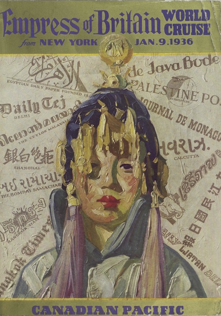
 Click image to view and download a 98.8-MB PDF of this booklet from the University of British Columbia Chung collection, which also has a brief brochure advertising the cruise.
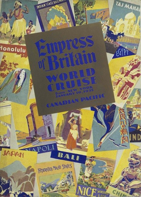
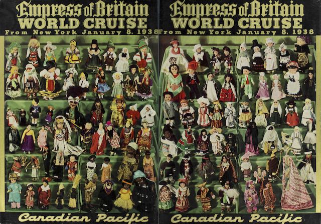
The cover of the booklet advertising the cruise features more than 100 dolls dressed in exotic clothes supposedly reminiscent of the places that would be visited on the cruise. Some of the dolls are dressed in Dutch, German, and Scottish styles even though the cruise didn’t visit those countries. Continue reading