Paintings recently sold by Soulis Auctions reveal that GM proposed several different ideas for painting the E6 used for Illinois Central’s City of Miami, which began operating as an all-coach train in December 1940. In retrospect, I don’t think they picked the best design.

Click image for a larger view. Click here to download a 6.5-MB PDF of high-resolution images of these paintings. The size of the images in this PDF is based on the resolution of the original images, not the actual size of the paintings in inches.
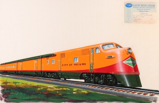
The locomotive paint job had to coordinate with the train’s passenger cars, which were to be yellow with a green roof and green skirts with red stripes, a little too thick to be called pinstripes, between the green and yellow bands. Judging from the drawing numbers the above image was the first idea. This would have broadened the bottom green to become dominant on the locomotive nose, interrupted by the vertical red stripes reminiscent of vertical yellow stripes on the Santa Fe Warbonnet. Since IC’s green diamond logo is already green, it got a little lost on the green nose, plus dark green would not be highly visible at night.

Click image for a larger view.
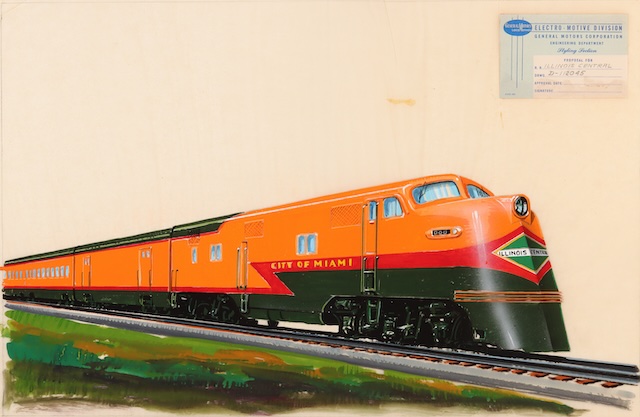
Idea number two was much better. Instead of the green stripe expanding to cover the nose, the red stripe does so. This provided a better contrast with the green diamond logo and was also more likely to be visible at night.

Click image for a larger view.
The third idea conveyed a sense of motion with a lightning stripe. The red stripe expanded to embrace the green diamond logo and still provided some nighttime visibility. However, I think the second alternative was better.
According to Jim Boyd, who worked for General Motors before he became editor of Railfan and Railroad magazine, these paintings were all by Paul Meyer. The development of these alternatives persuaded Boyd that these locomotive paint schemes “were created by the artists, not just rendered by them.” Of course, these creations were done in conjunction with the railroads, which approved the final schemes.

Click image for a larger view.
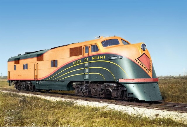
This builder’s photo taken at La Grange shows what they finally ended up with. Instead of rising to a point, the green band bubbled up like bow waves separated by yellow pinstripes. The green diamond was abandoned in favor of a red kite. The words “City of Miami” are naturally integrated into the bow wave rather than simply being placed on the side of the locomotive. This is a creative idea that looks like someone was trying to imitate the success of the Santa Fe Warbonnet.
Yet it was a failure. The Warbonnet design kept the Santa Fe logo, merely turning it into an ellipse rather than a circle. In contrast, the City of Miami design completely jettisoned the familiar green diamond in favor of something that was unrecognizable.
The bow wave had no straight lines for two-thirds of the length of the locomotive, making it a nightmare to repaint. The curved lines weren’t even parallel to one another or of uniform thickness. In contrast, the Warbonnet used black and yellow pinstripes but they were mostly straight lines, with just two curves that the pinstripes followed in parallel at a constant thickness. For safety, the Warbonnet must have been highly visible at any time while the bow wave was only moderately so.
The bow wave lasted only nine years. While the Warbonnet was prominently displayed on locomotives pulling a half dozen or more Santa Fe trains per day, the bow wave was applied to only one locomotive that operated once every three days between Chicago and Miami, so it never got the publicity it might have deserved.
Florida service was seasonal and Illinois Central’s need to expand or contract the train with cars that would sometimes be used on other trains led it to want the same paint scheme for all its trains. If the bow wave had been as successful as the Warbonnet, that yellow-and-green scheme might have been the one that was selected. Instead IC adopted the drab chocolate-and-orange colors used for the streamlined Panama Limited (and which Boyd thinks was also developed by Paul Meyer).
