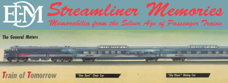
This 1965 brochure uses many of the same photos, graphics, and text as a 1959 brochure that I posted here previously. The biggest difference is the cover art.
Click image to download a 7.3-MB PDF of this 16-page brochure. Click here for a non-OCR version.
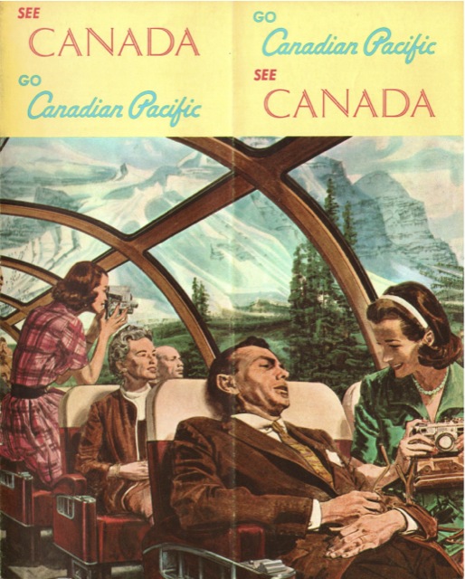
With all of the beautiful scenery outside, why is that guy slouching? He’s in the second row of the dome, which has limited legroom, so where is he putting his feet? And why does he look like the meal he just ate in the diner didn’t agree with him? The cover on the 1959 edition looks happier, but judging from these 1965 Great Northern ads, the 1965 cover is more in keeping with the artistic style of the mid-1960s.
Really. It looks like the food poisoning scene from the movie “Airplane!”. Even more disconcerting is the fact that the woman seated next to him, whom I guess is his wife, looks pretty happy about his pain and suffering. This has to be some kind of inside joke with the artist that slipped by the CPR brass, although I can’t imagine how.
Jim