Several months ago, I wrote that since the St. Paul road was the last to reach the Pacific Northwest, it needed to “make a statement” with its transcontinental passenger trains. This booklet shows how it did so.
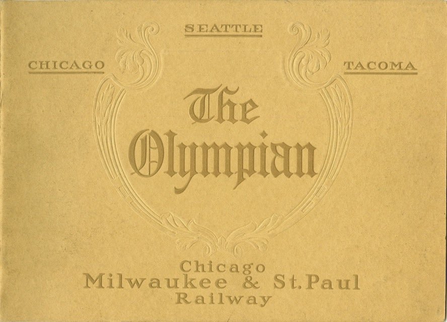 Click image to download a 9.4-MB PDF of this 32-page booklet.
“The Olympian is without peer,” says the booklet, representing “a new and better standard of passenger train service and equipment.” All-steel cars, electric lights, and bathing facilities were just some of the train’s improvements over its competition.
A photograph of the train in the centerfold shows one of the railroad’s latest 4-6-2 locomotives, a baggage car, and six passenger cars. According to the July 1911 Official Guide, the train consisted of a compartment-observation car, dining car, standard sleeping cars, tourist sleeping cars, and coaches. Assuming that the plurals represent at least two cars each, that adds up to more than six cars, so perhaps the train in the photo was an abbreviated version assembled for publicity purposes.
The booklet displays the name “the Olympian” on the front cover in blackletter, conveying a sense of tradition and permanence. Inside, “the Olympian” is repeatedly displayed in an art nouveau typeface, conveying a sense of freshness and modernism. In a very real sense, art nouveau was rebelling against everything that blackletter stood for. Arguably, St. Paul marketing staff used the authority of blackletter on the outside to get people to pick up the booklet and art nouveau on the inside to tell people how modern their train was.
This booklet is undated and I assumed it was from 1911, the year the trains were inaugurated. But, based on the list of agents in the back, I now date it to 1912.