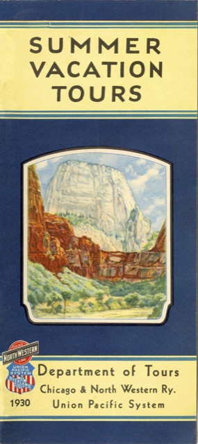
Nominally, this 24-half-page booklet is a companion to the 52-page tour booklet published the same year. Strangely, however, there aren’t many design cues that would suggest they go together. The background color on the covers appears to be a different shade of blue and the front cover illustrations differ (though the back covers use the same illustrations). Inside, only one color illustration in this booklet matches one of the photographs in the larger edition.
 Click image to download an 6.3-MB PDF of this booklet.
In some ways, this smaller version is the better of the two, as the amount of information in the larger seems overwhelming. While I usually think that bigger graphics are better, the color illustrations in this booklet are attractive and bright while the photographs in the bigger booklet are a bit muddy. Of course, UP must have prepared these two for different markets, perhaps one focusing on travel agents and the other more on the general public.
