These blotters from the Dale Hastin collection advertise Rock Island trains in the Midwest. The first one advertises trains from the Twin Cities to Des Moines, Kansas City, and St. Louis. Though it is undated, it appears to be from the 1920s or early 1930s.
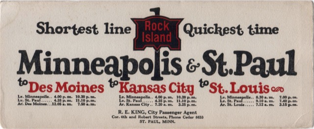
Click image to download a 553-KB PDF of this blotter.
The second blotter advertises sleeping car service between St. Joseph and Chicago. St. Joseph was not on Rock Island’s main line and in the late 1930s Rock Island had one train a day from St. Joseph to Trenton, Missouri, where it met the Californian. This undated blotter appears newer than the one above, and may be from the late 1940s or early 1950s, as the St. Joseph-Trenton train was discontinued by 1957.
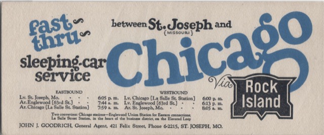
Click image to download a 446-KB PDF of this blotter.
The last blotter isn’t necessarily a Midwestern blotter but it doesn’t fit in my other Rock Island blotter categories either. The image of a Diesel and steam locomotive together indicates the blotter is probably from the 1930s or possibly the 1940s.
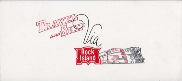
Click image to download a 332-KB PDF of this blotter.
I’m struck by how similar the lettering on these (top two) Rock Island blotters is to lettering on Santa Fe advertising materials – particularly from the Chico era and before.
I wonder – was the style in vogue with other companies, too? Or was there crossover of ad agencies or artists?
It’s similiar – maybe a hand-lettered precursor – of the font Cooper Black that became the “billboard” logo lettering on locomotive sides during the Super Fleet era of the 1990’s.
Follow-up comment: The bold “Santa Fe” lettering on locomotive sides predated Super Fleet. It appeared in yellow on blue during the “pinstripe” paint scheme on freight locomotives, too. The lettering replaced the “Roman” font used on passenger locomotives. If anyone has exact dates or more exact details, please correct or clarify my comments.