
Despite the title, this brochure is in English and unfolds to the equivalent of a 12-page booklet. Filled with 22 color photos, it is a significant advance on the dreary Ontario booklet shown here a couple of days ago, which exclusively used black-and-white photos. That booklet was from the late 1950s; this one is from 1961, just before CN replaced its boring green color scheme with even more boring black-and-white and its maple leaf logo with the worms that are celebrated for having stood the test of time but that are non-evocative of anything to do with railroading or Canada.
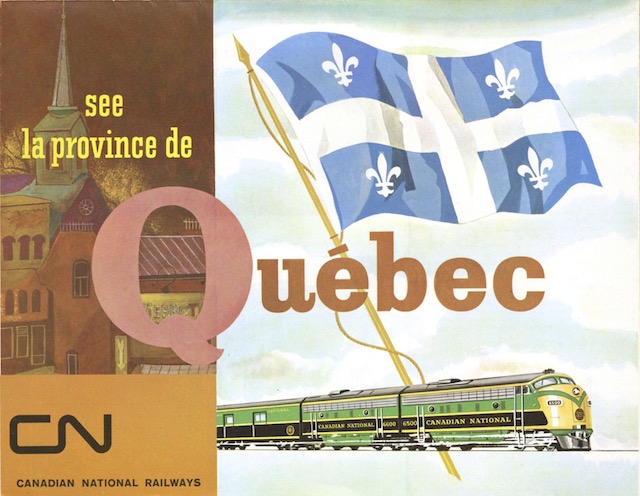 Click image to download a 5.2-MB PDF of this brochure.
The front of the brochure has a curious layout in which introductory text in the lower right panel is continued on the lower left panel, which makes sense only when the brochure is folded up. In-between, the lower center panel has a photo of a nuclear Canadian family pouring over Canadian National travel booklets and brochures, with a helpful list of CN agents to the right of the photo.
Four of the six panels on the back of the brochure are devoted to Montreal and Quebec City, with text accompanied by numerous photographs. Two other pages have text and photos about the Laurentians, Gaspé, Sqguenay, the basilica of Ste-Anne-de-Beaupré, and l’île d’Orléans.
Are CN’s paint schemes really any worse than the competition?
With a yellow nose and bright green paint, the first scheme is as bright, if not brighter than, the NYC’s famous Lightning Stripe, and it is not that different from the C&O paint scheme. Why is CN “dull” while B&O is “elegant” and “subdued”?
The second paint scheme is no worse than SP’s Bloody Nose, CP’s Action Red, NH’s McGinnis or B&O’s sunburst. And it is much better than NYC’s Cigar Band, SCL’s black with yellow stripes, SOO’s white and red, or PC.
CN’s paint schemes are typical of the time period, which is a sad commentary on the tastes of the 1960s, but it seems unfair to single them out as “dull” compared to other paint schemes being “elegant”.