In the 1950s, the Burlington settled on a standard pattern for Zephyr on-board stationery: black or grey printing on white paper stating “Aboard the . . .” on the left of the Burlington Route logo, and the name of the train to the right. The main cities served by the train were listed at the bottom.
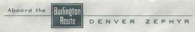
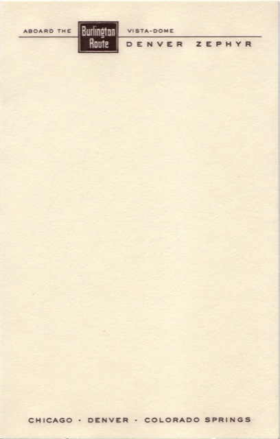
This letterhead is from the post-war, pre-vista-dome Denver Zephyr. Letterheads for all vista-dome trains included the words “Vista-Dome” to the right of the Burlington logo and above the line.
It is possible that the grey printing is meant to subtly reflect the silvery-grey stainless steel of the Zephyr trains. In any case, this was much more sedate than the flamboyant stationery used on the pre-war Denver Zephyr.
Click image to download a PDF of this letterhead.
When the Burlington re-equpped the Denver Zephyr in 1956, it made a minor but significant departure from this formula: instead of grey-black ink, it used brown; and instead of white, it used a cream-colored paper. This gave the new stationery a feel of the Old West. Even if cowboys themselves didn’t use stationery like this, the sepia tones of old leather, bare wood, and dust were indelibly associated with the West.

Click image to download a PDF of this envelope.