Here are two more brochures promoting the 1924 Oriental Limited. Both use different graphics from yesterday’s and one is 8-1/2″x11″ instead of 7″x10″.
 Click image to download a 623-KB PDF of this brochure.
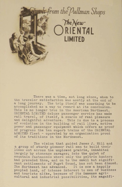
The first one, signed by Great Northern’s agent in Detroit, emphasizes that — rather than being merely a means to an end — the new train is “a source of real pleasure and delightful adventure” thanks to a well-built railway and the use of superb passenger equipment “fresh from the Pullman shops.” The graphic in the upper left of the first page is a non-colorized version of the graphic used on page 3 of yesterday’s brochures, while page 3 of today’s brochure depicts a barber cutting a woman’s hair. As we’ve previously seen on a blotter, GN was careful to point out that the barber is white. The graphic is signed something like “Foit” with “GNRR” in smaller letters.
 Click image to download a 586-KB PDF of this brochure.
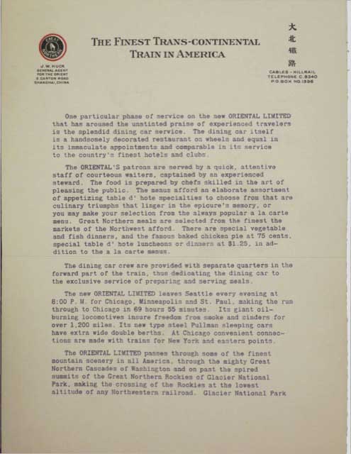
Today’s second brochure, which is 8-1/2″x11″ (unfolding to 11″x17″) was signed by Great Northern’s “general agent for the Orient,” and uses a few Chinese letters in the address section of the letterhead. More important, the letterhead prominently declares that the Oriental Limited is “the finest trans-continental in America.” The letter itself emphasizes the train’s “splendid dining car service,” which is illustrated on page 2. Strangely, the back page is left blank even though it would have cost virtually nothing to print a two-color graphic on it, since the front page is printed in black and red.
