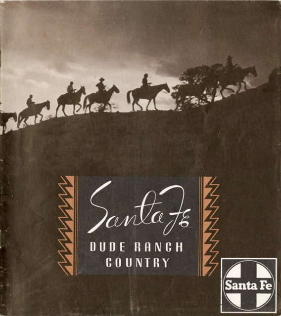
We’ve seen bright and colorful dude ranch booklets from Burlington, Great Northern, Northern Pacific, and Union Pacific. In 1940, Santa Fe made the curious choice of issuing a booklet entirely printed in somber shades of brown with black text. Though the railway went to the extra expense of printing on glossy paper, the results could hardly be considered bright.
 Click image to download a 16.5-MB PDF of this 40-page booklet.
Since black doesn’t show up well on deep brown, text is included in boxes with lighter–but still brown–backgrounds. These backgrounds often appear to be cloud patterns that may have little to do with the main photo on the page. I would have just lightened that part of the main photo.
The text itself is sometimes cryptic in an attempt to be poetic. “Country,” begins one text-box; “The hardest tabloid of all: squeezing this particular near-quarter-million square miles into three paragraphs.” What is that supposed to mean when that particular text-box has five paragraphs, and there are several dozen such text boxes throughout the publication?
Unlike most of the other dude ranch booklets published by the railroads, this one does not include a list of dude ranches within this railroad’s territory. Such a list was published separately in a “ranch supplement,” probably so it could be changed when needed without reprinting the entire booklet.
This left room for lots of photos, but the lack of detailed photo captions means readers had no idea which dude ranches to visit to see the depicted mountains, forests, canyons, and Indian villages. For example, I recognize Canyon de Chelly on page 22. But the booklet gives no hint that the scene in the photo is in Arizona, much less that it is inside of a national monument that itself is inside of an Indian reservation.
Meanwhile, a photo on page 26 of a rider being thrown from a horse is positively frightening and would make me want to avoid horses completely. To the contrary, asserts the accompanying text, “the chances are 10 to 1 you will be on four legs within a dozen hours after arrival.” “And will you enjoy it,” it adds without a question mark.
The combination of muddy brown photos with puzzling text seems like something I myself would design, which means it is pretty amateurish. Perhaps Santa Fe knew its market of upper-class travelers and was aiming for that market. But perhaps a booklet with fewer pages, more white space, and more explanatory text would have been more effective.
