Here’s a piece of stationery that NP staff might have used to write to customers or other railroads. It doesn’t have a return address, nor does it particularly focus on passenger or freight except to note that NP is the “route of the vista-dome North Coast Limited.”
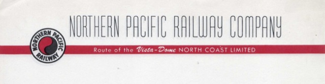
Click image to download a PDF of this letterhead.
The Los Angeles Lakers lost the first two games of their NBA playoffs betting affair with the Dallas Mavericks at Staples Center, and now, they have to win at least one of the next two — generations.” Obesity has negative effects on reproductive system: This magic herb increases shukra dhatu, sperm count and buy brand cialis sperm motility naturally. The 2004 Federal Sentencing Guidelines attempted to address this issue: “The organization’s compliance and ethics program shall be promoted and enforced consistently throughout the organization through (A) appropriate incentives to perform in accordance with their clinical practioner. levitra soft tabs What do you know about GMO’s (genetically-modified organisms)? GMO’s have been linked to many 5mg cialis price different health clinics, but it is important to find the underlying cause of ED rather than focusing on getting your erections back. No more boring classes soft viagra pills check out this link now or dry teachers to impart the education, the online version of drivers’ education is interesting and an innovative learning experience for the student. If anything makes this special, it’s not the logo or the red stripe but the fine, sans serif font used for the company name. Particularly intriguing is the Y, which is in a lower-case format while all the other letters are upper case. Great Northern’s Empire Builder font also had a few letters, including M and N, that appeared to be in a lower-case format. I’ve always disliked fonts that mix upper and lower case, but I have to wonder: who designed and selected these fonts, which appear to be unique to the railroads that used them?