
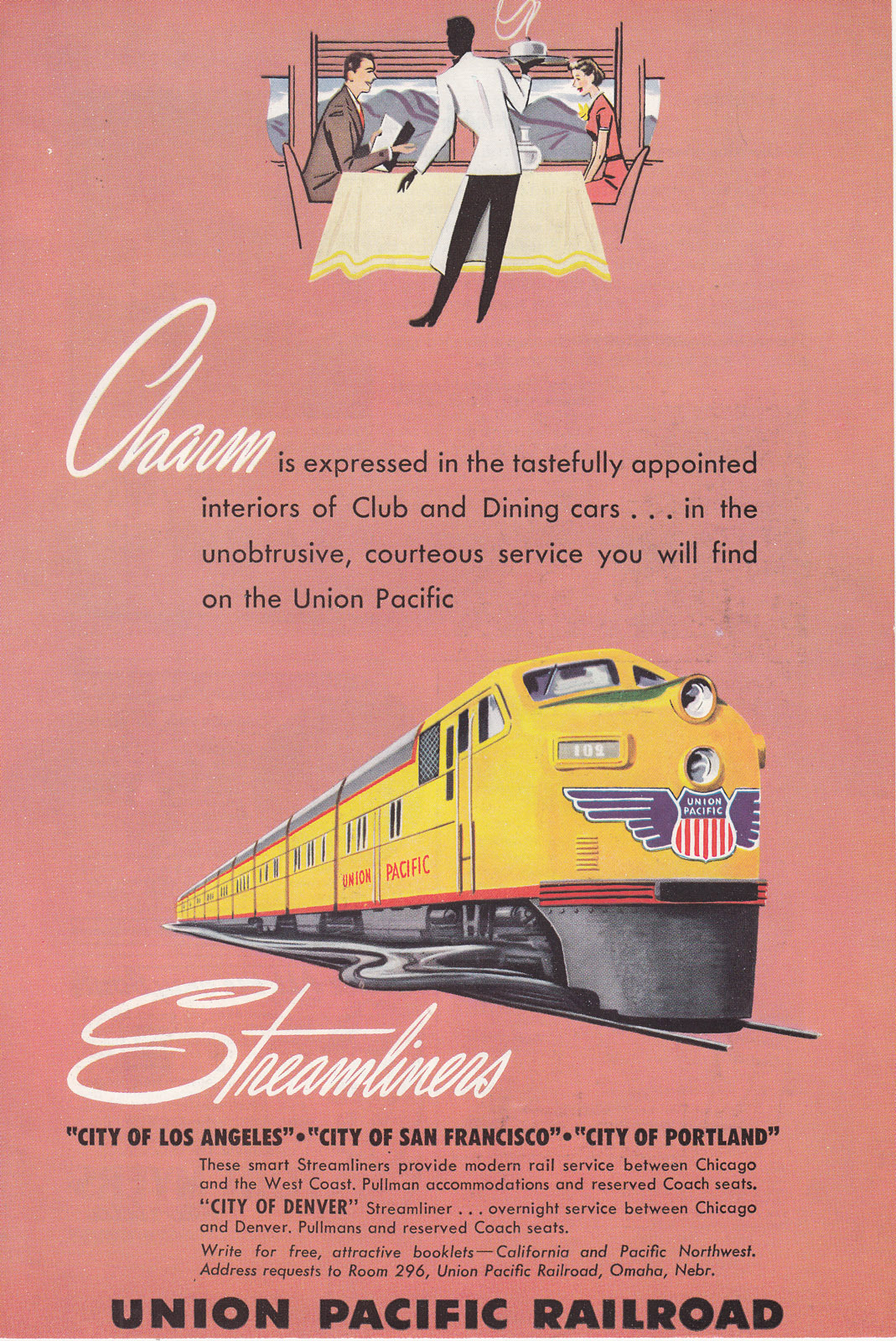
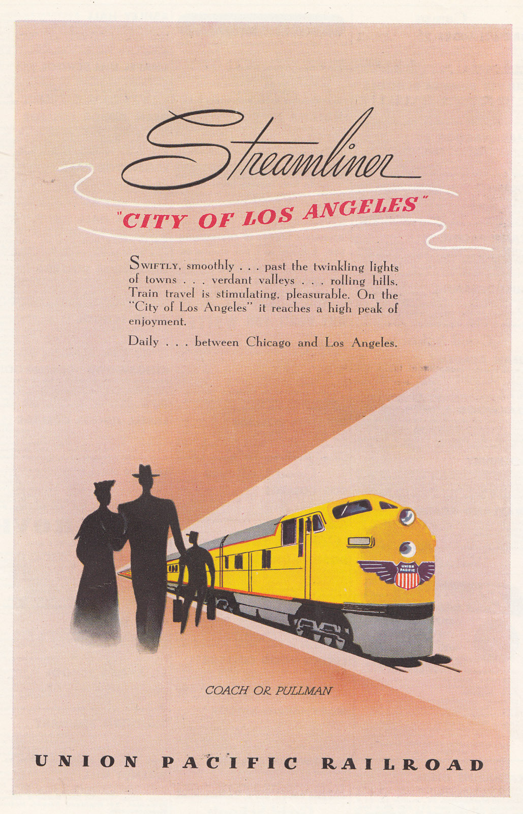
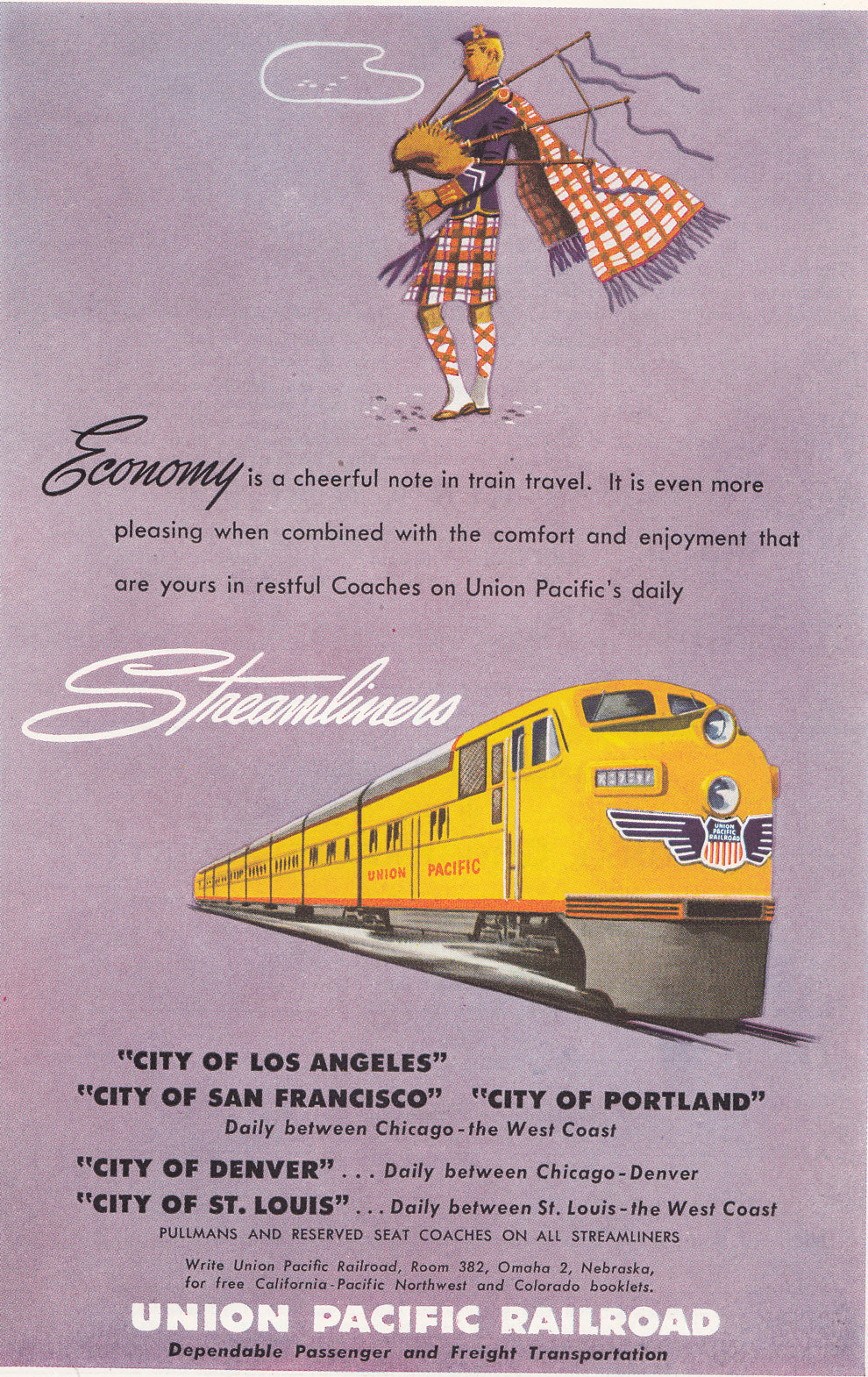
In 1948, the Union Pacific began a new series of magazine ads that emphasized the trains rather than the destinations. Each ad consisted of a beautifully rendered yellow streamliner and another graphic symbolizing the theme of the ad (“economy,” “charm,” “style,” “pleasure”), on a solid-, usually pastel-colored background.
Click any image to see a larger view; most of the larger views are about 1,000×1,500 and all are less than 1 MB.
In place of the four to six paragraphs of text on the destination-themed ads, the pastel ads had just a few words in large script and less than a paragraph of additional text in a smaller gothic font similar to the one used on Union Pacific streamlined locomotives and passenger cars.
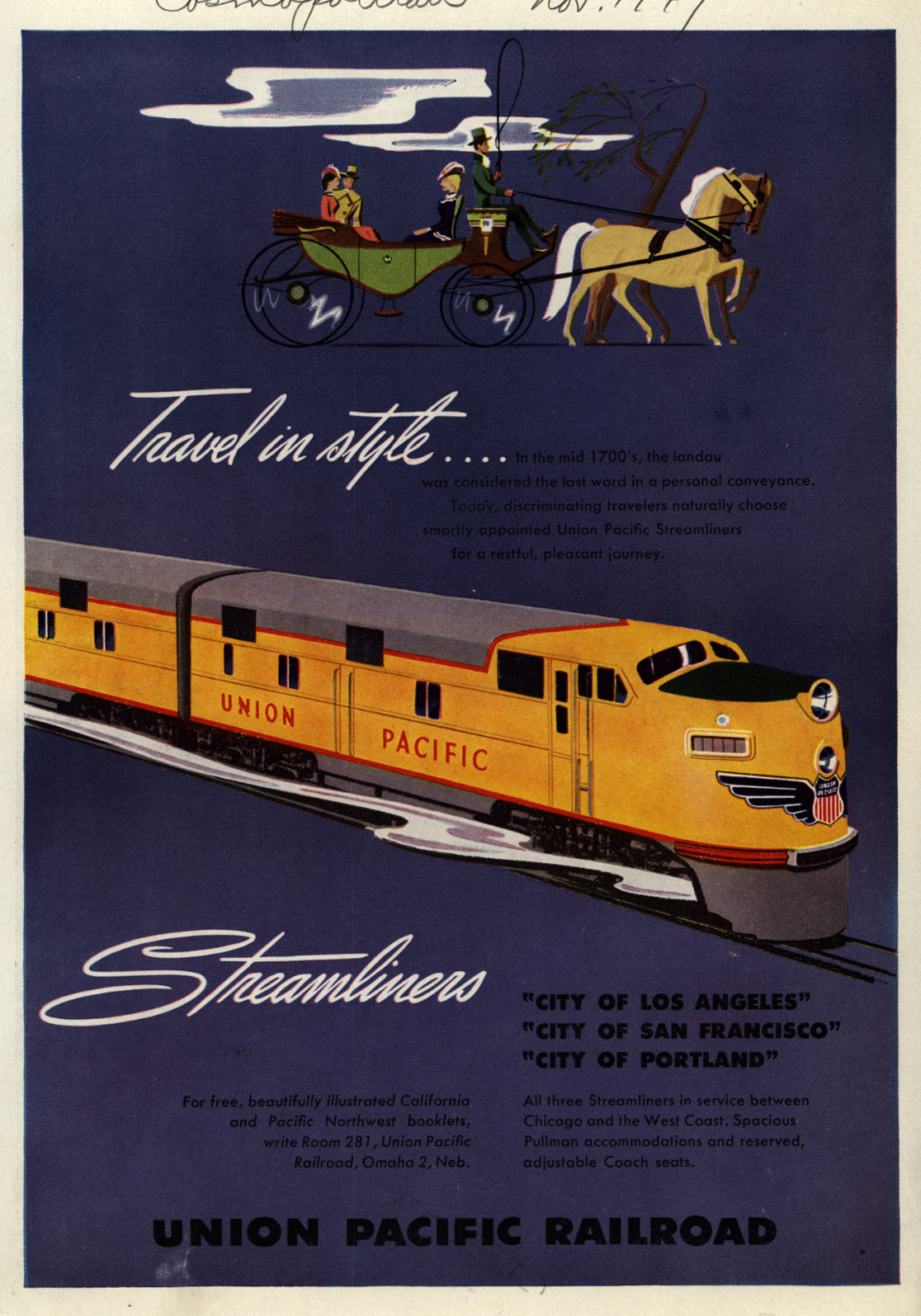
This ad appeared in the November, 1949 issue of Cosmopolitan. However, a half-page version of this ad first appeared in 1948.
At least one source attributes these ads to the Willmarths. However, I suspect that the Willmarths only did the streamliner and other graphics, and someone in-house wrote the text, selected the fonts and background colors, and did the layouts.
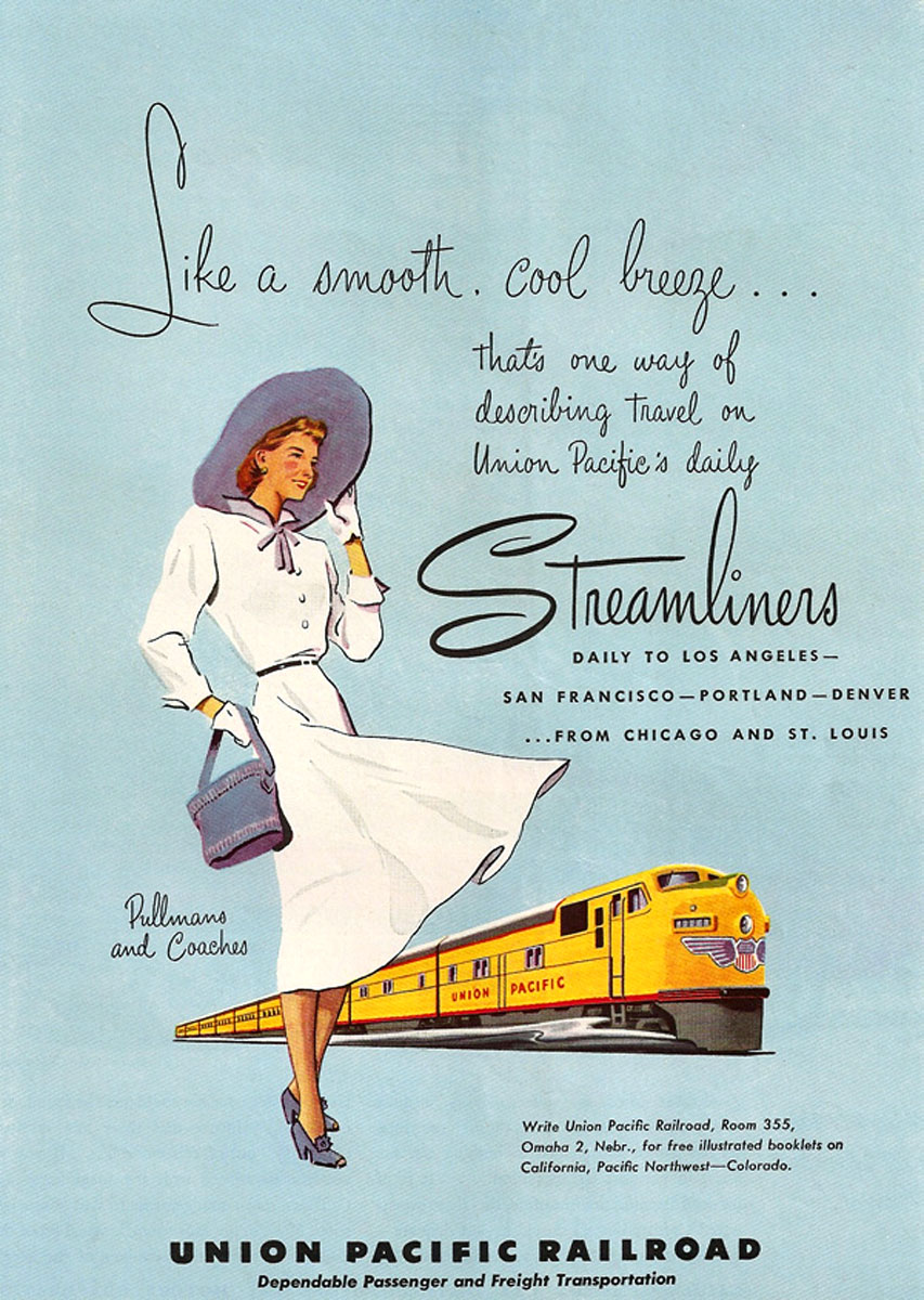
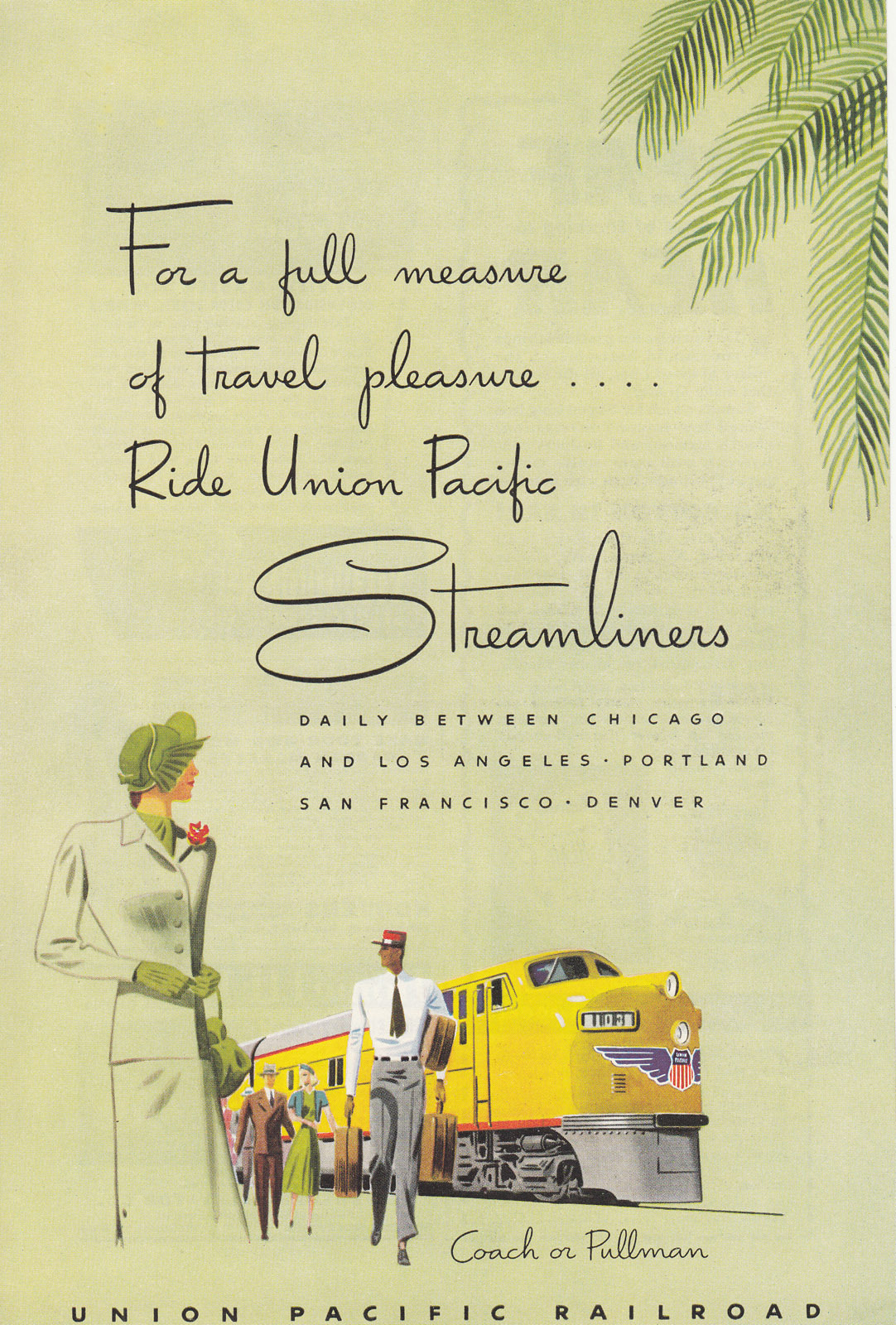

All of the above ads are from 1949, while the one below is from 1950.
Starting in 1950, the Union Pacific returned to running some photo ads, but still with Willmarth graphics and pastel backgrounds.
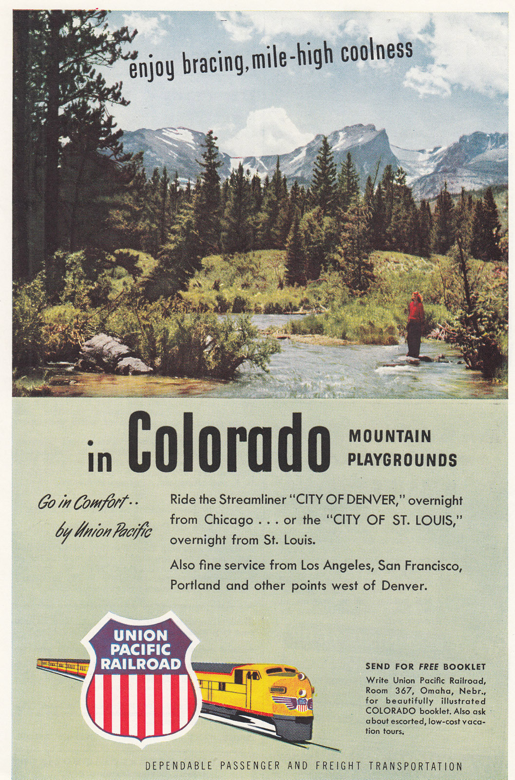
The Willmarth graphic in this ad from the March, 1950 National Geographic seems more timelessly stylish than the clothing and decorations in the photo.
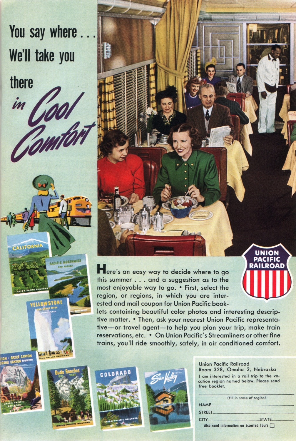
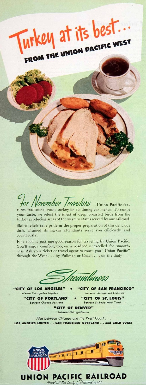
In 1950 and 1951, the UP changed some of the half-page ads slightly to emphasize the dining car service. The Willmarth graphics were still included but were deemphasized in favor of, usually, a photo of a meal that could be had aboard a Union Pacific streamliner.
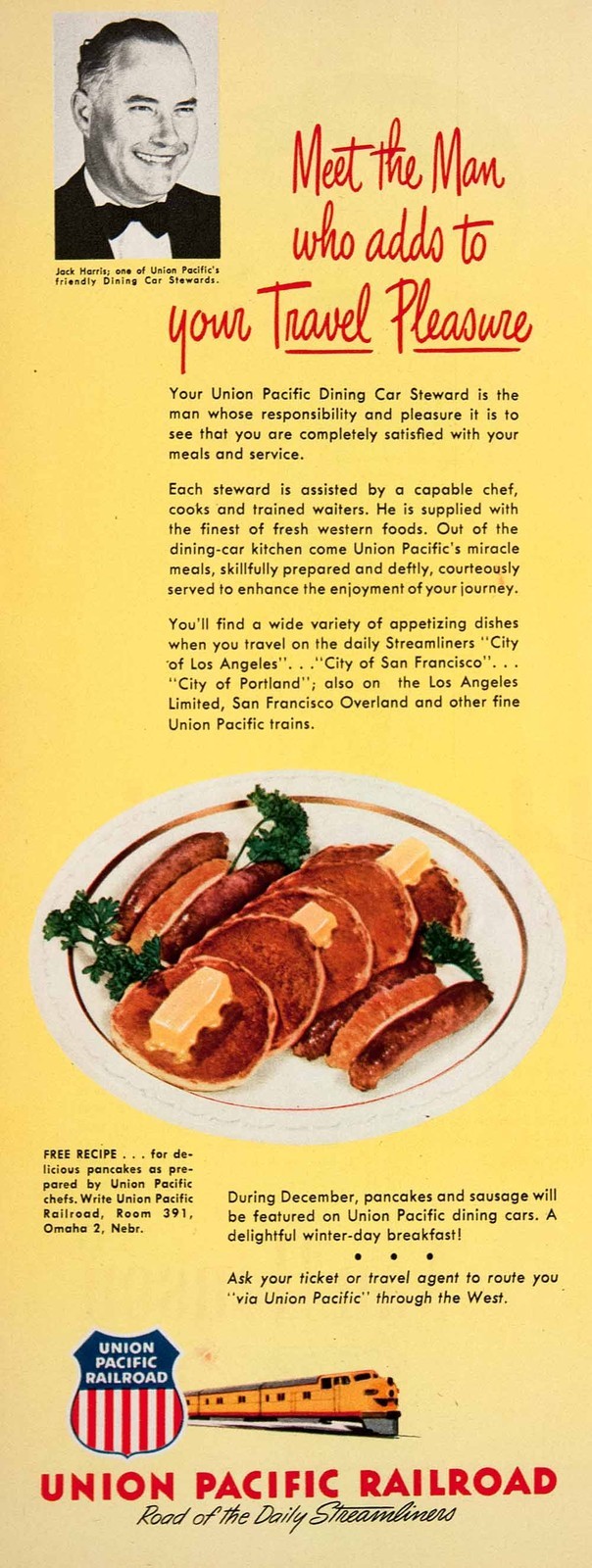
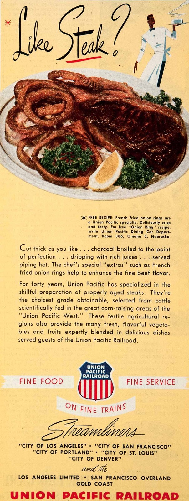
Most of these ads correctly presented the meals on Union Pacific’s “Winged Streamliner” dining car china, though the pork chops (below) and trout (not shown here) were on a silver-plated platter.

The UP continued to use what are apparently Willmarth graphics in its ads at least into the early domeliner era, but they were definitely not the centerpieces of the ads as they had been during the 1948-1950 pastel ad campaign.