This gorgeous booklet introduced an all-new Olympian in 1927. In March of that year, the Chicago, Milwaukee, St. Paul & Pacific (nicknamed the Milwaukee Road), had been organized to take over the bankrupt Chicago, Milwaukee & St. Paul (nicknamed the St. Paul railroad). The company didn’t formally emerge from bankruptcy until January, 1928, hence this booklet is still marked “Chicago, Milwaukee & St. Paul.”
Click image to download a 10.8-MB PDF of this 32-page booklet. Click here to download a 1.3-MB JPG of the cover. Click here to download a 34.1-MB uncompressed PDF of the booklet.
As if in preparation (but more likely a coincidence), the railroad had ordered all-new passenger equipment for the train from Pullman and began running it in August 1927. To stay technologically ahead of its competitors, the new Olympian was the first transcontinental train equipped with roller bearings. This was three years before Timken introduced the first roller-bearing steam locomotive.
This booklet emphasizes the electric locomotives, but they only operated for 660 miles of the 2,190-mile route to Seattle, so the railroad relied on steam the rest of the way. By 1927, Great Northern was using 4-8-2 locomotives for its transcontinental passenger trains and Northern Pacific had just purchased the first 4-8-4 locomotives. Possibly due to its financial straits, the St. Paul still used 4-6-2 locomotives and would not buy its first 4-8-4 until 1930.
In 1920, the railroad’s own shops built 70 4-6-2 locomotives with 79-inch drivers for fast running. While the 33,275 pounds of tractive effort these locomotives produced was nowhere near the 58,838 pounds of a GN 4-8-2 or the 57,511 pounds of NP’s first 4-8-4, it was apparently sufficient to pull one of the 11-car passenger trains illustrated in this booklet on the line’s flatter terrain.
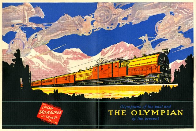
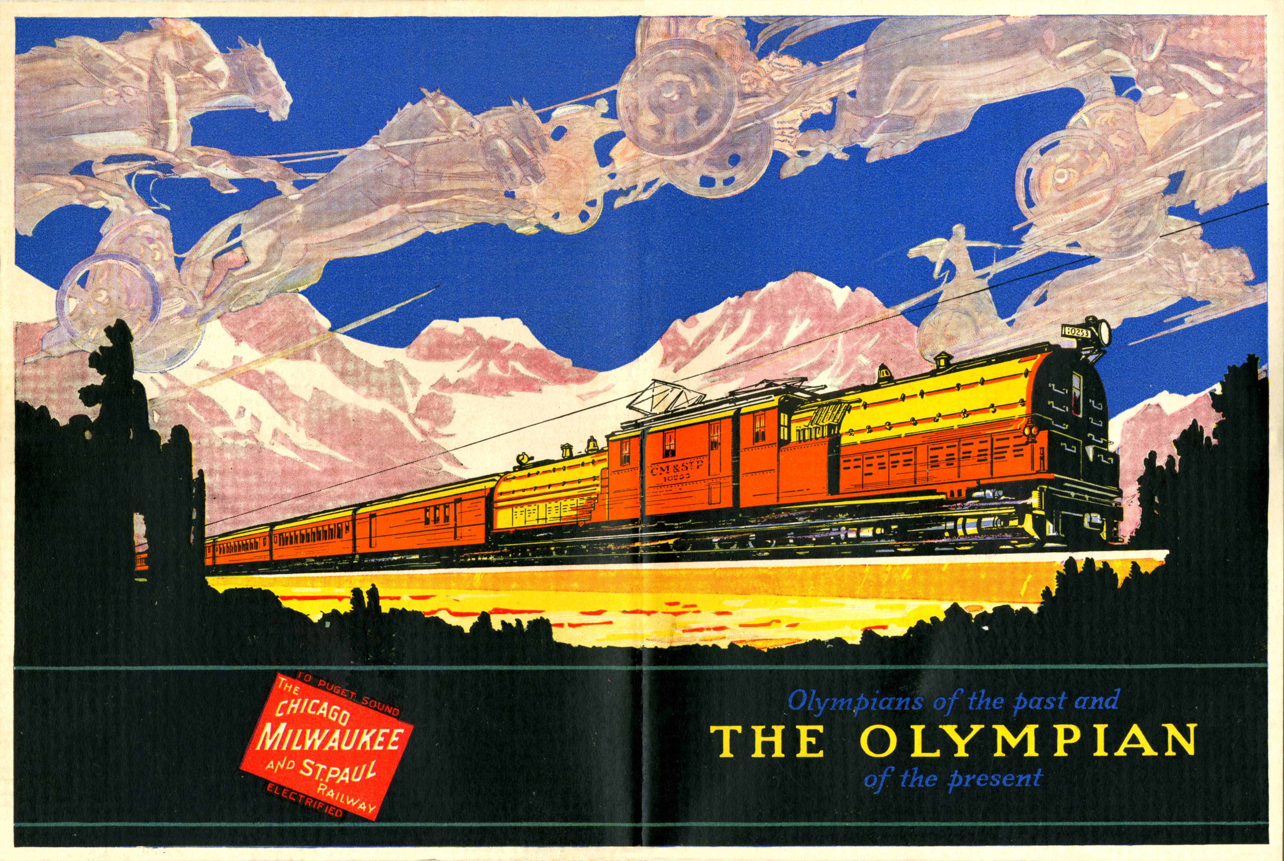
This is quite possibly the most beautiful name-train booklet I have ever seen. It actually has two heavy-duty covers. The inside front covers show a steam-powered Olympian with “Chicago’s magnificent New Union Station.” The inside back covers show a bipolar electric-powered Olympian with the Seattle skyline in the background.
Inside this pair of covers are 24 glossy pages that are slightly smaller than the covers. These feature 21 striking four-color illustrations. Print historians believe that the four-color printing process using cyan, yellow, magenta, and black (CYMK) had been perfected in 1906 by the Eagle Printing Ink Company. This process involved printing each color with a dot pattern oriented at a different angle so that when they overlapped they could fool the eye into seeing a full range of colors including green, orange, and purple. Despite the benefits of this system, it was rarely used for the next three decades.
The illustrations in this booklet use a similar dot pattern but instead of CYMK they use blue, yellow, red, and black. This gives the illustrations a bolder look, especially when blues and reds dominate a picture, but the mixed colors such as green and orange don’t appear as accurate, giving the illustrations a surrealistic quality. The registration of some of the colors is a bit off, indicating the printing press used was not as precise as it should have been. Despite this, the illustrations all pop out of the pages of this booklet.
The illustrations are accompanied by 17 black-and-white photos mostly showing train interiors but also a few exterior photos. However, all of the pages with photos also have a color illustration and the eye is invariably drawn to the color pictures. I imagine this was especially true in 1927 when four-color photos were still rare and printed color pictures, such as those on postcards, were usually rather dark and somber.
The booklet is dated 7-15-27, which was just over 16 years after the Olympian made its debut on May 28, 1911. Curiously, the booklet says this was “seventeen years ago,” indicating that whoever wrote it either couldn’t subtract or forgot that in 1910 the Chicago, Milwaukee & Puget Sound was only running local trains.
The Juan de Fuca Straight, which separates the Olympic Peninsula from Vancouver Island, was explored by and named for a Greek navigator. Later, English explorer John Meares named the largest mountain on the peninsula Mount Olympus to further honor Juan de Fuca’s Greek origin. The Greek chariots on the cover of this booklet follow this tradition.
Recently, I’ve noticed that the compression software I use to shrink the size of PDFs shifts colors slightly, most notably turning orange into red. This was especially serious on some of the Great Northern timetables I’ve posted recently, but is also noticeable on the cover of this booklet. If you think this is a problem, the larger (34.1-MB) PDF listed above is uncompressed and should have more accurate colors.