Along with yesterday’s note pads came another note pad that I am pretty sure wasn’t issued by a railroad. I’m including it here both to warn people against fakes and to laud whoever did this for their creativity. I’m not complaining: I suspect whoever made it didn’t try to sell it as genuine, and the dealer I bought it from probably didn’t know enough railroad history to know any better. Some people, however, might be misled into thinking these are real.
 Click image to download a 1.3-MB PDF of this 15-sheet note pad.
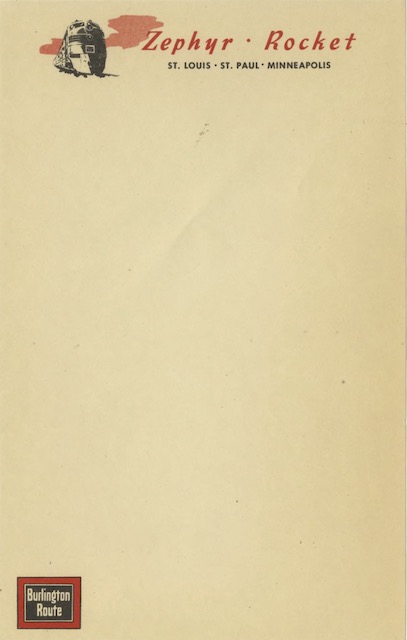
This notepad consists of 15 different sheets, each advertising a different train. The pad I bought has two of some of the ads, but presumably the original had four or more copies of each ad.
Several things lead me to believe this notepad wasn’t railroad issue. First, it consists of multiple sheets glued together at the top and is printed on cream colored paper. Just about every other note pad I’ve seen is printed on white paper — why pay extra for color for something designed to be used as just scratch paper? While on-board stationery was often printed on cream-colored paper, it was never glued together at the top.
Second, the pad consists of fifteen different advertisements for various trains. Every other office note pad I’ve seen uses the same ad or image on every page.
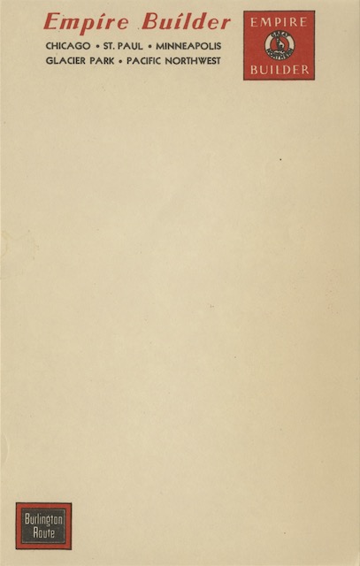
Third, there is at least one major anachronism. Two of the trains, the Silver Streak Zephyr and Advance Flyer, began operating in 1941, yet the sheet for the Empire Builder uses the “Old Bill” Great Northern logo, which was replaced by the “Rocky” logo in 1936. Burlington might be excused for using the wrong logo in 1936 or even 1937, but by 1941 it would have certainly updated its marketing files to use the newer logo.
There are other little problems. For example, just as the Empire Builder page has a (questionable) Great Northern logo and the North Coast Limited page has an (also questionable) Northern Pacific logo, the Zephyr-Rocket page should have a Rock Island logo, since this was a joint Burlington-Rock Island train.
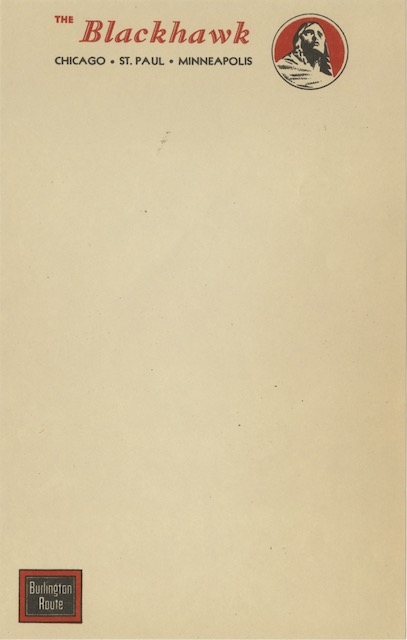
Between the cream color and the emphasis on passenger trains, it seems that whoever made this note pad intended it to look something like on-board stationery. But they didn’t succeed in that, either. Almost all of the sheets follow a similar pattern: a symbol of a specific train with a list of cities served by that train at the top and a Burlington Route logo in the lower left corner. But Burlington on-board stationery didn’t follow that pattern.
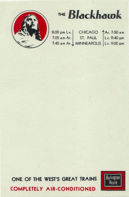
The stationery for the Blackhawk, for example, doesn’t just list the names of the principal cities; it lists the departure and arrival times. The Burlington Route logo is at the bottom right, not left. On top of that, almost all Burlington on-board stationery I have was printed on white or bluish paper, not cream-colored paper.
I can imagine someone selling this at train swap meets to Burlington fans who would use it like anyone uses a note pad: making shopping lists, taking telephone messages, and so forth. I can’t see the Burlington Railroad itself publishing this pad.
Excellent detective work, and as usual, enlightening explanations as to why things weren’t as they seemed. Thank you.