
The Banff Springs Hotel is an incredible place. It’s chateau-style architecture would look completely out of place in a U.S. national park, but somehow it fits in Canada’s Rocky Mountain National Park (later called Banff). This booklet describes many of the special architectural and interior decorating features of the building.
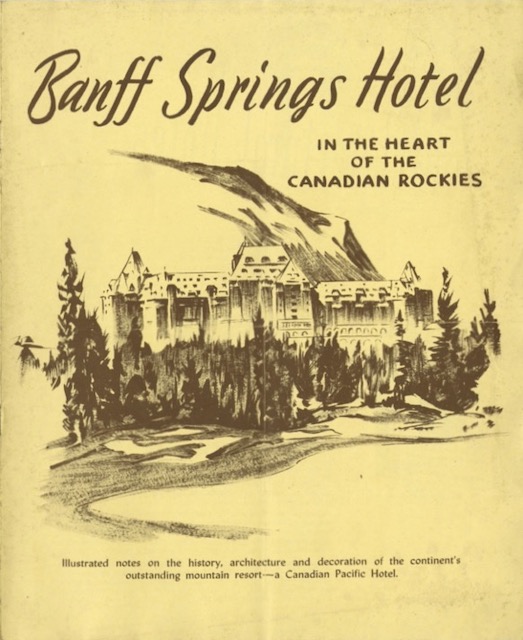 Click image to download a 3.0-MB PDF of this 8-page booklet.
William Van Horne, the president of the Canadian Pacific who conceived of the hotel, was a Dutch-American, but the financiers who started the railway — George Stephen, Donald Smith, and others — were Scot-Canadians, so Van Horne had the hotel designed to resemble a Scottish castle. Some of the interior beams and flooring used the same techniques found in such castles, while some of the furniture is either from the 16th century or replicas of 16th-century tables and desks. Many of the paintings and other decorations are also replicas from that era.
This booklet is undated. One of the typefaces in the booklet is called Lydian and was designed in 1938, so it must be from that year or later. There is no Canadian Pacific script lettering, which as near as I can tell was first used in 1939 but didn’t become ubiquitous on CP advertising until about 1950. This makes me suspect the booklet was issued around 1940, though it could have been in the late 1940s.