Southern Pacific issued several portfolios like this one with names like Scenic Grandeur of the West and Scenic California. Each contained 16 color or colorized photos “suitable for framing.” The ones we’ve previously seen that are dated 1943 say they were printed by “National Color Press.”
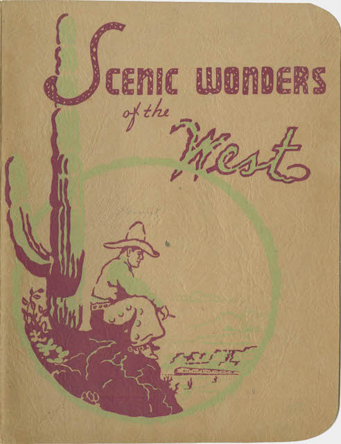
Click image to download a 24.3-MB PDF of this portfolio with 16 color photographs.
This one has a slightly different title and says it was printed in 1942 by “The Printing Company” in San Francisco and sold for 75¢ (the price tag is hidden by a tiny flap on page 3 of the folio cover). All of the photos, however, can be found in one or more of the folios printed by National Color Press. Ten of the sixteen were in Scenic Grandeur of the West while the remaining six were in Scenic California. Six were also in the 1948 Scenic Views Along the Shasta Route. Some might have been in some of the other portfolios but I haven’t checked them all.
These were all colorized black-and-white photos. Some of the color renditions are truly atrocious, looking not a bit like the real subject matter. A photo of the City of San Francisco crossing the Lucin Viaduct in Utah is pretty bad, with the yellow looking more chartreuse than the Armour yellow of City streamliners. For some reason, SP’s colorist has airbrushed out the UP/SP/C&NW logos on the nose of the locomotive.

One of the better colorized pictures is the above photo of the Coast Daylight, which may reflect SP’s pride of ownership or the familiarity of the colorists with the subject matter. It’s possible that the colors of some of the other photos look strange because they have faded, but the relative accuracy of this photo suggests instead that it was due to poor quality workmanship.
Folios issued in 1950 or later say they were based on “full color Kodachrome” images, and they look much more realistic. Kodachrome was available and actively used by SP partner Union Pacific before 1942, but apparently SP was behind the times.