It’s always been a bit of a puzzle to me why the Great Northern didn’t use the “as-delivered” paint scheme for its E-7 Diesels when it put those locomotives into service pulling the 1947 streamlined Empire Builder. The orange-and-green colors now commonly known as the Empire Builder paint scheme were actually first used on the FT Diesels that General Motors delivered to GN in 1940. On the nose the green stripe broadened to provide a contrasting backdrop for the GN Rocky logo while on the sides the stripe was decorated with the words “Great Northern” in a traditional railroad Roman script whose letters were extended to make them readable at an angle.
In a 1940 publicity photo, GN FT locomotives pull a string of brand-new refrigerator cars whose color almost matches the orange of the locomotives. Click image for a larger view.
For the E7s, which were delivered in 1945, GM designers terminated the green stripe near the front of each locomotive, punctuating the end of the stripe with bold forward-facing Rocky logos that were not surrounded by the words, “Great Northern Railway.” Instead, the side also had the words “Great Northern” in a new, custom-designed typeface that is now aptly called the Empire Builder font. This made the side-view of the locomotives more dramatic than that of the freight locos.
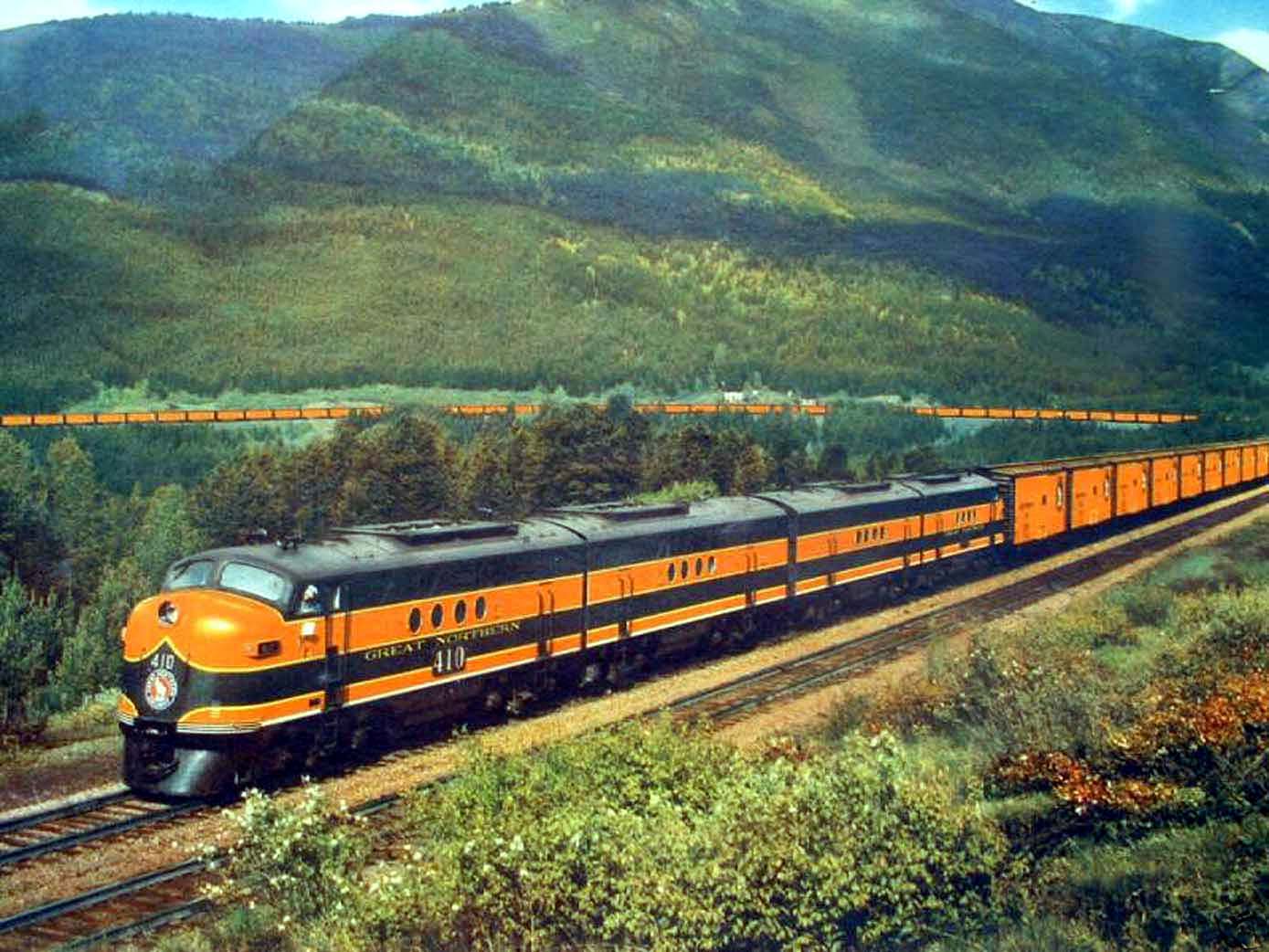
That left a huge expanse of orange on the nose. Although Dupont called this shade of orange “Omaha orange,” it is also known as “safety orange” as experiments showed that it was the most visible color in a variety of conditions including fog. That’s why it was used by several railroads, including the Milwaukee Road, Southern Pacific, and Western Pacific as well as Great Northern, and Rio Grande’s orange was a slightly lighter shade of the color. The larger amount of orange on GN’s passenger locomotives may have reflected higher passenger speeds and thus a need for earlier warnings.
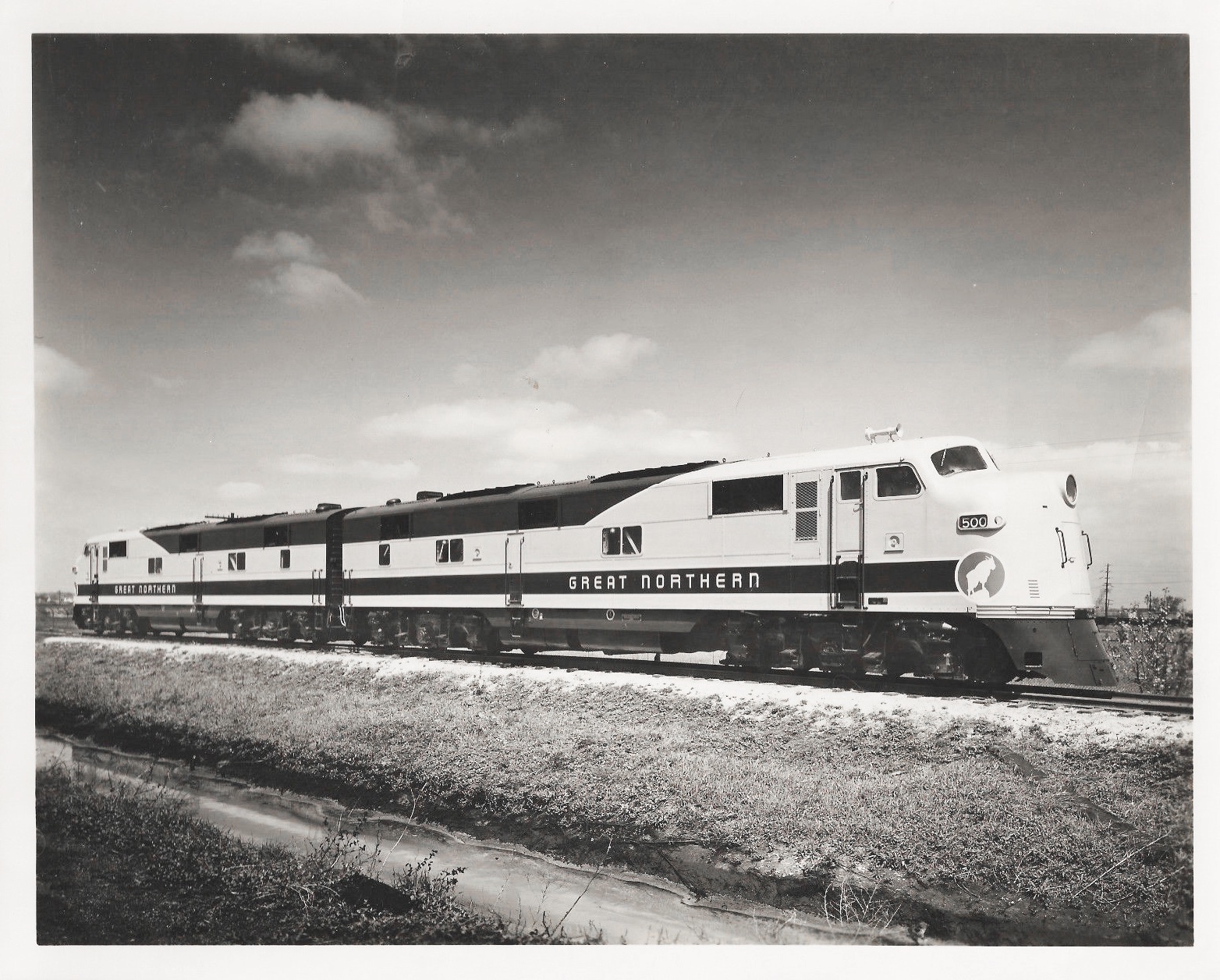
These two locomotives, along with two others, were delivered to the GN in April, 1945. This publicity photo was taken by Hedrick-Blessing, the commercial photo house that did a lot of work for GN. Hedrick-Blessing was located in Chicago, so the photos may have been taken there or, more likely, in the Minneapolis-St. Paul area. Click image for a larger view.
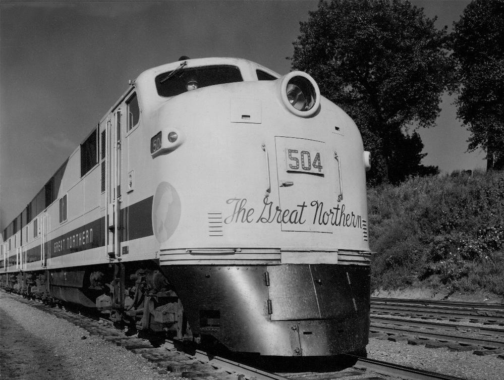
To decorate the nose, General Motors applied the words “The Great Northern” in Spencerian script. The old-fashioned script lettering didn’t really fit with the modern Empire Builder typeface used on the sides of the locomotives as passenger cars. Worse, the letters were in the same imitation gold paint as the letters on the side, but while that color showed up well on a green background, it was barely visible on an orange background.
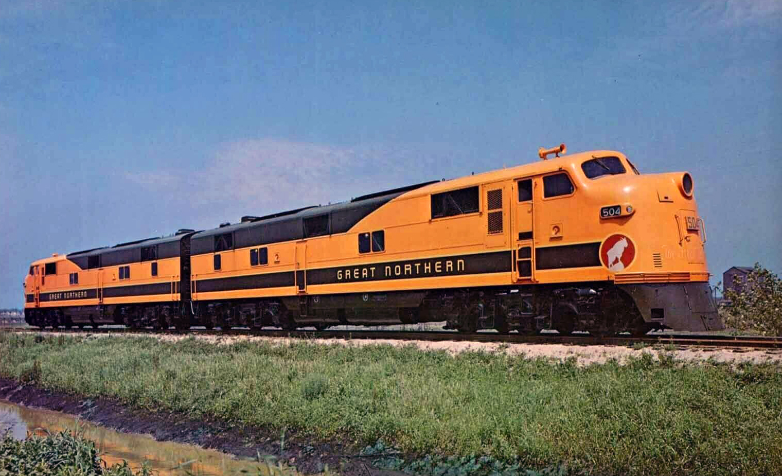
These two and the remaining four locomotives of GN’s initial order were delivered in June, 1945. Note that the gold lettering on the nose is almost invisible. This photo appears to have been taken in about the same location as the previous one. Click image for a larger view.
GN apparently tried to remedy this by repainting the words in green, no doubt the same Pullman green as used on the paint stripes. I haven’t seen any color photos, but I understand the photo below was taken when the lettering was green. Note that it is the same locomotive as the color photo above. Until the equipment for the streamlined Empire Builder was fully delivered in 1947, GN used the locomotives to pull the heavyweight Empire Builder and Fast Mail.
Here, the gold lettering on the nose has apparently been painted over on green. Click image for a larger view.
Apparently, the green lettering didn’t present as pleasing a nose view as the GN wanted. Some time in 1946, GN decided to mount a traditional Rocky logo on the nose, remove the red Rocky logos from the side, and terminate the green stripes in a point before they reached the front of the nose. This still left a more expansive orange area on the nose than on the FT locomotives, but was more conservative than the as-delivered scheme.
Click image to download a 467-KB PDF of this Great Northern publicity photo.
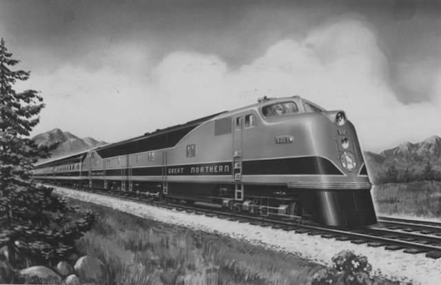
The caption on the back of the above illustration says, “Here is the designer’s conception of Great Northern’s streamlined Empire Builder. Delivery of the five 12-car trains, which will operate on a 45-hour schedule between Chicago, the Twin Cities and the Pacific Northwest is expected in the last quarter of 1946 unless construction difficulties intervene. Exterior of the diesel powered streamliner will be orange and green. The 4,000 horsepower locomotives for the new train have already been delivered.”
It seems likely this illustration was done by GM’s stylists, but the photo has a Hedrick-Blessing identification number. From the caption, however, it is apparent the illustration was probably done in mid-1946, or barely more than a year after GN took delivery on the first E-7 Diesels.
My guess is that GN wanted the nose of the locomotives — the first thing many people see when a train pulls into a station — to have a greater impact than was provided by the Spencerian-script version. As an alternative, I would have suggested that the railway use the larger, red Rocky logo without the “Great Northern Railway” lettering. Rocky was so heavily identified with GN that the lettering was unnecessary, but a larger Rocky logo would have been visible from further away and provided a cleaner appearance.