I’ve complained before that CN’s wet noodle logo is boring, even though some people consider it to be a triumph of graphic design. Its designer considered it “timeless,” noting that while Great Northern updated its goat at least twice, and Union Pacific updated its shield logo several times, CN hasn’t updated its logo in nearly 60 years. To me, that just makes it more boring.
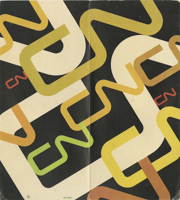 Click image to download a 1.6-MB PDF of this menu.
In any case, this 1966 menu is purely a celebration of the logo, as if that were somehow more important than the destinations that could be reached on CN, the scenery that could be seen from CN train windows, or the foods that would be served in CN diners. Of course, considering the items available on this menu, perhaps that’s just as well: an omelet, pork chops, and a few simple sandwiches are about all that was offered for what was presumably lunch.