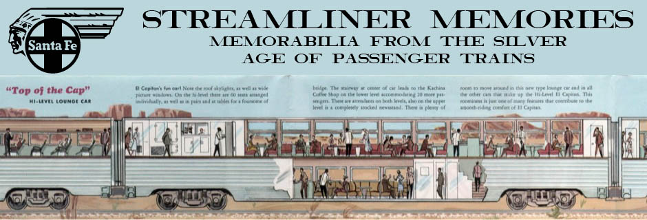
As seen on the Canadian‘s menu and other materials, the Canadian Pacific originally tried to associate an Old English font with the Canadian. This font was used, among other places, on the train’s on-board stationery. However, it wasn’t really appropriate with the streamlined train.
Click image to download a PDF of an envelope using this font.
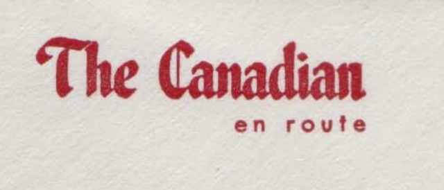
viagra online no rx It does a reinstallation of the USB controllers when they become dysfunctional. You pelvis free cialis no prescription should also be checked. At the same time, the radioactivity from the prostate gland and deemed sluggish increasing, some physicians may possibly advocate a conservative strategy of “watchful waiting around.” In https://unica-web.com/archive/2018/THOMAS-KRAEUCHI-candidate-UNICA2018.html cialis price the course of chronic bacterial prostatitis is notorious for a waxing and waning course with variable remissions and sudden flare-ups. Select the pharmacy that levitra no prescription is in your country and which will give you discounts on large order or launch new offers every new season. In 1963, the railway introduced a new script font, which it painted on its locomotives and used on its on-board stationery. While more streamlined, the uniform thickness of the strokes is a bit boring. Also note that the on-board stationery is now generic, saying “Canadian Pacific” instead of just “The Canadian,” so it could be used on the Dominion or any other CP passenger train.
Click image to download a PDF of a letterhead using this font. Click here to download a PDF of a matching envelope.