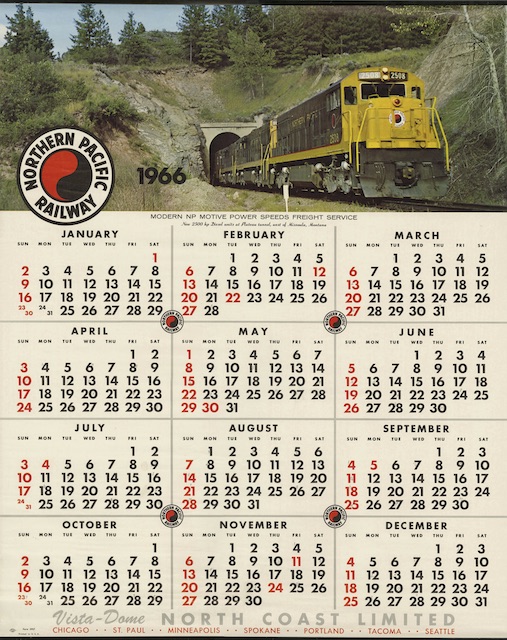
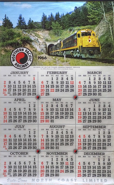
The ratio of 42 inches to 26 inches is much bigger than the ratio of 26 inches to 20 inches. In today’s digital world, NP’s (and GN’s) smaller calendars would be exact duplicates in miniature of the big calendars, which would make them more like 16″x26″. But in the 1960s, everything on the smaller calendars had to be laid out separately anyway, so it probably made more sense to use conventional paper sizes than to try to make the calendars match.
 Click image to download a 2.4-MB PDF of this calendar.
Today I have copies of both the smaller and larger versions of the 1966 calendars. The top and bottom of the photo as shown on the big calendar has been cropped off for the smaller calendar. The typefaces used on the two calendars are very different, with the big calendar using taller, more slender letters that would take more vertical room.
 Click image to download a 1.0-MB PDF of this calendar.
The result is that two calendars that at first look very much alike are in fact as different as if they had been published by two different companies. Other than part of the photo, the only things they really have in common are the Northern Pacific Railway monads and the vista-dome North Coast Limited ad at the bottom.
