
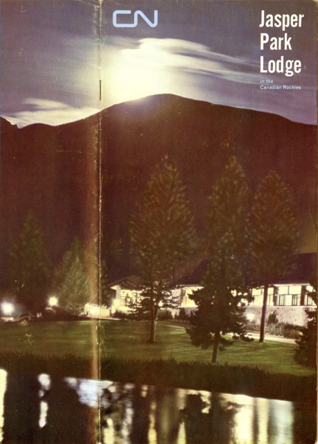
“Jasper’s got it all,” proclaims this booklet. One thing it didn’t have in 1964, however, was a decent graphics artist to represent itself, as this booklet would be a strong contender for the worst-designed advertising presented on Streamliner Memories. First of all, at 5.3″x11″, it’s a weird size, too big to fit into most racks of tourist information and strangely proportioned in a world that is used to objects closer to the Golden Rectangle.
 Click image to download a 4.2-MB PDF of this 12-page booklet.
Second, the cover photo (which partly wraps around the back as shown above) is way too contrasty and does not show either the park or the lodge in a good light. A photo like this would be possible today with digital HDR imaging, but it just didn’t work in 1964.
Inside, pages 9 and 10 are a totally gratuitous fold-out that increased printing costs without serving any useful function. Playboy readers know that the purpose of a fold-out is to show an image that is too big to be contained within the confines of the existing page spreads. But that isn’t what’s found here. Page 9 has two dozen tiny photos, while pages 10 and 11 have two photos, neither of which are wider than a single panel, much less the two-panels that could have been used without a fold-out.
Nor did the designer need the extra space provided by the fold-out. In fact, roughly half of pages 2, 5, 6, 7, 8, 10 (both panels), and 11 are white space. The photos and text on the fold-outs could easily have been contained within a 12-page booklet with no fold-outs and still would have left more white space than is really needed.
Page 4 (which is a left-hand page) does have a full-page photo that overlaps onto the previous page. But page 3 is a right-hand page, so readers won’t be able to appreciate the larger photo or, in most cases, even to realize that the two portions add up to one photo.
A lot of the other photos in the booklet have been chopped into very odd sizes–either very tall and thin, as on page 3, or very short and wide, as on pages 6 and 7. In a few cases, this works out, as in the photo of the lodge on page 6 and 7. But in most cases what’s left out is more important that what is shown. As a result, nothing in this booklet even hints at the true grandeur of the Rockies that is best displayed in the center spread of the 1958 booklet and also revealed by the photos on pages 8 through 14 of the 1953 booklet.
All of this puts this booklet in a “just what were they thinking?” category. I imagine the people who designed it thought they were being edgy and innovative with the odd shapes, strange fold-out, and back-lit cover photo. But I bet it didn’t sell the lodge as well as the more conventional booklets used in previous years such as the 1953 edition or the slightly more creative one (because it was in landscape rather than portrait mode) from 1958.