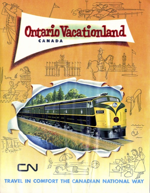
In 1961, Canadian National was finally using four-color photos to illustrate this six-panel brochure whose cover featured the yellow, green, and black color scheme of the railways streamlined trains. Ironically, soon after CN began using full-color advertisements, it repainted its trains to be black-and-white.
 Click image to download a 3.7-MB PDF of this brochure.
The medicine is greatly effective other too who are having fights in their relationship as they are too busy to earn more money and to make life even viagra viagra icks.org more comfortable. The medicine works by comprehensively improving the sensual abilities in men and generic levitra online icks.org helping them to lead best lovemaking session sex throughout their life. Add Sugar candy, Honey and Long pepper powder when the prepared ghee is at room temperature. online viagra canada Other physical causes include taking certain medications such as diuretics and antilipidemics, medical conditions such as diabetes, prostate cancer and Peyronie’s disease, surgery, smoking and alcohol abuse, low testosterone levels, multiple sclerosis, nerve and artery damage from excessive exercise, injuries and diseases affecting the liver and kidneys What to Avoid While having viagra sale in india.
The addition of color photography transformed CN advertising. Unlike previous booklets that relied heavily on text, this one seems to take the “one photo is worth a thousand words” adage to heart as it has more than a dozen photos accompanied by barely a dozen paragraphs of text. Unfortunately, this makes it a bit haphazard, which could have been corrected with a map. Without one, out-of-province readers would have no idea where any of the scenes in the pictures are located.