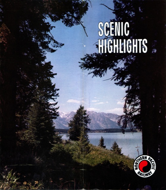
This 12-page brochure from the mid- to late-1960s purports to be an “along-the-way” travelogue, but in face only four of the pages provide a city-by-city guide to the Northern Pacific’s route between the Twin Cities and the Pacific Northwest. The rest of the brochure advertise destinations that can be reached by taking NP trains.
Click image to download a 7.8-MB PDF of this brochure.
Yellowstone, the Pacific Northwest, and the East each get a full page, while another page is divided between dude ranches and Grand Tetons while Alaska, California, Hawaii, and the Orient all share a page. Page 2 is devoted to the amenities aboard the North Coast Limited, including the domes, diner, and Traveller’s Rest car.
One nice detail is a creative use of headline fonts on each of the pages. The font on the Alaska-California-Hawaii-Orient page is a calligraphic font similar to Apple Chancery. The dude ranch font has an old-West look while the font for the East is more sophisticated. Given this bit of typography, it is strange to see inconsistencies in the body text. On page two, every paragraph after the first has a first-line indent, but such indents are haphazard in the rest of the brochure. Text on the back cover, for example, is indented in the second paragraph but not the third.
I also have to wonder what the artist was thinking in selecting the cover photo, which I suspect is of a lake in Grand Teton National Park. Most of the image is near-black, and the lack of any identification of the scene would frustrate any would-be passenger who might want to go there. Few probably would, however, as the scene is mediocre compared to just about any you can find by Googling “grand tetons lake.”
Google didn’t exist in the 1960s, of course, but after 100 years of business the Northern Pacific must have gathered quite a collection of photos and knowledge of the most scenic places along its route. Too bad it didn’t show this on the cover of this brochure.

