The Santa Fe ran two distinctly different series of ads for the Super Chief and its other trains. One series featured four-color illustrations of scenes on board the train–mostly of some part of the Pleasure Dome. The other series, which I’ll take up tomorrow, featured two-color (black and either brown or turquoise) illustrations usually showing some piece of Southwest Indian art.

Notice the double meaning: “next to the stars” including both the stars in the sky and the movie stars who ride the “train of the stars.” Click on any image for a larger view.
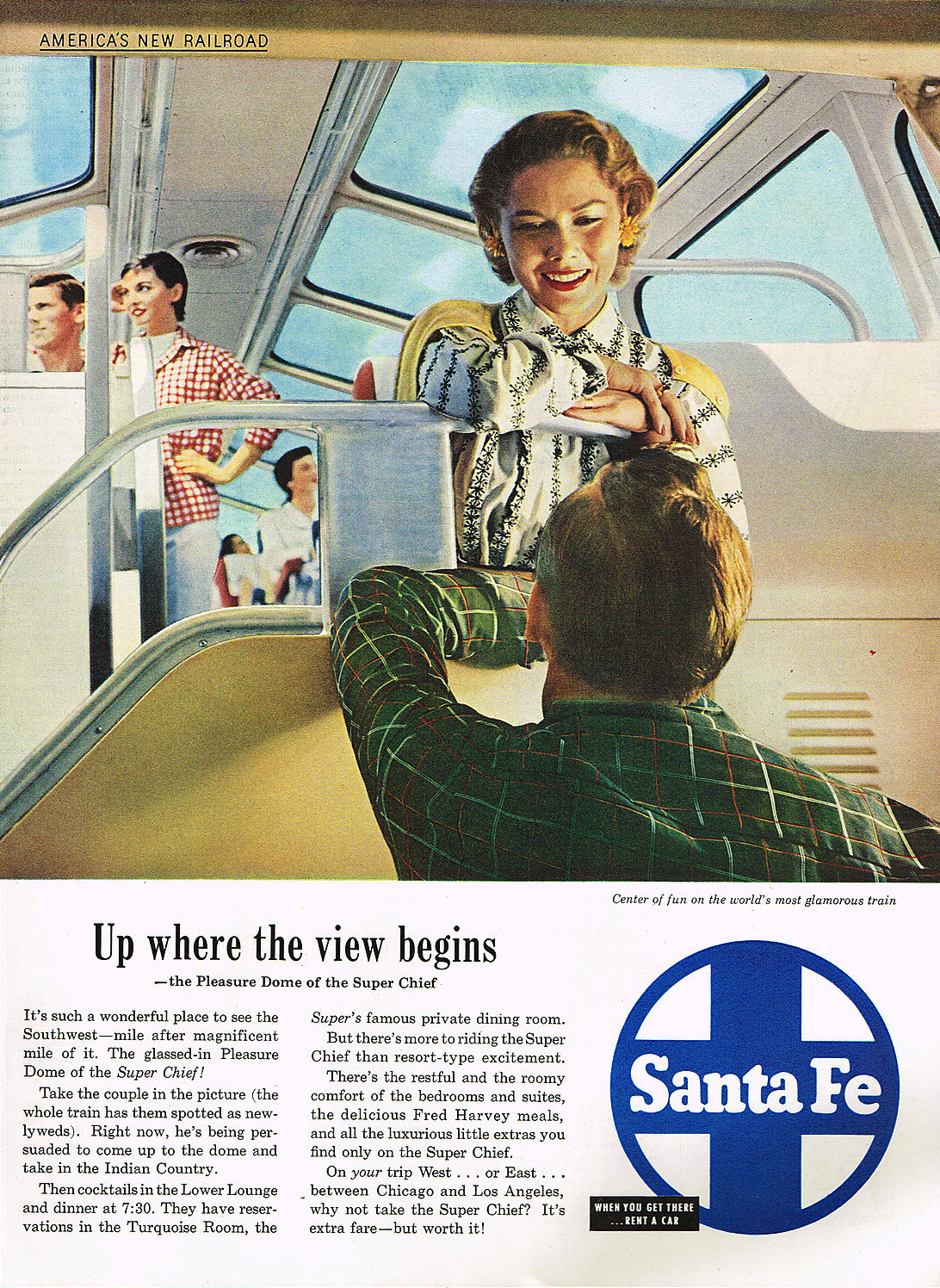
The above ad provides an excellent view of the interior of the dome, and only slightly exaggerates the size of the windows. The ad probably appeared in Saturday Evening Post in 1951. The earliest ads relied on illustrations rather than photos both to make an idealized portrait of the train and because the Pleasure Domes may not yet have been completed when the ads were first laid out.
Looking up to the dome from the main floor, I can’t tell if this is a photograph or an illustration. This ad appeared in Life magazine in 1951.
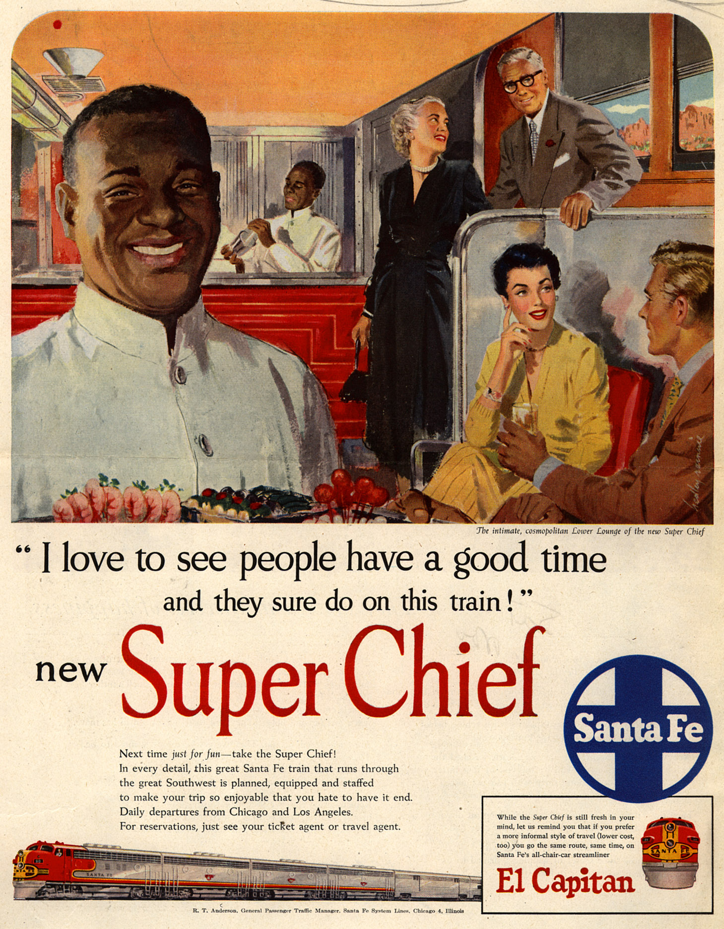
This ad, which appeared in a September 1951 issue of Saturday Evening Post, features the lounge beneath the dome. The illustration is by Hedley Rainnie, who also did illustrations for Canadian Pacific as well as various book and magazine covers.
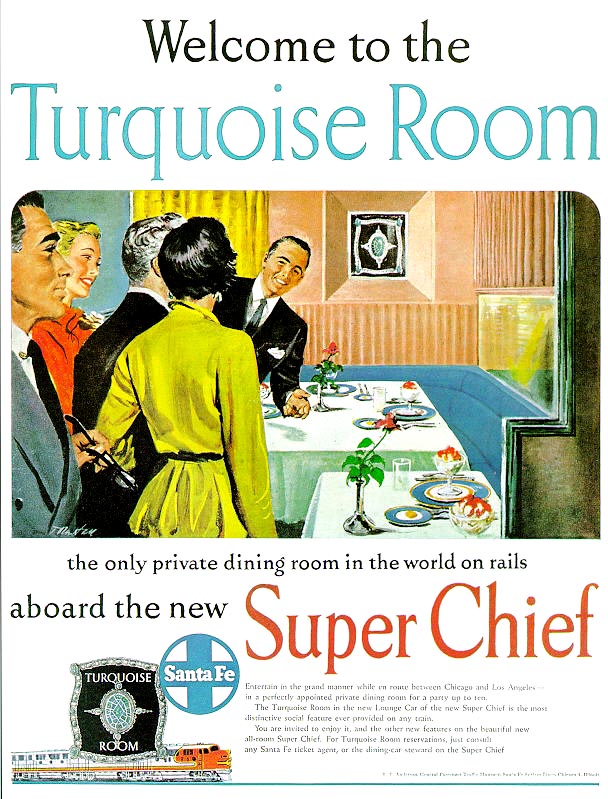
Santa Fe publicity promoted the Turquoise Room as “the only private dining room on rails.” After 1954, when Union Pacific included a private dining room in the dome-diners of the City of Los Angeles and City of Portland, this changed to “the first private dining room on rails.” Unfortunately, I can’t make out the signature of the artist of this illustration; could it be “T Masten”?
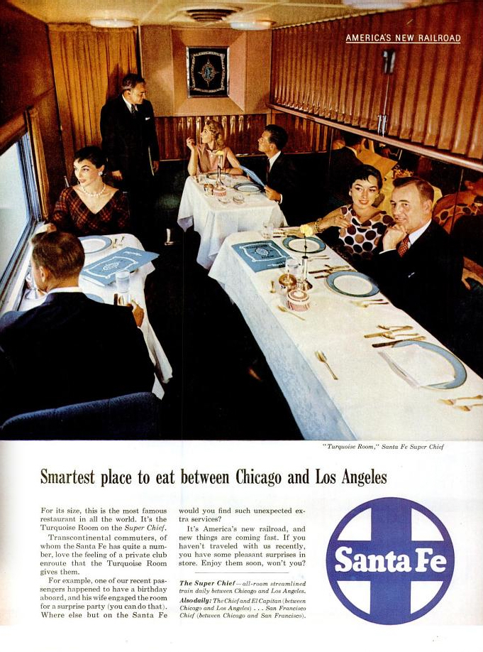
The above ad from page 120 of the March 14, 1955 Life magazine uses a photo that was obviously taken during the same session as the one from yesterday’s brochure.