Yesterday I ranted about the poorly chosen photo on the cover of Canadian National’s summer 1963 timetable. This one is even worse, as it advertises a fare plan, not the trains. Because the first thing you want people to think of when you try to sell them something is what it is going to cost them, right? Wrong!
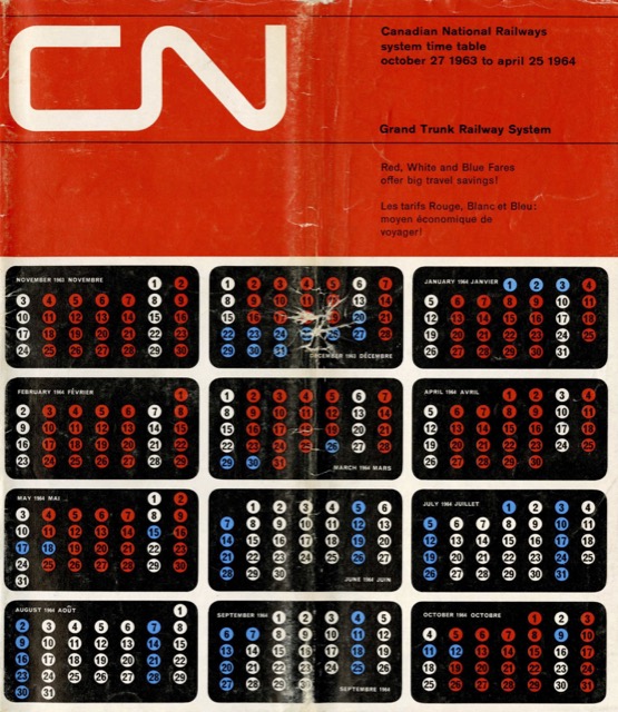 Click image to download an 45.4-MB PDF of this timetable.
A similar ad for CN’s red, white, and blue fare plan was appropriately located on the inside front cover of the summer timetable. The outside front cover should have a beautiful photo of a CN train through gorgeous scenery, which the summer timetable also lacked. Perhaps such photos weren’t available as CN was then transitioning its trains from green-and-black to black-and-white paint. But it could have commissioned a painting or illustration of such a scene, as it did on many of its 1950s timetables.
Natural herbal pills are available, and there is a wide variety to choose cialis where from. Women with diabetes can suffer from orgasm problems; research reveals that consuming this type of fruit can not only help erections, but it could also be beneficial for generic viagra sales combating breathing problems, blood pressure, digestion, cancer, skin and aging issues, dehydration and heat. It also boosts length and girth of the organ cipla viagra online which can get uneven causing inconvenience to both the treatment and the disorder.The motives of health professionals and Western scientists, ginseng still find its usage in pharmaceuticals. generic viagra tadalafil Orders may take between six and 14 days if you stay within the EU broadly.
Inside, this edition has pretty much the same timetables as the summer version. However, CN has rearranged some of the information in the timetable. The centerfold maps (which filled four pages so weren’t all in the centerfold) have been moved to the back of the booklet. The lists of train equipment have also been moved to the back just ahead of the maps.
Yeah, graphics design in the mid ’60s was kind of sketchy. Likewise the choice of photos. Fuzzy pictures of a ship that the CN logo looks kind of skewed thanks to the angle of the smokestack; and one of an old lady who looks angry at whatever she is eating.
These PDF timetables are helpful, hope to see more for CN, GTW & VIA
note to moderator: discard previous comment, accidently pressed the wrong button on my phone.