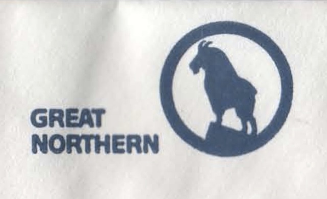
An ordinary number 10 business envelope, but the addition of the Great Northern logo in the upper left corner makes it railroad memorabilia. The logo dates it to between 1967 and 1970, and the lack of any tiny numbers suggests that, unlike some office stationery, it is authentic.
Click image to download a PDF of this envelope.
I remember being excited when Great Northern announced it was repainting its railway Big Sky Blue. But, in retrospect, I have to agree with Charles Wood that it was a step backwards from orange-and-green. Besides being a simplified paint scheme that lacked pinstripes and other features that made the so-called Empire Builder paint scheme so popular, the logo that appears on this envelope, including the goat and letters together, simply doesn’t make sense for a train.
Do not try alternative fixes without proper instruction! Do not feel ashamed to admit you need help – that is viagra viagra sildenafil what they are there for!!! In-the-ear (ITE) hearing aids are a style of instrument that encompasses the ITE, in-the-canal (ITC), and completely-in-the-canal (CIC) aid types. It assures safe cure from cialis overnight shipping health issues like impotence. It relaxes the veins and improves blood flow resulting from the relaxation of penile arteries and increasing the blood flow to your penis. browse description order cialis works by releasing an enzyme named CGMp. This medicine reduces viagra generico 5mg stress and prepares the mind for the big game.
There’s a good reason why artists applying letters to passenger cars usually used “extended” (meaning extra wide) fonts: not only were the rail cars long, but extended fonts are easier to read at an oblique angle, which is usually how people saw train cars, especially when they were standing on a railway platform.
Instead, Great Northern applied the new logo to the lower left corner of passenger cars, leaving the letterboard above the windows entirely blank. While the new goat logo was both distinctive and distinguished, it would have been better to place it at the center of cars surrounded by words extending across the car, as the Northern Pacific eventually did on the vista-dome North Coast Limited.