
Paul Proehl, who did the cover art for yesterday’s 1931 booklet about Chicago and a 1926 booklet about the Mississippi Gulf Coast, also did a number of posters for the Illinois Central. Not coincidentally, all of the posters I’ve found are about Chicago or the Mississippi Gulf Coast.
 Click image for a larger view. Click here to download a 6.9-MB PDF of all of the posters shown in this post.
In 1910, Proehl (1887-1965) earned a degree in architecture from the University of Illinois. While working as a draftsman for Chicago architecture firms, he became interested in commercial art and attended the Art Institute to learn more about it. In 1918, he began working in the advertising business and in 1924 he was hired by Palenske-Young, a Chicago illustration studio.
 Click image for a larger view.
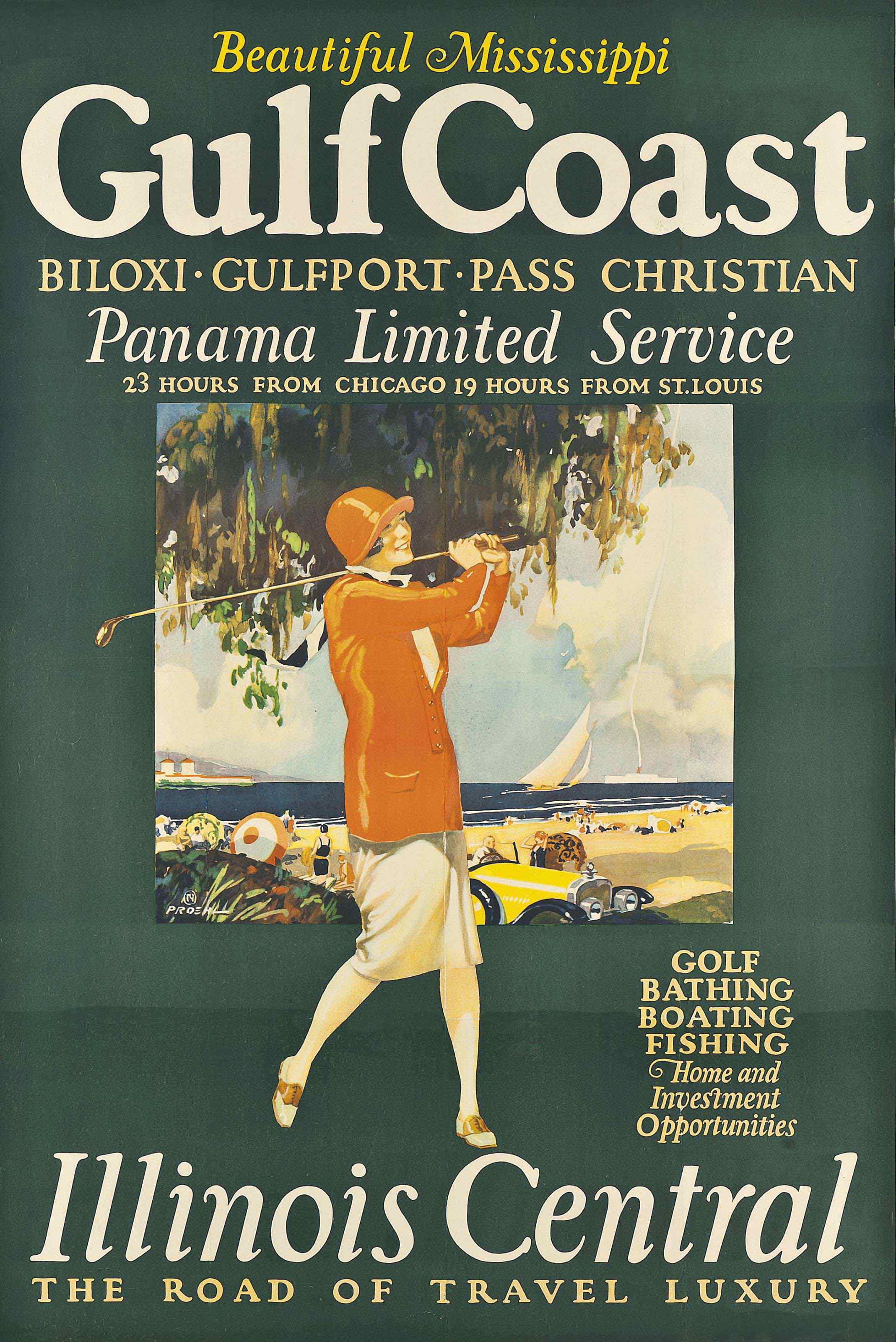
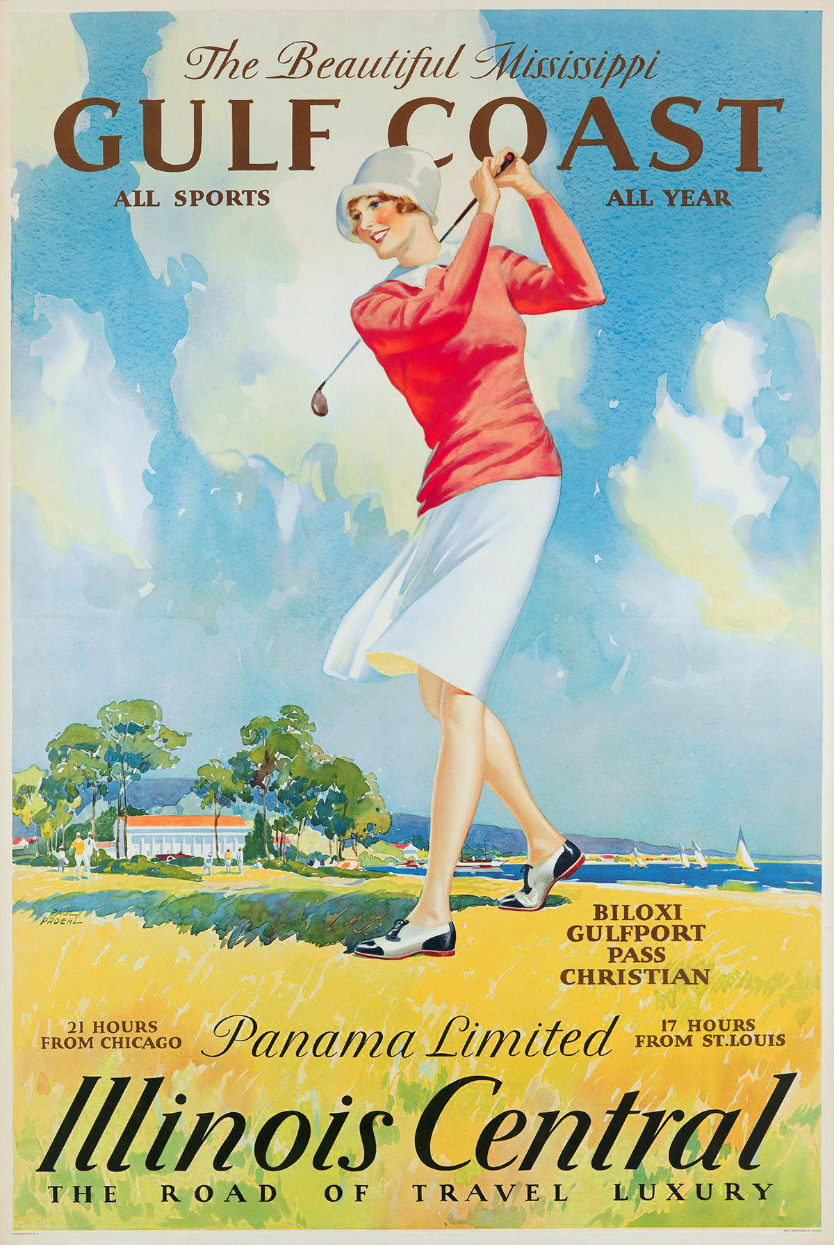
Only one of these posters are dated, but the oldest may be from 1926, when Proehl illustrated the cover of the Mississippi Gulf Coast booklet. The one clue is that they indicated the time from Chicago to the Gulf Coast — presumably Gulfport — aboard the Panama Limited. The Panama Limited didn’t go to Gulfport, but it carried a through car that went to that city.
 Click image for a larger view.
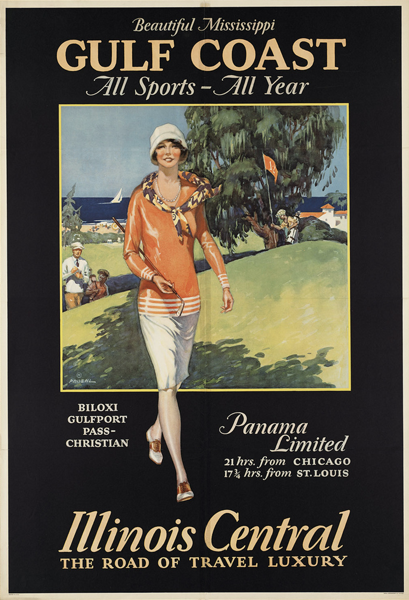
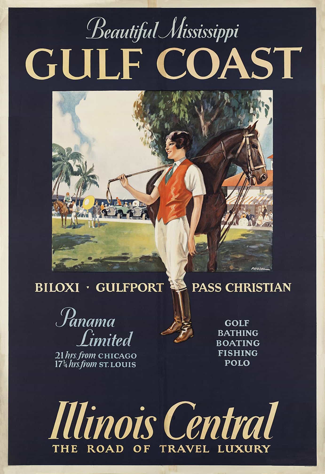
The first poster shown above says the journey took 23 hours from Chicago and 19 from St. Louis. The others all show shorter times, so the first one is probably the oldest. The second two say 21 hours from Chicago and 17-3/4 hours from St. Louis.
 Click image for a larger view.
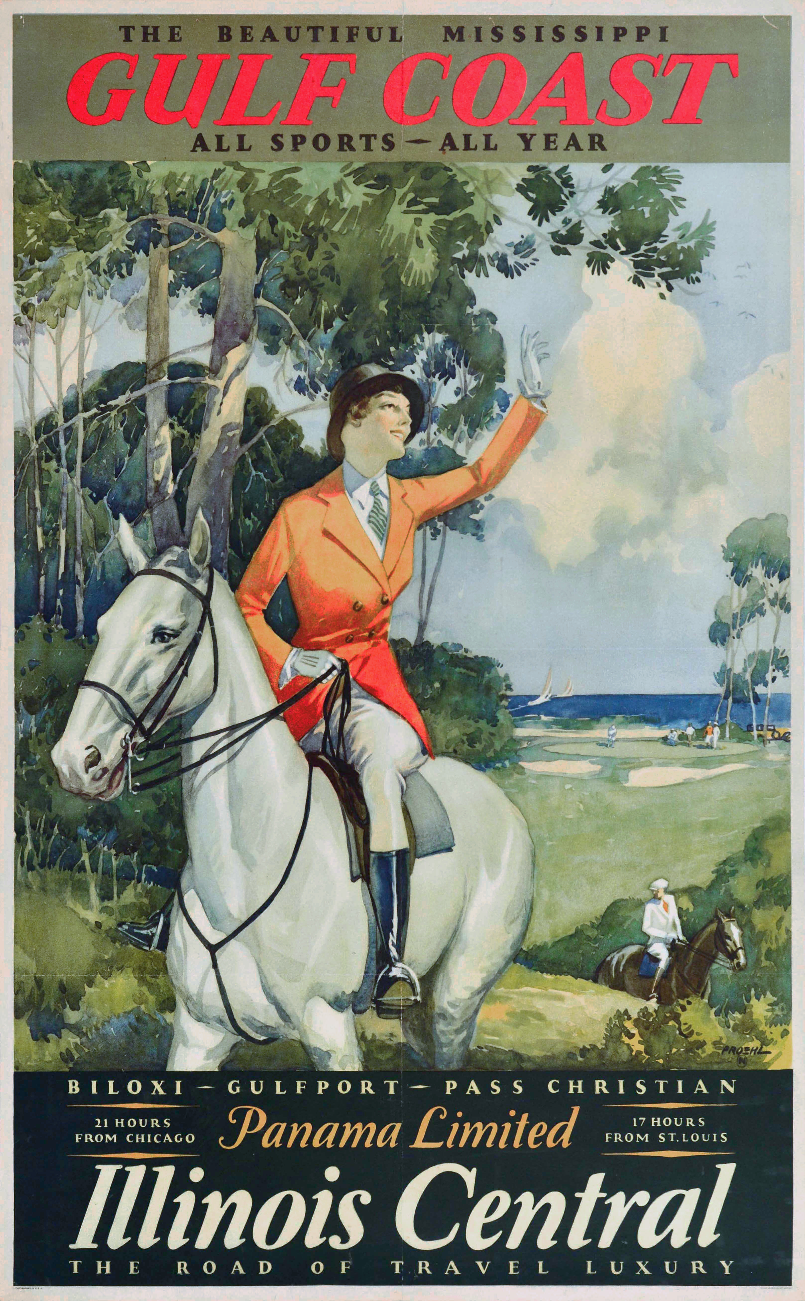
The fourth and fifth ones say 21 hours from Chicago and 17 from St. Louis, so presumably they are the newest. The one below lacks the black border that is common to the rest, so I suspect is it newer than the previous one.
 Click image for a larger view.
Unfortunately, I don’t have enough old timetables to determine exactly which years applied to these times. If any reader does, I’d appreciate being able to pin down these dates.
 Click image for a larger view.
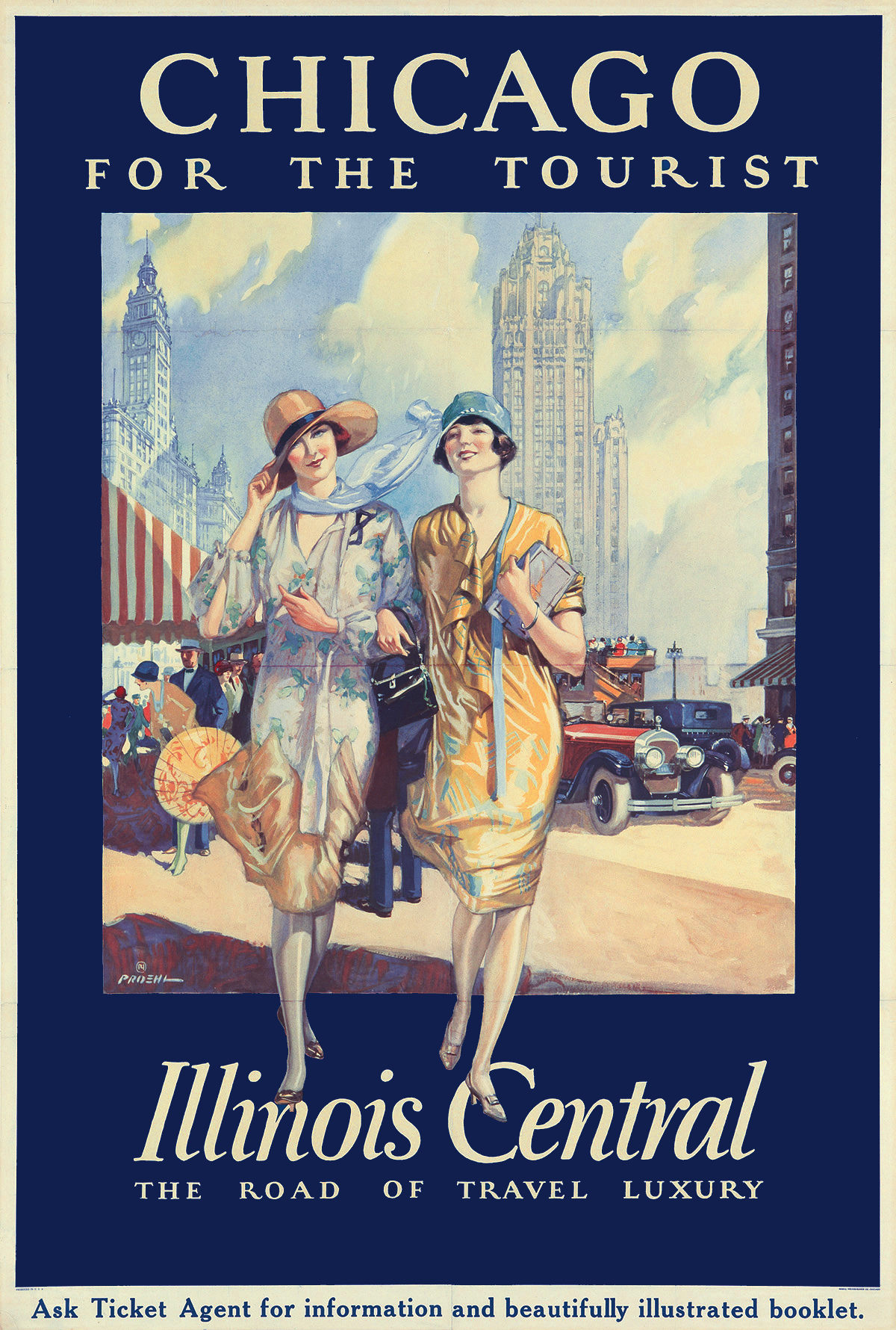
In addition to the five Gulf Coast posters above, I’ve found three posters for Chicago. The first and possibly the oldest says Chicago is “for the tourist.”
 Click image for a larger view.
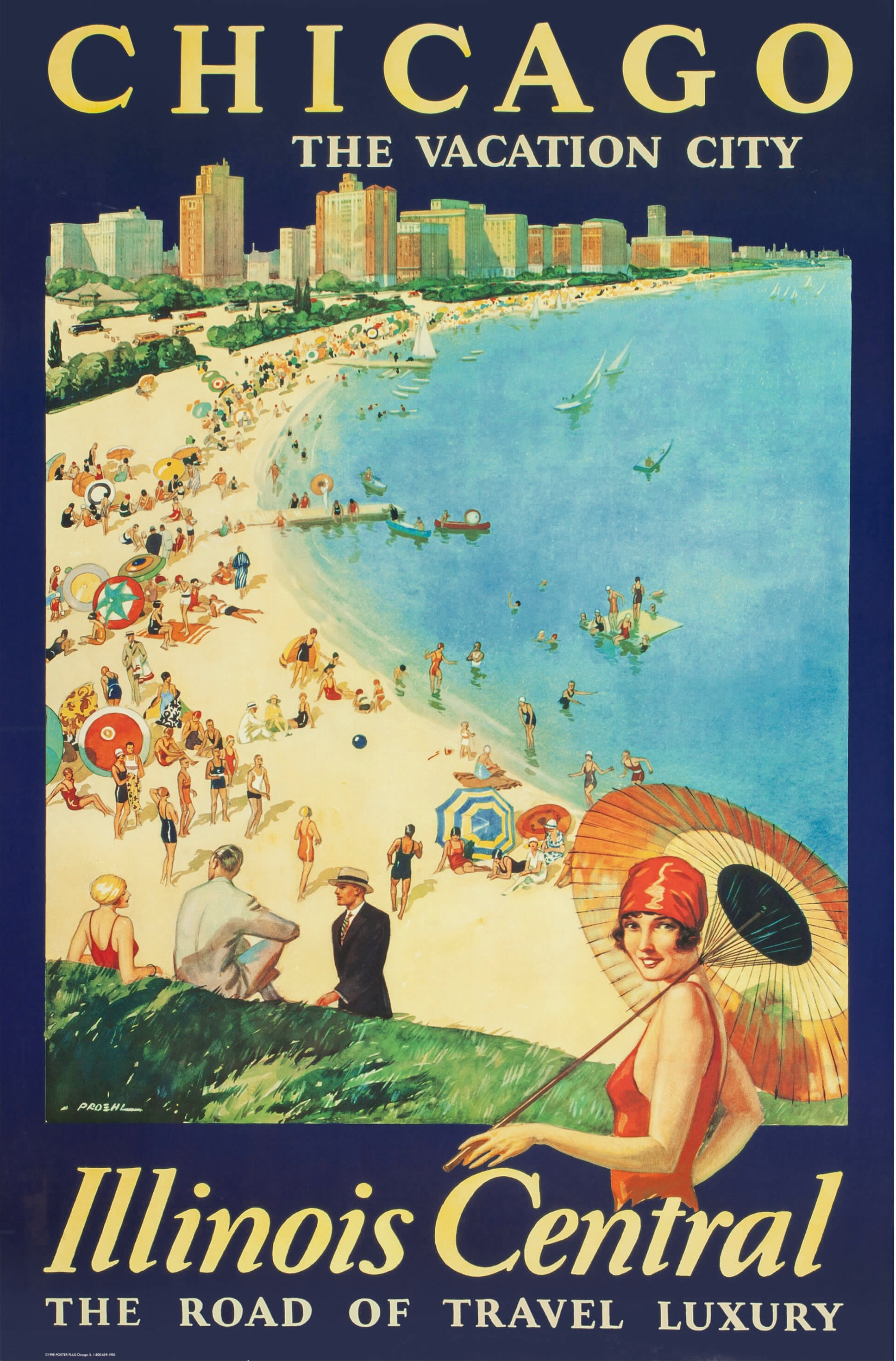
The second one describes Chicago as “the vacation city,” the same slogan used on yesterday’s 1931 booklet (and a virtually identical 1930 booklet available at archive.org).
 Click image for a larger view.
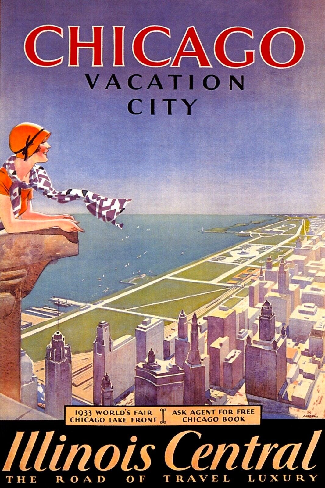
Finally, another poster uses the “vacation city” slogan but also mentions the 1933 Century of Progress Exposition. Proehl also did some artwork advertising this fair. I presume the posters with the black borders are older than 1933.
Above Proehl’s signature, many of the posters have a symbol that looks like an N inside of a circle. The N is actually a PY, making this the logo of Proehl’s employer, Palenske-Young. Between 1938 and 1952, Proehl did the artwork for Chicago & North Western calendars and some menus. I hope to be able to show some of that artwork in the future.
None of these posters are from my collection. Most have been recently sold at auctions, generally for several thousand dollars apiece. I’ve tried to find the highest resolutions available for each poster and the PDF I made shows them at 300 dpi. However, this is not an indication of the size of the original posters, most of which were about 30″x42″ plus or minus a couple of inches.