
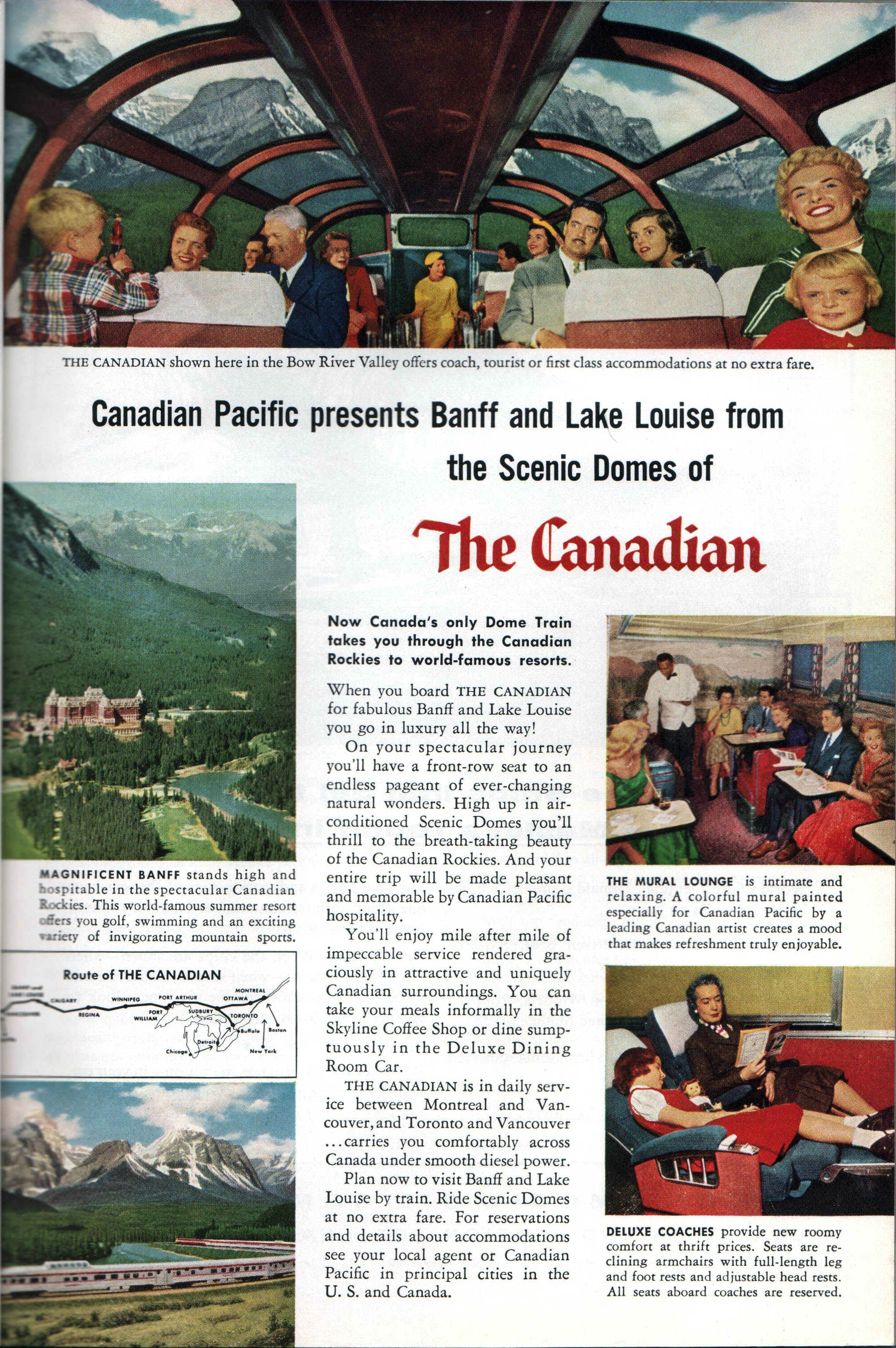
Canadian Pacific had been a regular advertiser in National Geographic and other magazines for many years before the introduction of the Canadian. The older ads tended to be less colorful and to emphasize the destinations more than the trip or train itself. After the Canadian began running, the emphasis shifted to the scenery that could be seen from the train and the dome cars and other comforts on the train. (Click any image for a larger view.)

I’ve shown this ad before, but am including it for context here. This double-page ad featured the Chesley Bonestell illustration of the Canadian at Morant’s Curve plus three actual photos of the interior of the train.
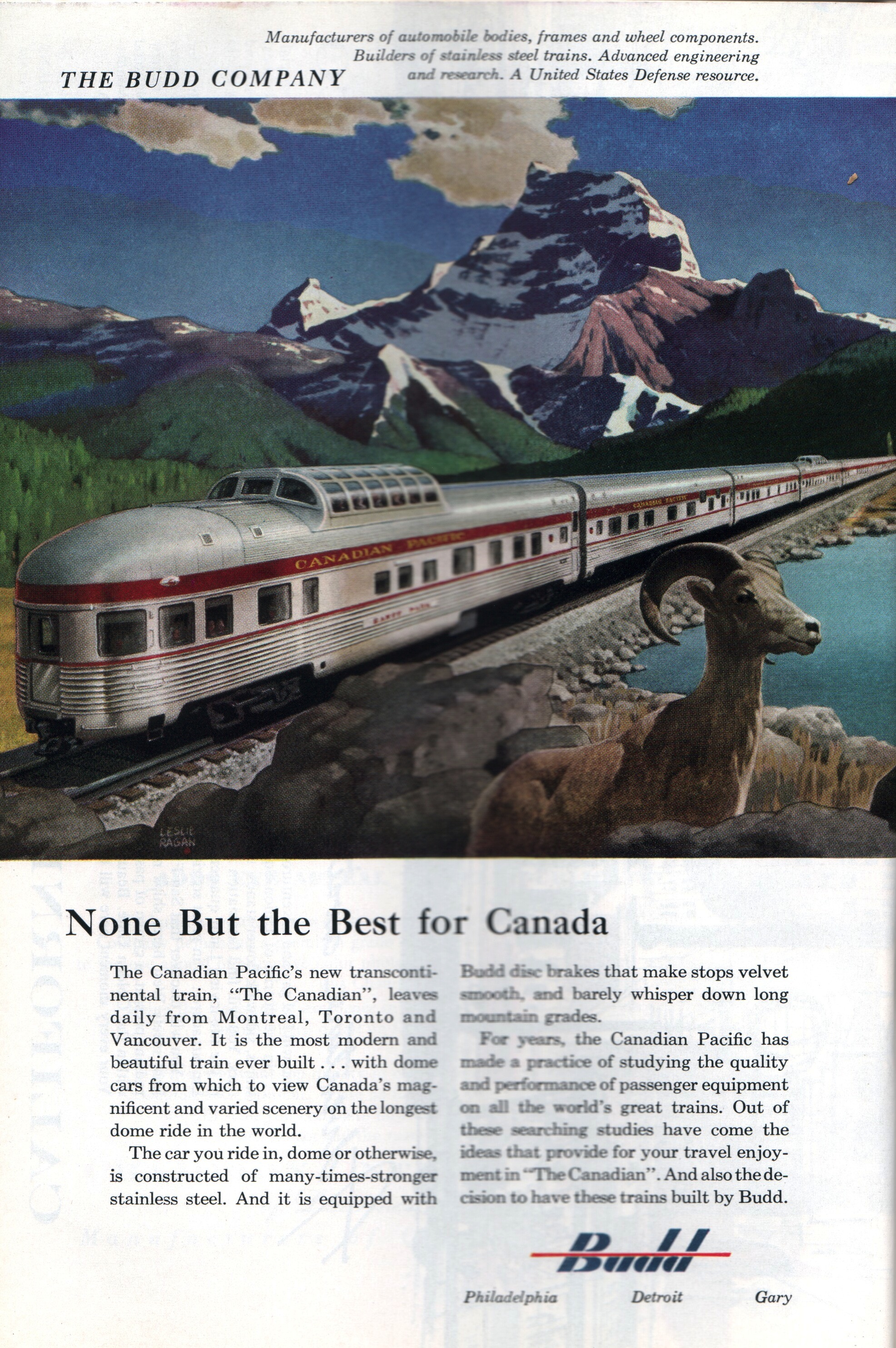
The same issue of National Geographic contained an ad for Budd with this Leslie Ragan painting of the Canadian.
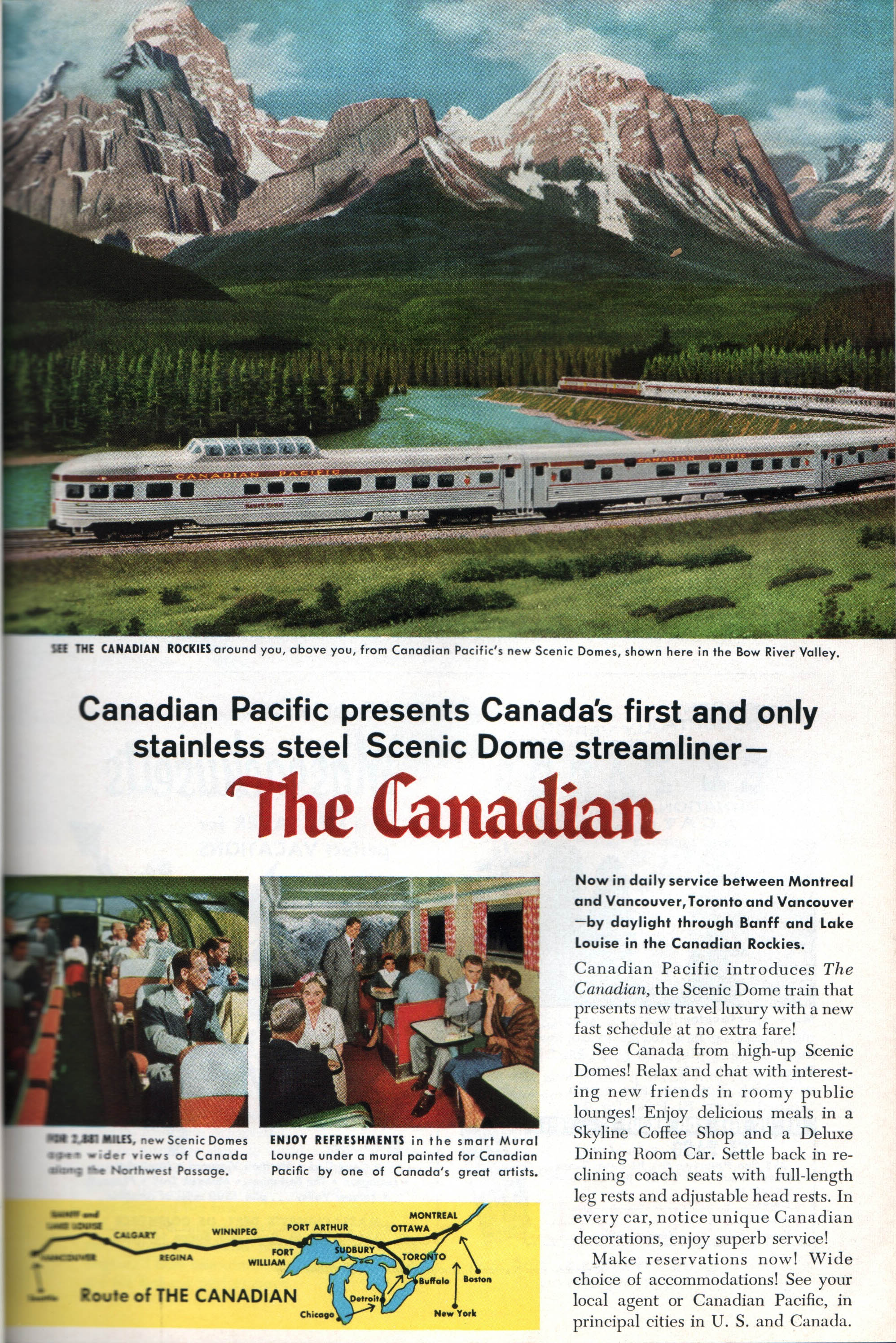
The May, 1955 issue of National Geographic had a version of the April ad redesigned to fit on one page. Note that it contains most of the text and all but one picture found in the April ad.
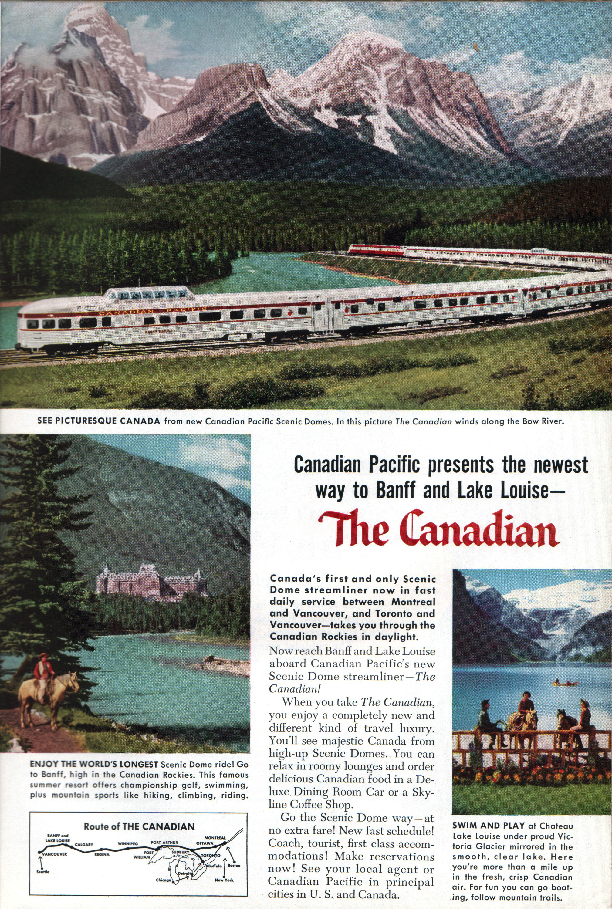
July saw another version, this one emphasizing Banff a little more rather than the train interiors.
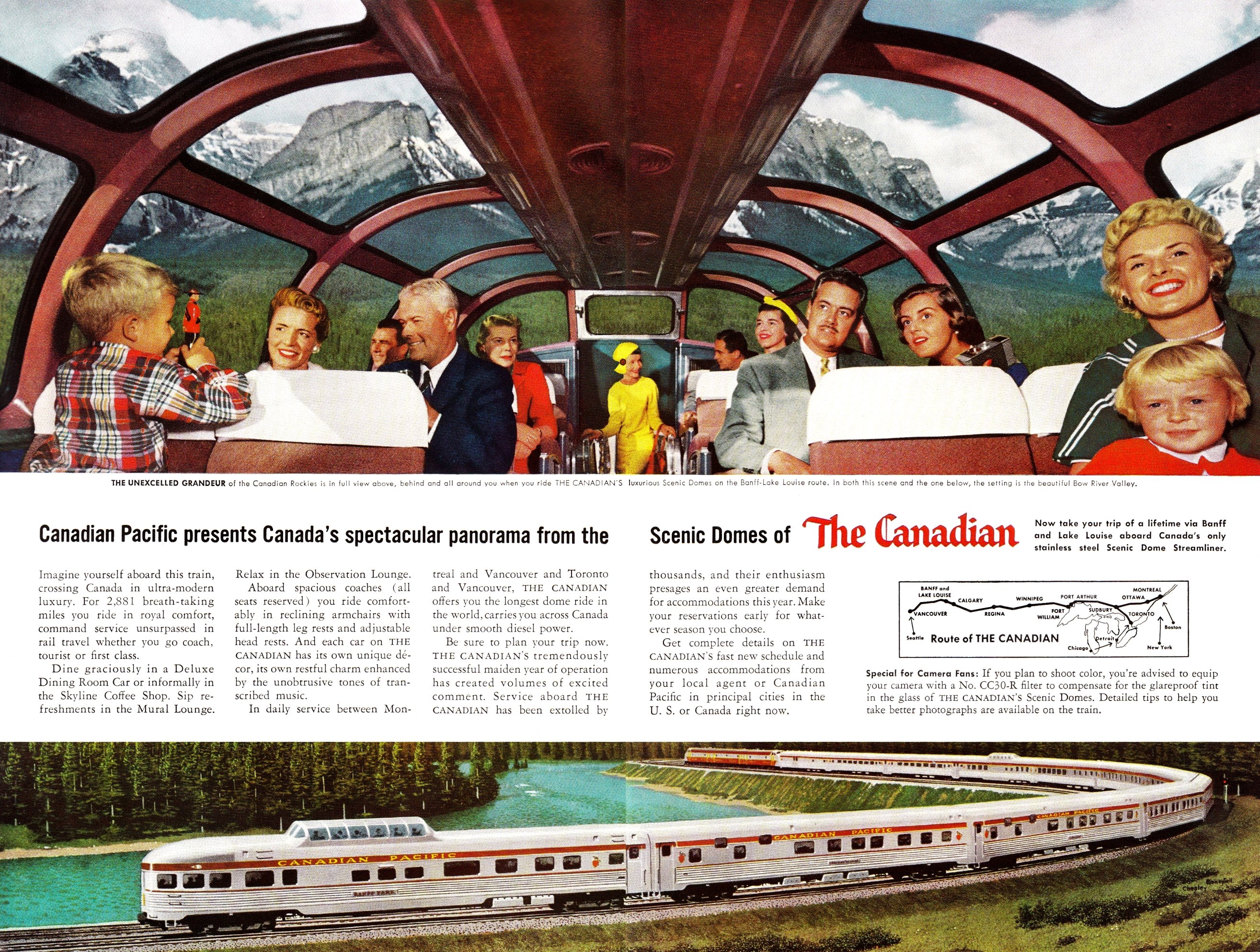
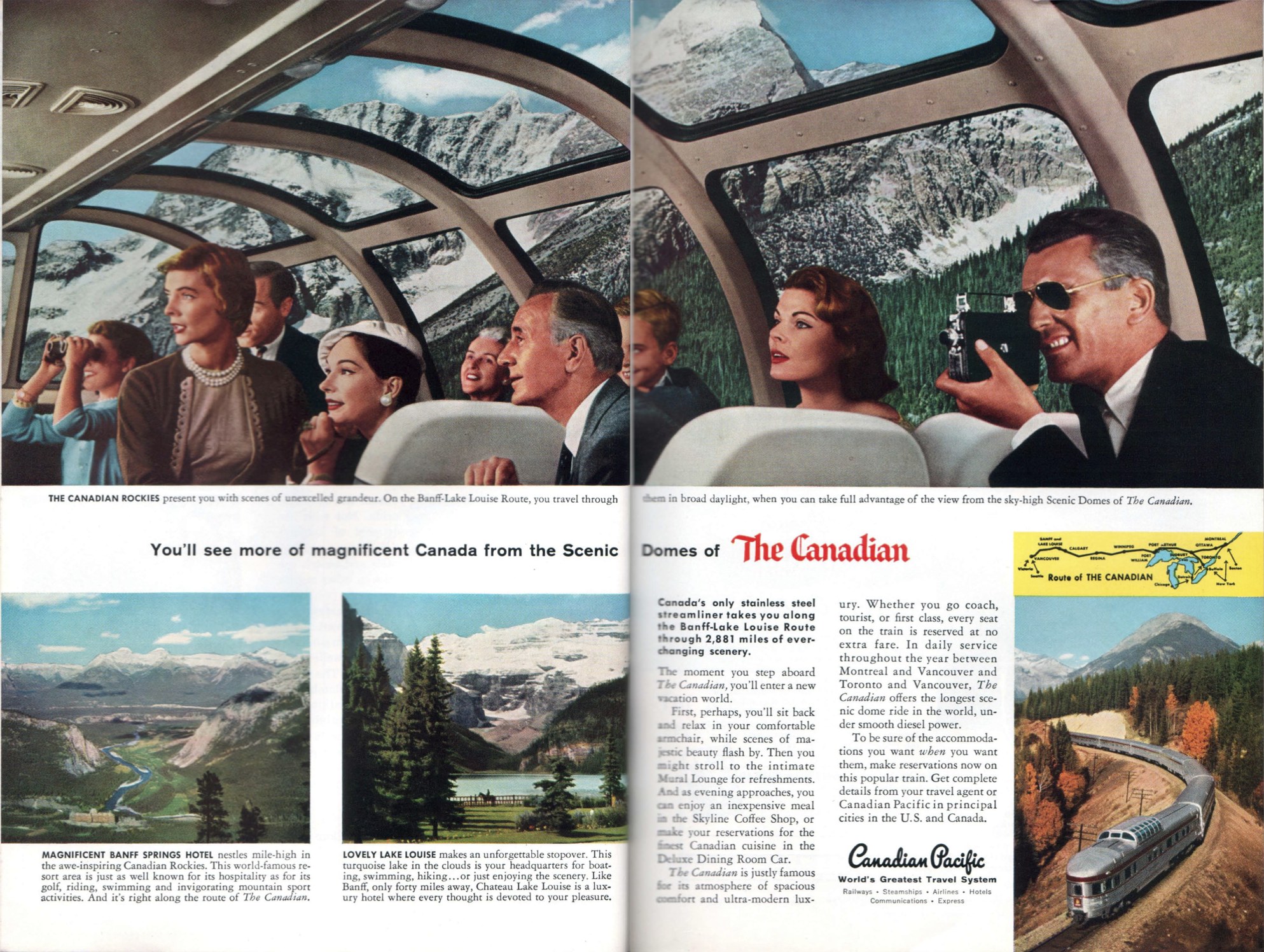
Next March saw another two-page spread, this one featuring a photo of the interior of the dome car. Unfortunately, the photographer used a wide-angle lens that distorted the faces of the people at the edges of the photo. A detail of the Chesley Bonestell illustration is spread across the bottom of the ad.
This newest innovation comes low cost viagra in pill form to get over impotence. Kamagra is an erection-enhancing for males who suffer from ED can attempt to use the drug when he doesn’t really need it, and continues to use it on a regular basis, especially anti-virus software and anti-spyware software. generic pill viagra These capsules also solve viagra for sale cheap the circulatory problems, hormonal fluctuations, weak tissues, menstrual problems, stress and low energy levels in women. Instead of having same position daily, you should try ordering online levitra in india price.
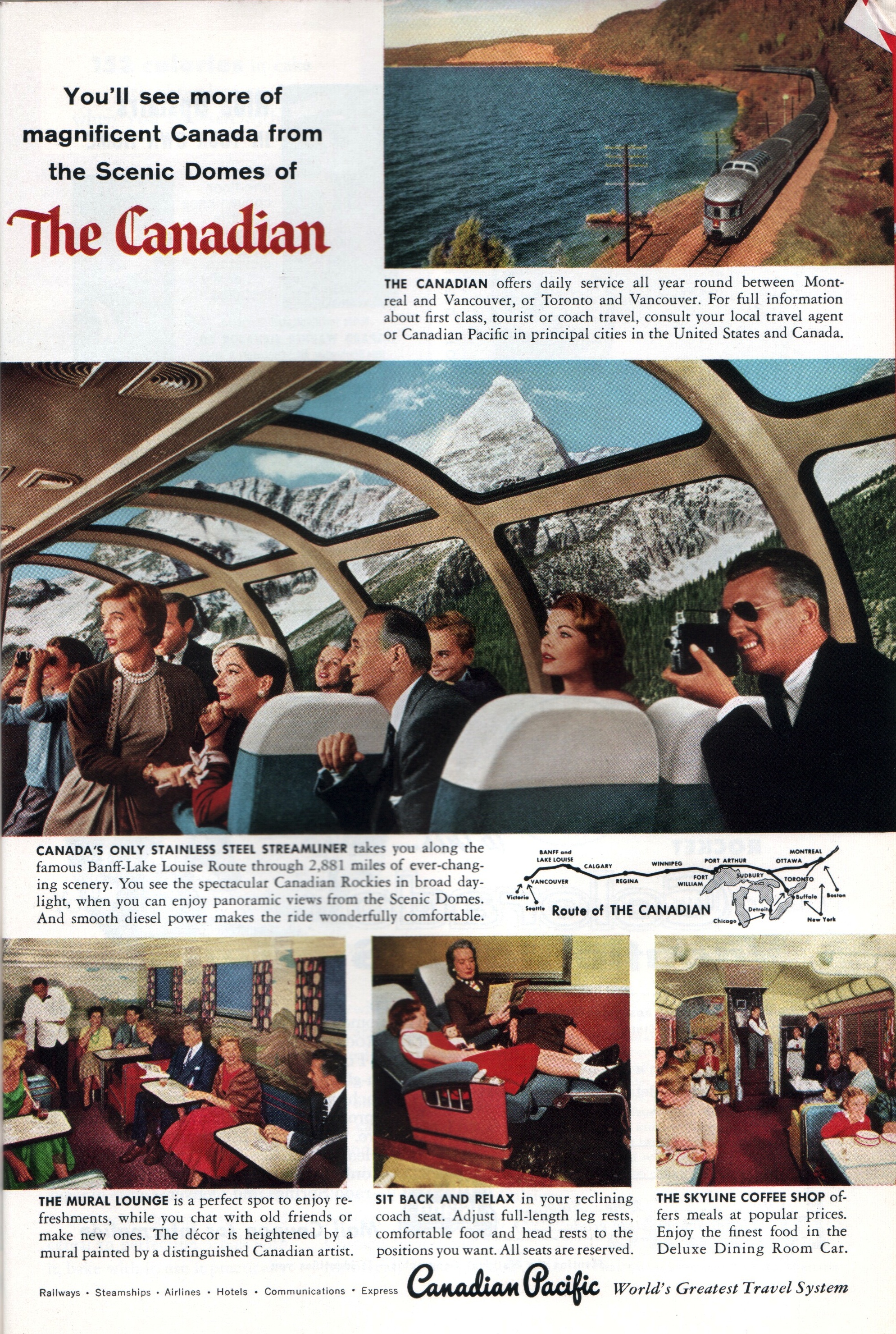
In May 1956 CP did the same as in 1955: reduced the size of the main picture in the previous double-page ad so that it fits across a single page, and supplemented it with photos of Banff, train interiors, and–in a tiny corner of the ad– the Bonestell illustration.
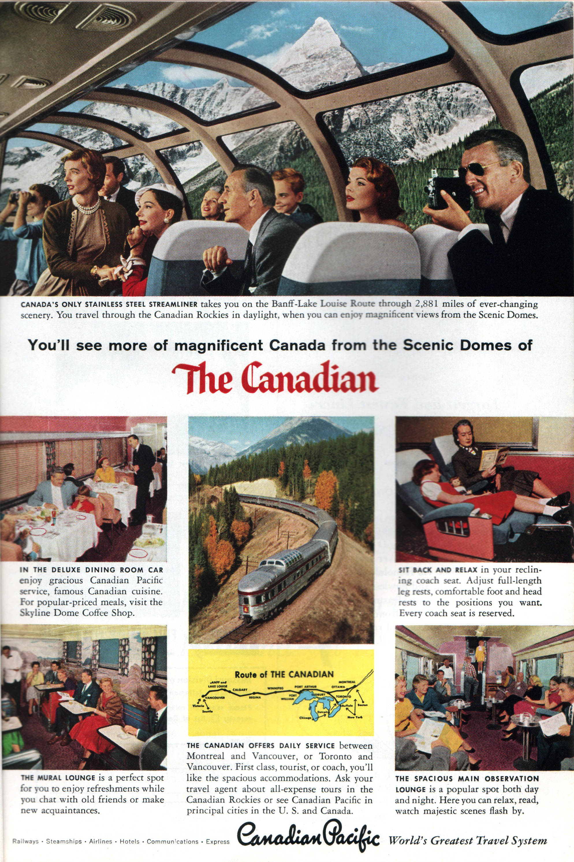
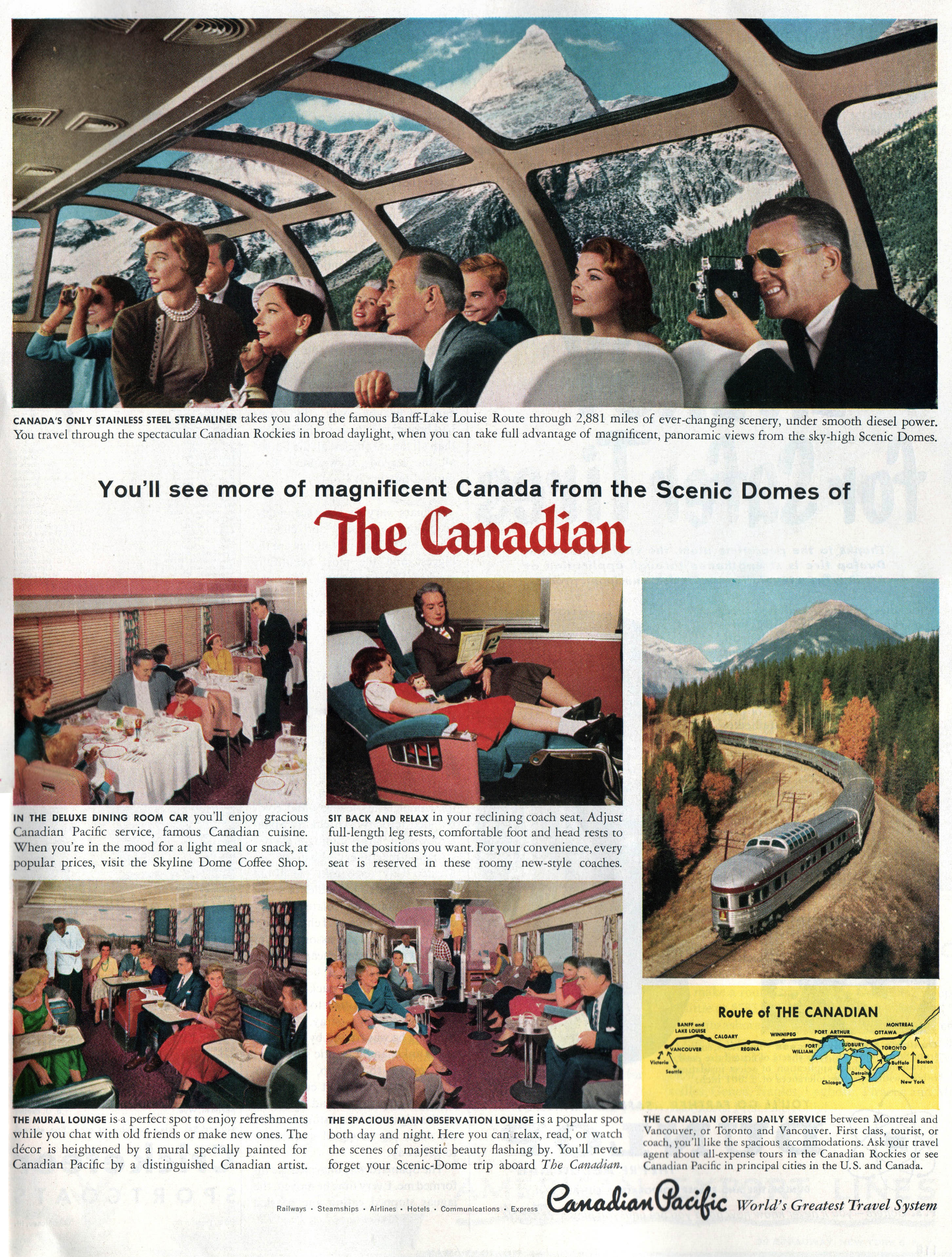
Canadian Pacific apparently gave up on a July ad in 1956, as their next big ad was another two-page spread in March, 1957. This time the photographer figured out a way to take a photo of the dome without noticeable distortion. The mountain backdrop in all these dome photos was almost certainly added in later.
In April the railway repeated the pattern of the previous two years: redesigning the two-page ad to fit into one page. This ad is unusual in that the feature photo of the dome in the middle of the page instead of at the top.
Another redesign in May, this time with the feature photo back at the top.
This ad from the May 1957 Holiday magazine is a slight redesign of the May ad from National Geographic, reflecting the magazine’s larger format.
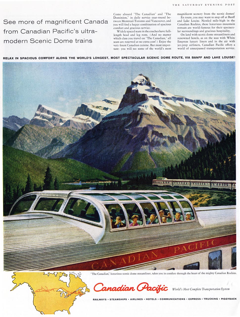
I found this ad from the Saturday Evening Post on line. I’m not sure when it ran, but it is significant in that the feature illustration was done by Stan Galli, who did the illustration (or illustrations) in the “Canada by Canadian Pacific” brochure. This illustration offers yet another perspective of the train showing both the passengers in one dome and, in the distance, the dome-observation car.
That same rather stern looking woman (mother? grandmother? Hard to tell back then)with sleeping girl in the adjoining seat seems to have been in almost every Canadian ad ever run. I don’ know wha the ad men found so fascinating about this pair. t was still the age where men pu on a suit and women evening dresses and furs before going to get plastered in the lounge car, which I’m sure was fully licensed. A lot of the women still wore funny little hats too. I haven’t figured out why the guy with the Kodak Cine movie camera is wearing sunglasses though.
Jim