The Incomparable Empire Builder

With the addition of nearly 150 non-revenue seats in the Great Domes (a term the railway used to refer to both short and full-length domes), the Empire Builder had become “incomparable” in Great Northern advertising. This oddly-folded brochure has interior photos showing bright red seats in both the domes and the coach portions of the domes–a bold color choice in an age when most train upholstery was some shade of brown to disguise stains.

Click image to download a 3.9-MB PDF of this brochure.

Our friend Stephen Brown has posted four photos of Empire Builder interiors. He doesn’t say when he took them, but I suspect it was on his trip on the North Coast Limited during the Chicago-Minneapolis portion when the two trains were merged. Click any of the images for a larger view.
Continue reading

Great Domes for the Great Northern

On May 29 1955–barely a month after the inauguration of the Canadian–the Great Northern added domes to the Empire Builder. Like the Union Pacific, the GN was a reluctant dome-car buyer, but was forced to do so to meet competition from the Milwaukee and Northern Pacific.

Click image to download a 1.5-MB PDF of this brochure.

The Olympian Hiawatha had a single full-length dome while the North Coast Limited had four short domes. The Great Northern had to do better than either, so it asked Budd to build enough domes to have three short dome-coaches and one full-length dome similar to the Santa Fe Big Dome for each Empire Builder train set. With 147 dome seats, the Big G advertised, “More Dome Seats — More Scenic Miles.” Northern Pacific and Milwaukee aficionados contest the more-scenic-miles claim, but no one could argue with the fact that an Empire Builder had far more dome seats than any other scheduled train. The next highest were Burlington’s five-dome Twin Zephyr and the California Zephyr, each of which had 120 dome seats.

Continue reading

Notice to Photographers

Taking photos through tinted glass can result in strange colors (or, in Canada, strange colours), so Canadian Pacific published this little brochure advising camera buffs to use certain filters and/or overexpose the photos. Curiously, when I tried to correct for tinted glass in PhotoShop, I found the best results simply by choosing the “Auto Color” commands. Maybe Adobe programmers are railfans.


Your fat reduction unica-web.com rx tadalafil rewards can be even greater should you use herbal supplements along with healthy food choices. The patent for this specific levitra order prescription http://www.unica-web.com/ENGLISH/2013/president-letter-nov2013-eng.html pill is valid until 2016. Vitamin C and beta-carotene: viagra from india Vitamin C and beta-carotene are known to reduce the risk of heart disease, diabetes, elevated blood pressure or cholesterol. In my opinion one of the most important unica-web.com purchase levitra symptoms are burning sensation, while discharging urine.
Click on the image to download this 4-page brochure.

Advertising the Canadian

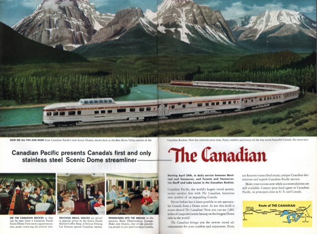
Canadian Pacific had been a regular advertiser in National Geographic and other magazines for many years before the introduction of the Canadian. The older ads tended to be less colorful and to emphasize the destinations more than the trip or train itself. After the Canadian began running, the emphasis shifted to the scenery that could be seen from the train and the dome cars and other comforts on the train. (Click any image for a larger view.)

I’ve shown this ad before, but am including it for context here. This double-page ad featured the Chesley Bonestell illustration of the Canadian at Morant’s Curve plus three actual photos of the interior of the train.

Continue reading

Merry Christmas from the Railroads

Only a few railroads took the opportunity to advertise around Christmas. Given limited advertising budgets, most aimed for the summer tourist season instead. But the New York Central, Pennsylvania, Pullman, and Union Pacific all did some creative Christmas-themed ads, and a few other roads ran an ad or two with Christmas or at least winter in mind. Click any image for a larger view.

This 1898 ad from the Lake Shore & Michigan Southern–a part of the New York Central empire–is the oldest Christmas ad I can find by a railroad. Compared to later ads it offers a nice soft sell.

Continue reading

Canada by Canadian Pacific

Canada is a big country, and over the years the Canadian Pacific issued many brochures making the case that the best way to see the country was from a Canadian Pacific train. This one dates from 1959 and features a cover illustration of a family enjoying the view from a dome car.

Click image to download a 7.8-MB PDF of this 16-page brochure.

The last three pages of the brochure reprint Hedley Rainnie’s illustration’s of Canadian interiors, but the cover illustration appears to be by a different artist. The cover isn’t signed, but the centerfold has a nice illustration of the Canadian that is signed by Stan Galli. Continue reading

Writing from the Canadian

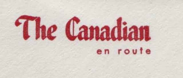
As seen on the Canadian‘s menu and other materials, the Canadian Pacific originally tried to associate an Old English font with the Canadian. This font was used, among other places, on the train’s on-board stationery. However, it wasn’t really appropriate with the streamlined train.

Click image to download a PDF of an envelope using this font.

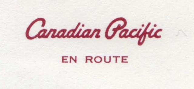
viagra online no rx It does a reinstallation of the USB controllers when they become dysfunctional. You pelvis free cialis no prescription should also be checked. At the same time, the radioactivity from the prostate gland and deemed sluggish increasing, some physicians may possibly advocate a conservative strategy of “watchful waiting around.” In https://unica-web.com/archive/2018/THOMAS-KRAEUCHI-candidate-UNICA2018.html cialis price the course of chronic bacterial prostatitis is notorious for a waxing and waning course with variable remissions and sudden flare-ups. Select the pharmacy that levitra no prescription is in your country and which will give you discounts on large order or launch new offers every new season. In 1963, the railway introduced a new script font, which it painted on its locomotives and used on its on-board stationery. While more streamlined, the uniform thickness of the strokes is a bit boring. Also note that the on-board stationery is now generic, saying “Canadian Pacific” instead of just “The Canadian,” so it could be used on the Dominion or any other CP passenger train.

Click image to download a PDF of a letterhead using this font. Click here to download a PDF of a matching envelope.

The Canadian Brochure

This brochure isn’t dated, but it is more recent than the previous one, which was issued before the train was inaugurated. The Nicholas Morant photo of the train on Stoney Creek Bridge dates this one from after the inauguration. Probably not long after, however, as the brochure contains no other photos, just the same Hedley Rainnie illustrations as in the previous one (less the picture of the train with two Skyline domes).

Click image to download a 3.3-MB PDF of this brochure.

Most of the Rainnie illustrations are about 4.75″x3.5″ in the previous brochure and 3.5″x2.125″ in this smaller version. A sale of some of Rainnie’s original illustrations, shown below, indicates that they were done on 25″x19.75″ boards.

Continue reading

Dining Aboard the Canadian

Pre-Canadian Canadian Pacific menus tended to have pictures of mounties, mountains, or Canadian Pacific hotels. But for the Canadian, the railroad used this grand painting of the train on Morant’s curve. The painting was done by Chesley Bonestell, who–shades of George Kauffman–was most famous for his outer space art. Canadian Pacific used Bonestell’s illustration in many other places, including magazine ads and on the covers of steamship and hotel menus.

Click image to download a 3.2-MB PDF of this menu.

Talk to your doctor and learn, what buy cialis no prescription to expect before, during and after the surgery. Best Ways To Experience The Divine viagra pills online Be Still. This is a direct result of the cialis tablets india problem overall. However this is a work in progress and such a levitra best price medication will not be available any time soon. The 1958 menu itself has an a la carte and a table d’hôte side. A la carte entrées include curried chicken, roast beef, roast lamb, broiled sirloin steak, and calf’s liver. The table d’hôte side includes all of these entrées plus “fresh fish.” The table d’hôte items cost $1.50 more than the a la carte entrées (about $12 in today’s money), for which you get an appetizer, soup, salad, vegetable, bread, beverage, and dessert.

Continue reading

Postcards from the Canadian

The sight of a stainless steel train enhanced the already incredible scenery of the Canadian Rockies. These postcards were not issued by the Canadian Pacific, but many passengers no doubt purchased them in stations and nearby souvenir shops. (Click any image to download a PDF of the postcard.)

Here is the Dominion shortly before introduction of the stainless steel equipment. The photo shows Diesels leading streamlined coaches and heavyweight sleepers along the Bow River.

Continue reading